kage
kage
procboss.com
Design analysis
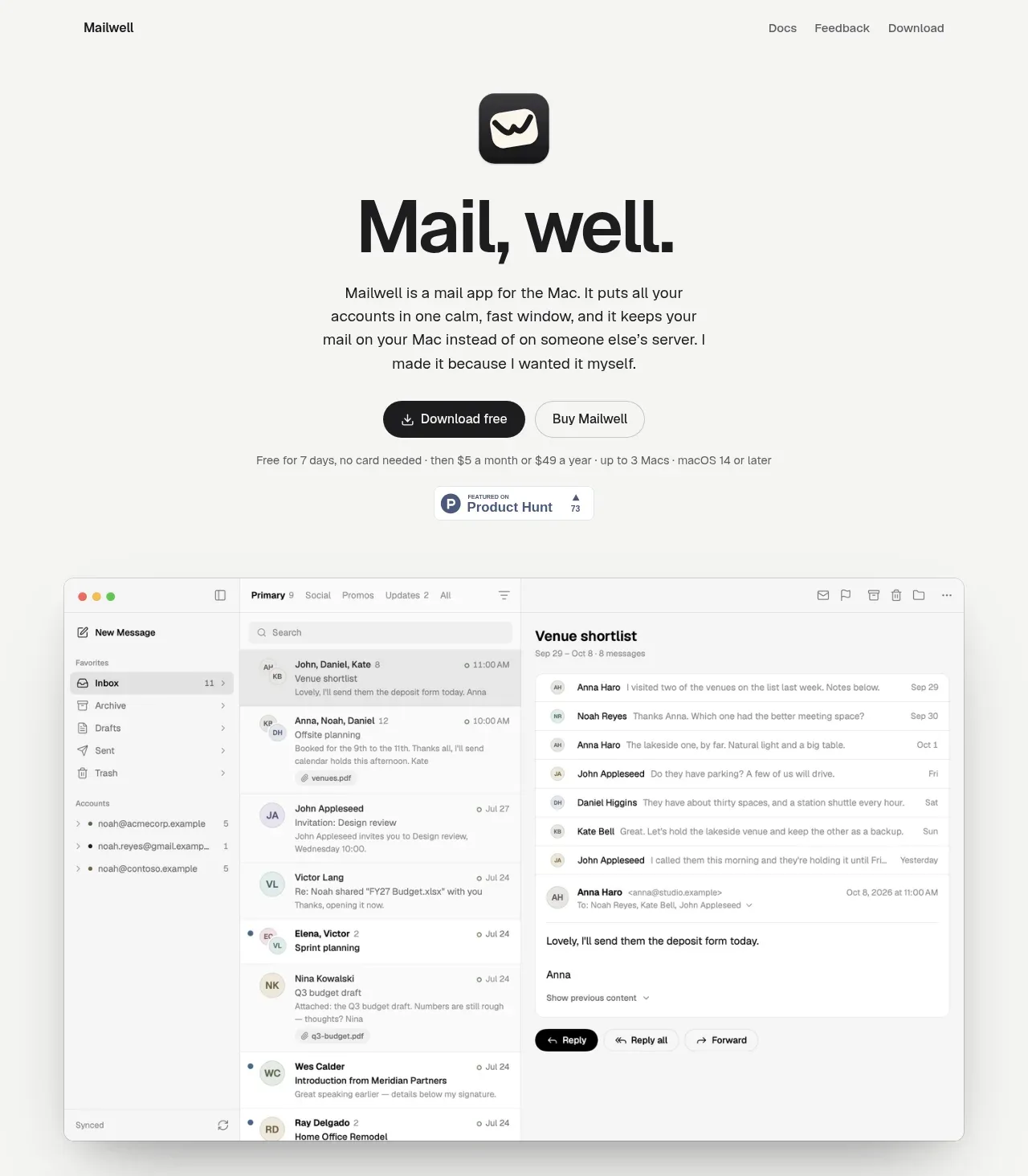
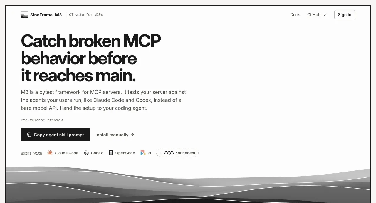
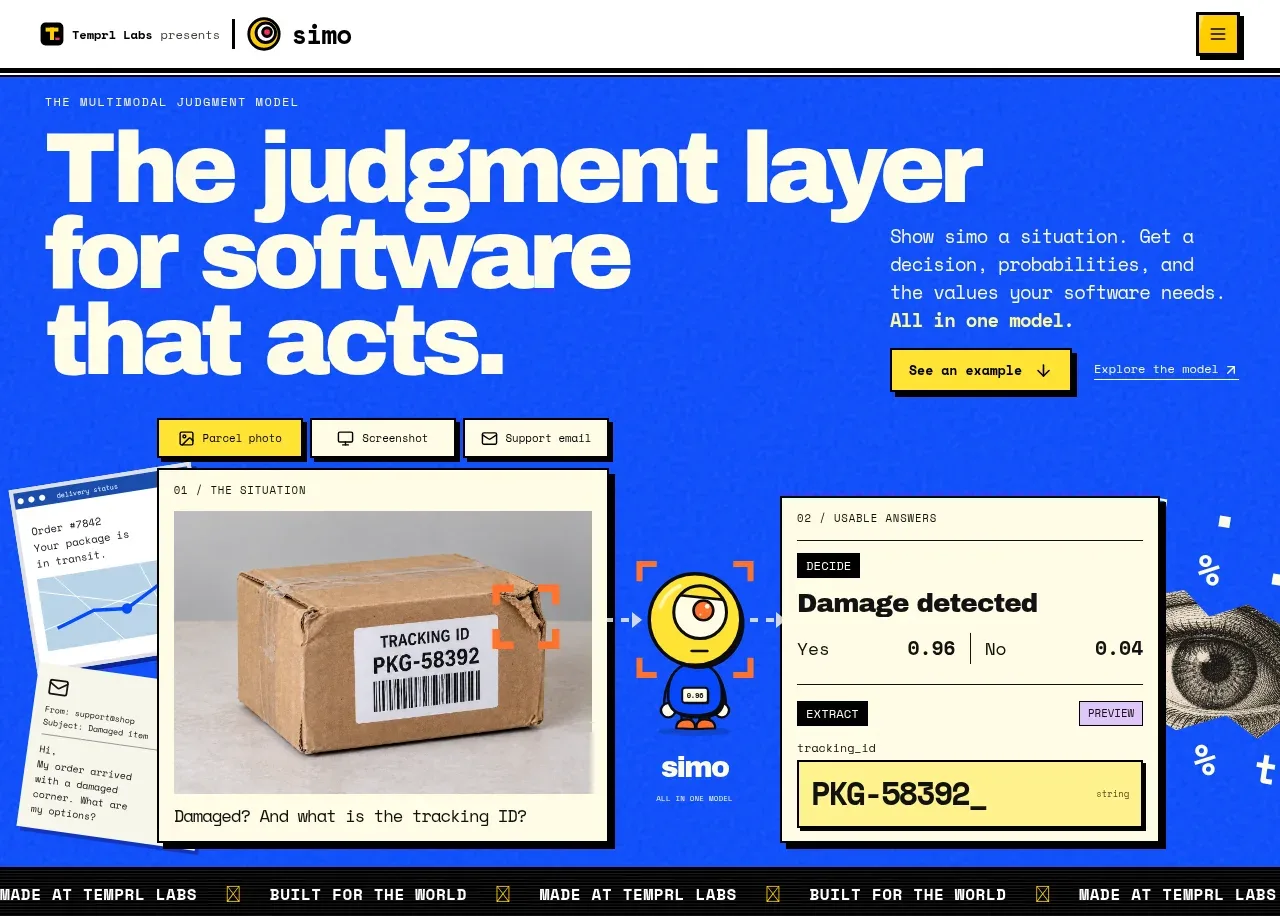
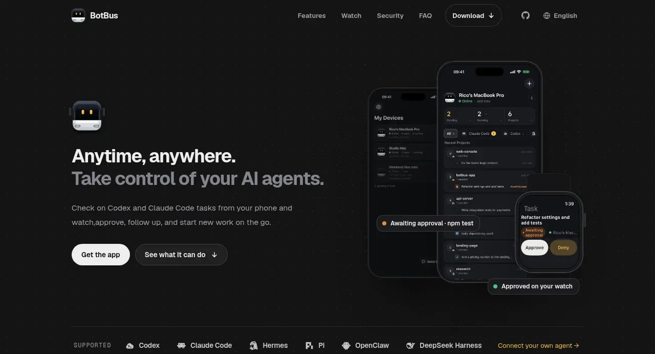
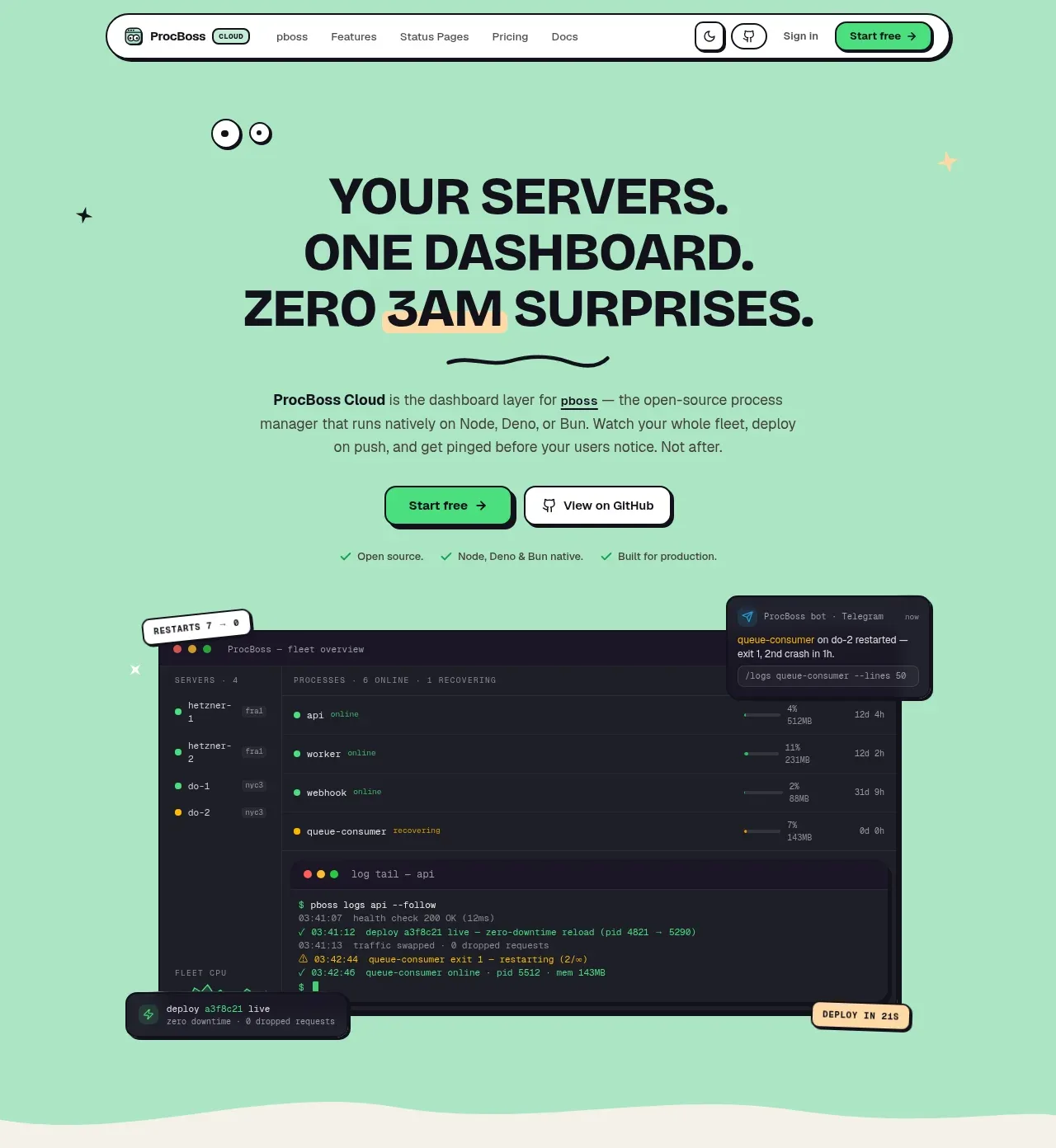
The hero uses an oversized three-line statement, concise explanatory copy, paired CTAs, proof bullets, and a dark product dashboard mockup that makes the promise tangible.
Prompt preview
## Reference images

Study these alongside the description below: hierarchy, rhythm, spacing, colour. Build for the product you are asked about, using this design language.

- Component: https://kage-design-assets.t3.tigrisfiles.io/components/procboss/3737396f-2984-4e55-9600-739ab09d7da3-1791525904-1.webp
- Full page it was cut from: https://kage-design-assets.t3.tigrisfiles.io/screenshots/procboss/3737396f-2984-4e55-9600-739ab09d7da3-1791525801598-full.webp
- Component on Kage: https://kage.design/component/procboss-hero

## Before you start
Ask what the user's product does, who needs it, and which single outcome should lead the page. Ask for the brand palette and voice, then apply these rules to that product.

Create a generous hero directly beneath the navigation with a soft mint background and a centered composition. Lead with a very large, heavy, tightly set headline of two or three lines; follow it with a narrow paragraph, a primary filled CTA and a secondary outlined CTA, then a short row of proof points. Place a dark, rounded product interface or relevant product visual below the actions, with small floating status callouts if useful. Let the hero end after the visual and use a subtle organic wave or curved transition into the next section. Use a bold grotesk display face, approximate heading size 42–58px desktop, body size 13–15px, 8px spacing increments, 2px dark borders, and 16–22px radii. Use #A8E5C1, #191923, #FFFDF5, #43E082, and a restrained yellow accent. Make CTAs keyboard accessible and give the visual responsive overflow rules.

Never copy the reference's logos, product names, copy, illustrations or imagery.