kage
kage
procboss.com
Design analysis
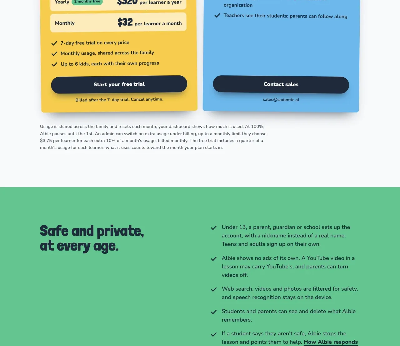
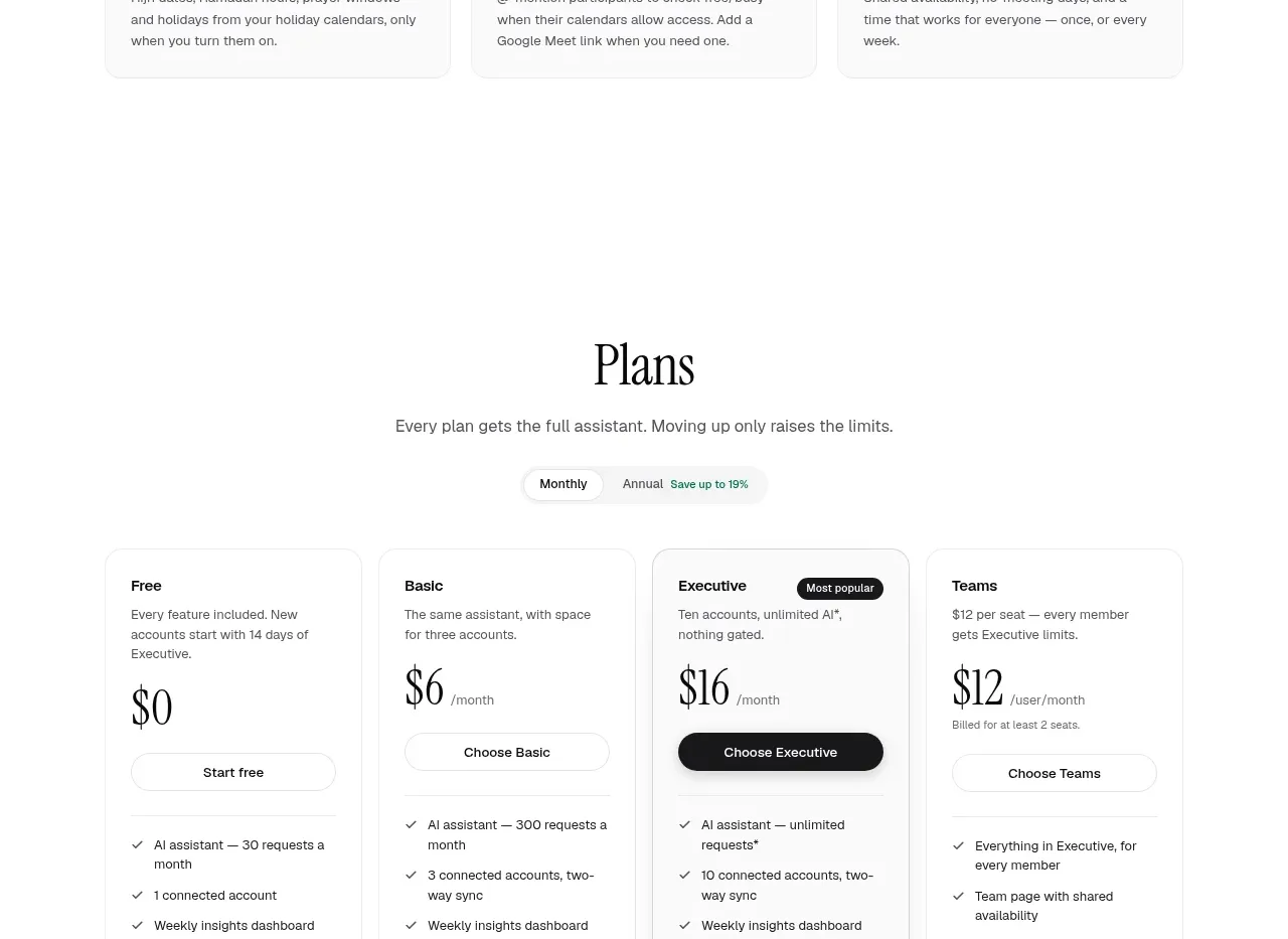
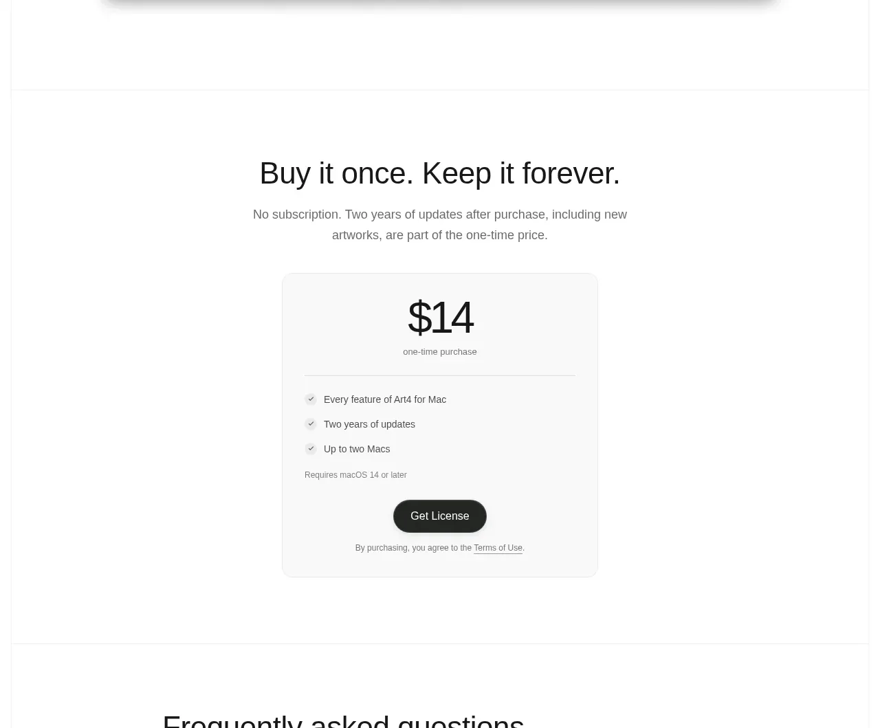
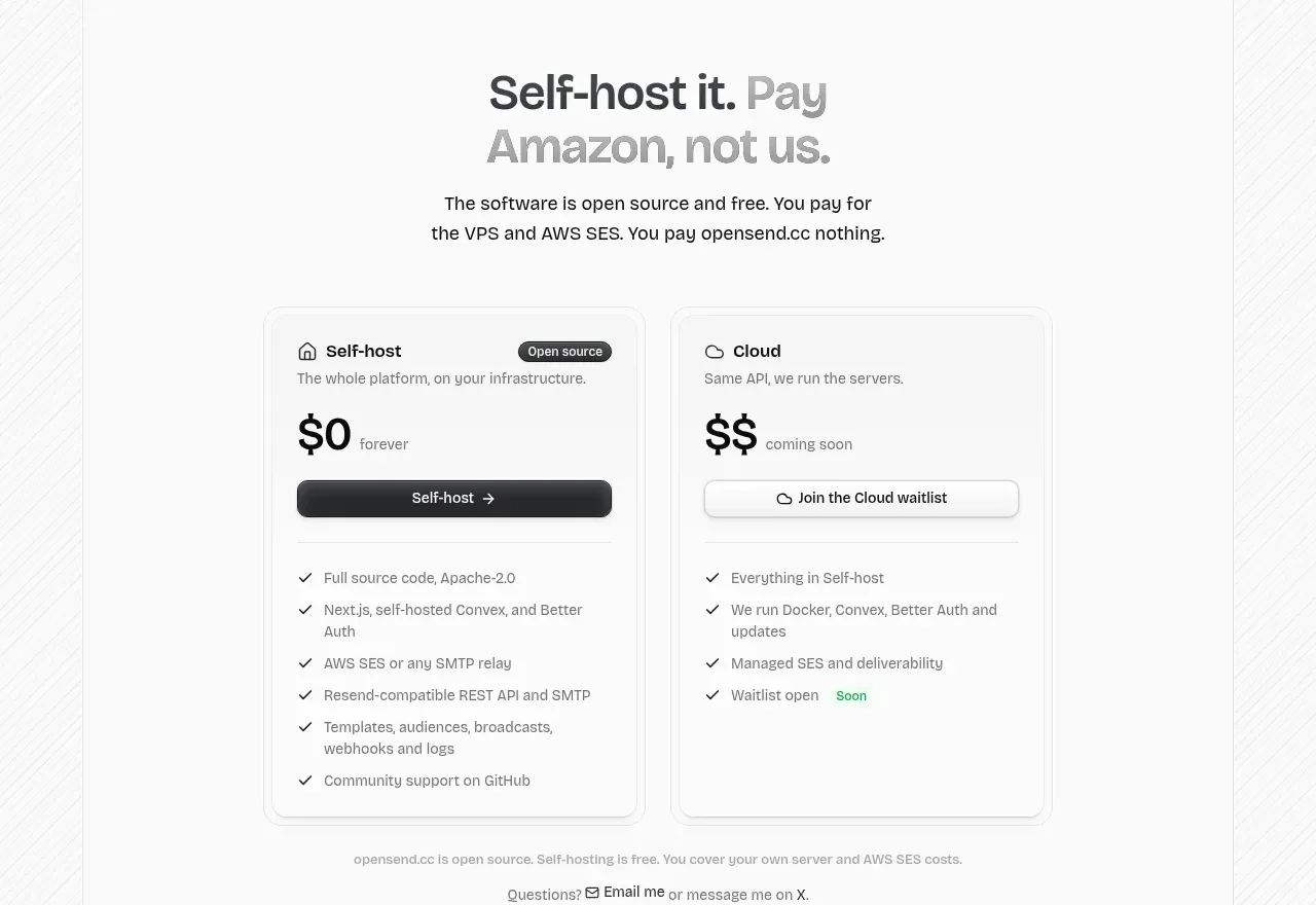
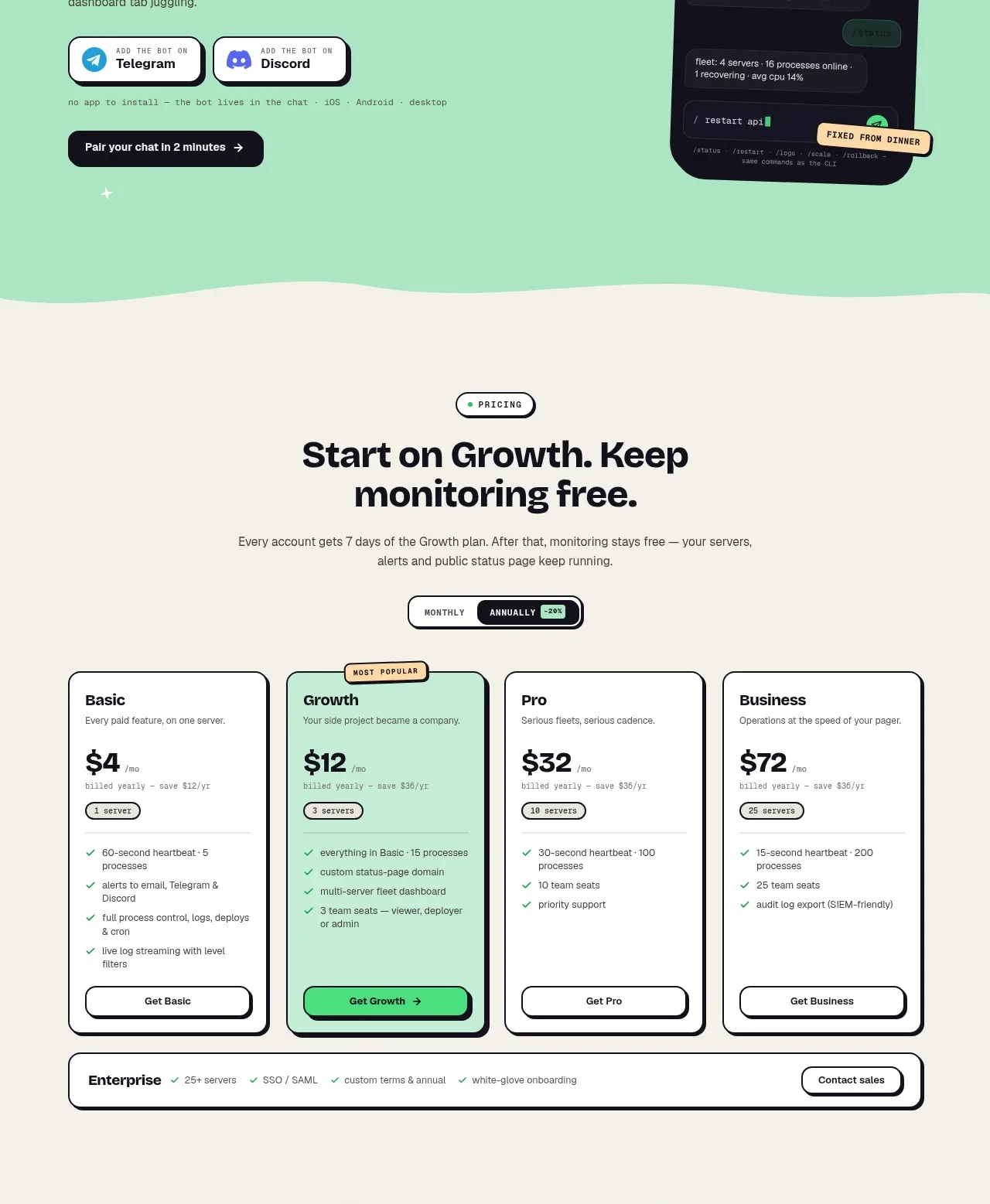
A centered pricing section offers a monthly/annual toggle, four sharply differentiated plans, one highlighted popular tier, and an enterprise strip beneath.
Prompt preview
## Reference images

Study these alongside the description below: hierarchy, rhythm, spacing, colour. Build for the product you are asked about, using this design language.

- Component: https://kage-design-assets.t3.tigrisfiles.io/components/procboss/3737396f-2984-4e55-9600-739ab09d7da3-1791525907-7.webp
- Full page it was cut from: https://kage-design-assets.t3.tigrisfiles.io/screenshots/procboss/3737396f-2984-4e55-9600-739ab09d7da3-1791525801598-full.webp
- Component on Kage: https://kage.design/component/procboss-pricing-table

## Before you start
Ask what the user's pricing model, billing units, target segments, and primary upgrade path are. Ask whether annual billing should be emphasized, then apply the answers.

Build a pricing section on a warm cream background with a small eyebrow, centered headline, concise explanation, and a compact monthly/annual segmented toggle. Below, create four equal pricing cards in a responsive grid. Each card includes plan name, short audience descriptor, large price with billing unit, included allowance, 3–5 benefit bullets, and a full-width CTA. Highlight one recommended plan with a mint surface and a small “most popular” badge while maintaining consistent dark outlines, 14–18px radii, and subtle offset shadow. Add a full-width enterprise row below with compact inclusions and a contact action. Use clear price hierarchy, aligned CTA baselines, accessible toggle states, and mobile stacking.

Never copy the reference's logos, product names, copy, illustrations or imagery.