 kage
kage
promptic.eu
Design analysis
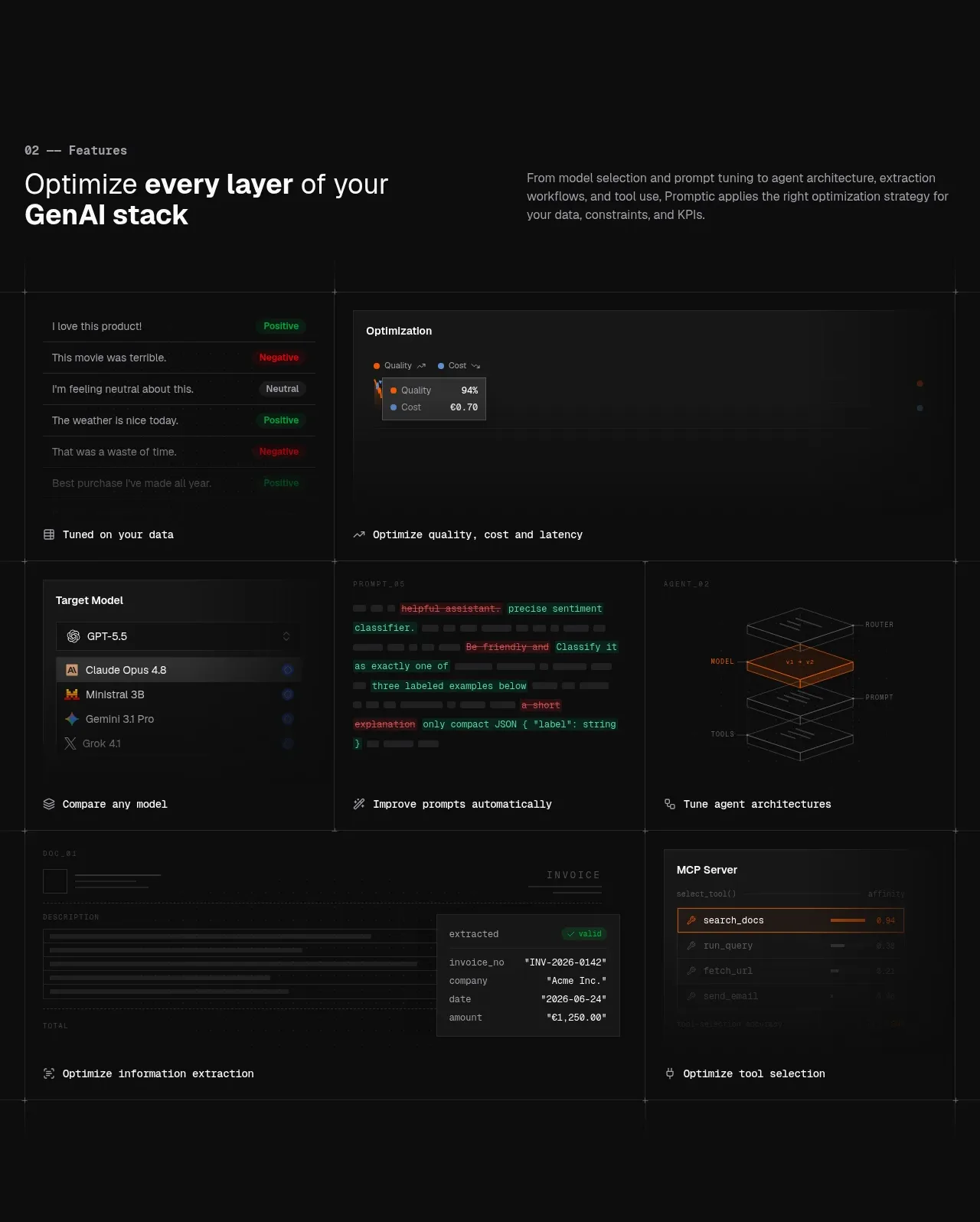
A section heading and explanation introduce a dense two-column capability grid. Each tile uses miniature interface/code diagrams and a concise outcome label to make complex features scannable.
Prompt preview
## Reference images

Study these alongside the description below: hierarchy, rhythm, spacing, colour. Build for the product you are asked about, using this design language.

- Component: https://kage-design-assets.t3.tigrisfiles.io/components/promptic/b6d3638e-158e-4f4b-839a-22e1c64a625e-1790402541-3.webp
- Full page it was cut from: https://kage-design-assets.t3.tigrisfiles.io/screenshots/promptic/b6d3638e-158e-4f4b-839a-22e1c64a625e-1790402502341-full.webp
- Component on Kage: https://kage.design/component/promptic-feature-grid

## Before you start
Ask what layers or capabilities make up the user's product, which ones deserve emphasis, and what UI or data can represent each capability. Apply the system to those answers.

Create a dark feature section with a two-column intro: a numbered monospaced eyebrow and bold 36–48px heading on the left, explanatory copy on the right. Beneath, use a 3-column desktop grid of tall feature tiles with 1px #292929 dividers, minimal or no radius, and charcoal surfaces around #111111. Each tile should contain a small, low-contrast product-inspired mini visualization—lists, charts, code snippets, model selectors, layered diagrams, extraction results, or tool cards—followed by a short monospace or semibold outcome caption. Keep text hierarchy restrained: #f4f4f4 headings, #909090 body copy, orange #e96b27 only for meaningful states. Let the grid become one column on mobile and ensure decorative mini-UI remains legible.

Never: use logos, product names, copy, illustrations, or imagery from the reference.
More components

 Three-step process cards
godaylight.com · Feature grid
Three-step process cards
godaylight.com · Feature grid

 Use-case selector with vertical video preview
Spira Maxima · Feature grid
Use-case selector with vertical video preview
Spira Maxima · Feature grid

 Insights and enterprise model access
FastRouter.ai · Feature grid
Insights and enterprise model access
FastRouter.ai · Feature grid
 Solutions by organizational role
FastRouter.ai · Feature grid
Solutions by organizational role
FastRouter.ai · Feature grid
 Routing reliability and model collaboration
FastRouter.ai · Feature grid
Routing reliability and model collaboration
FastRouter.ai · Feature grid
 Goal-oriented product capabilities
FastRouter.ai · Feature grid
Goal-oriented product capabilities
FastRouter.ai · Feature grid