 kage
kage
promptic.eu
Design analysis
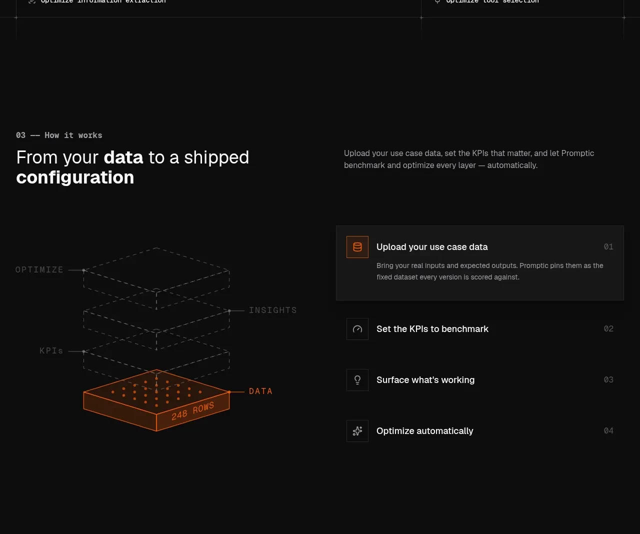
The workflow section combines a layered data diagram with a numbered list of four operational steps. A highlighted first step establishes the active state and hierarchy.
Prompt preview
## Reference images

Study these alongside the description below: hierarchy, rhythm, spacing, colour. Build for the product you are asked about, using this design language.

- Component: https://kage-design-assets.t3.tigrisfiles.io/components/promptic/b6d3638e-158e-4f4b-839a-22e1c64a625e-1790402542-4.webp
- Full page it was cut from: https://kage-design-assets.t3.tigrisfiles.io/screenshots/promptic/b6d3638e-158e-4f4b-839a-22e1c64a625e-1790402502341-full.webp
- Component on Kage: https://kage.design/component/promptic-feature-grid-2

## Before you start
Ask what the user's customer's workflow is, how many steps it has, and what input/output should be visualized. Then map this interaction to the user's domain.

Build a dark workflow section with a two-column heading row and a two-column body. On the left, show a simple isometric stack of translucent outlined layers, with the active data layer highlighted in warm orange and annotated with a compact metric. On the right, show four vertically ordered steps, each with a square icon, title, short optional description, and step number aligned to the far edge. Give the active step a charcoal card background and orange icon border; inactive rows should be quiet with thin #272727 borders. Use 16px row gaps, 24px internal padding, and a technical sans/monospace label pairing. Support keyboard activation and a visible active state if steps are interactive.

Never: use logos, product names, copy, illustrations, or imagery from the reference.
More components

 Three-step process cards
godaylight.com · Feature grid
Three-step process cards
godaylight.com · Feature grid

 Use-case selector with vertical video preview
Spira Maxima · Feature grid
Use-case selector with vertical video preview
Spira Maxima · Feature grid

 Insights and enterprise model access
FastRouter.ai · Feature grid
Insights and enterprise model access
FastRouter.ai · Feature grid
 Solutions by organizational role
FastRouter.ai · Feature grid
Solutions by organizational role
FastRouter.ai · Feature grid
 Routing reliability and model collaboration
FastRouter.ai · Feature grid
Routing reliability and model collaboration
FastRouter.ai · Feature grid
 Goal-oriented product capabilities
FastRouter.ai · Feature grid
Goal-oriented product capabilities
FastRouter.ai · Feature grid