 kage
kage
promptic.eu
Design analysis
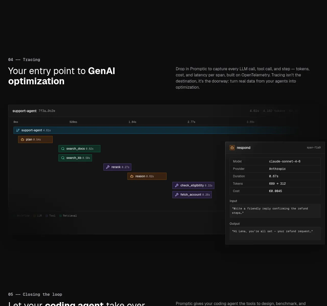
A concise tracing explanation is paired with a wide dark trace timeline. Coloured spans and a detail panel turn an abstract observability claim into a readable operational artifact.
Prompt preview
## Reference images

Study these alongside the description below: hierarchy, rhythm, spacing, colour. Build for the product you are asked about, using this design language.

- Component: https://kage-design-assets.t3.tigrisfiles.io/components/promptic/b6d3638e-158e-4f4b-839a-22e1c64a625e-1790402542-5.webp
- Full page it was cut from: https://kage-design-assets.t3.tigrisfiles.io/screenshots/promptic/b6d3638e-158e-4f4b-839a-22e1c64a625e-1790402502341-full.webp
- Component on Kage: https://kage.design/component/promptic-feature-grid-3

## Before you start
Ask what events, spans, logs, or metrics the user's product needs to expose and which detail should appear on selection. Use the answers to make the visualization useful rather than decorative.

Create a dark observability section with a numbered eyebrow, a bold two-line heading, and a short explanatory paragraph in a two-column header. Below it, build a wide bordered dashboard panel around #151515 with a faint timeline ruler and multiple horizontal nested spans. Use cyan/teal for active system spans, amber for model or processing spans, and violet for tool spans, each muted rather than neon. Add a right-side or floating detail drawer with rows for model, provider, duration, tokens, cost, input, and output. Use 1px #2b2b2b borders, square-to-4px corners, tiny 11–13px labels, and hover/selection highlighting. On small screens, stack the detail panel below the timeline.

Never: use logos, product names, copy, illustrations, or imagery from the reference.
More components

 Three-step process cards
godaylight.com · Feature grid
Three-step process cards
godaylight.com · Feature grid

 Use-case selector with vertical video preview
Spira Maxima · Feature grid
Use-case selector with vertical video preview
Spira Maxima · Feature grid

 Insights and enterprise model access
FastRouter.ai · Feature grid
Insights and enterprise model access
FastRouter.ai · Feature grid
 Solutions by organizational role
FastRouter.ai · Feature grid
Solutions by organizational role
FastRouter.ai · Feature grid
 Routing reliability and model collaboration
FastRouter.ai · Feature grid
Routing reliability and model collaboration
FastRouter.ai · Feature grid
 Goal-oriented product capabilities
FastRouter.ai · Feature grid
Goal-oriented product capabilities
FastRouter.ai · Feature grid