 kage
kage
promptic.eu

Design analysis
The hero pairs a very large declarative headline with concise supporting copy and two proof-oriented actions, then lets a tilted product UI visual carry the lower half of the section.
Prompt preview
## Reference images

Study these alongside the description below: hierarchy, rhythm, spacing, colour. Build for the product you are asked about, using this design language.

- Component: https://kage-design-assets.t3.tigrisfiles.io/components/promptic/b6d3638e-158e-4f4b-839a-22e1c64a625e-1790402541-1.webp
- Full page it was cut from: https://kage-design-assets.t3.tigrisfiles.io/screenshots/promptic/b6d3638e-158e-4f4b-839a-22e1c64a625e-1790402502341-full.webp
- Component on Kage: https://kage.design/component/promptic-hero

## Before you start
Ask what the user's product does, who the primary audience is, and which action should be the main conversion. Ask for the brand voice and visual assets, then adapt these rules to that product.

Create a spacious dark hero directly below the navigation. Use a large left-aligned headline with a tight 64–80px desktop size, 0.95 line-height, and an off-white primary phrase followed by a softer gray continuation. Add one concise paragraph in #a5a5a5 at 17–19px, then a primary orange pill CTA and a neutral outlined secondary proof/action badge. Reserve substantial vertical space for a wide, slightly tilted product or workflow preview fading into the background; use a subtle warm orange radial glow behind it, not a busy decorative illustration. Keep content aligned to a max-width container with 24px mobile gutters. On mobile, stack content and reduce the visual tilt. Include clear hover, focus, and reduced-motion behaviour.

Never: use logos, product names, copy, illustrations, or imagery from the reference.
More components
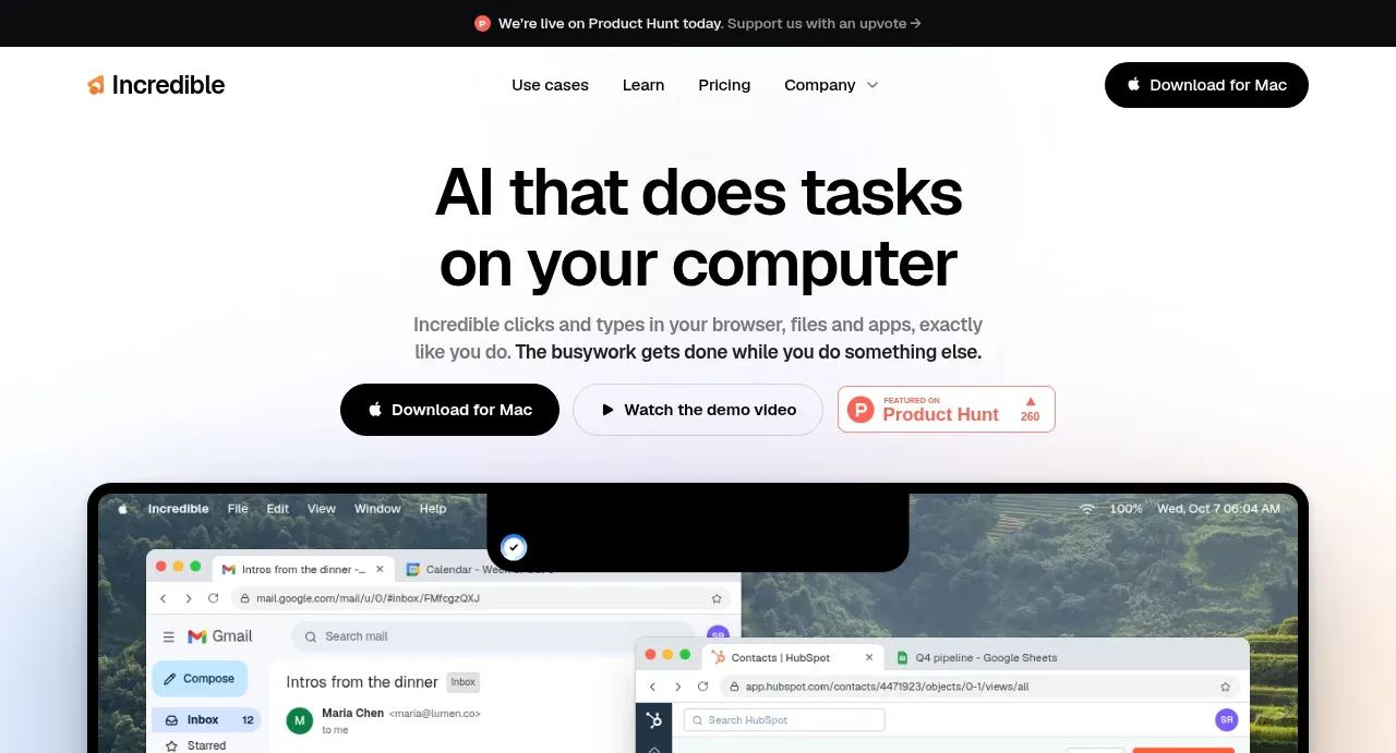
 AI workflow hero
Incredible · Hero
AI workflow hero
Incredible · Hero
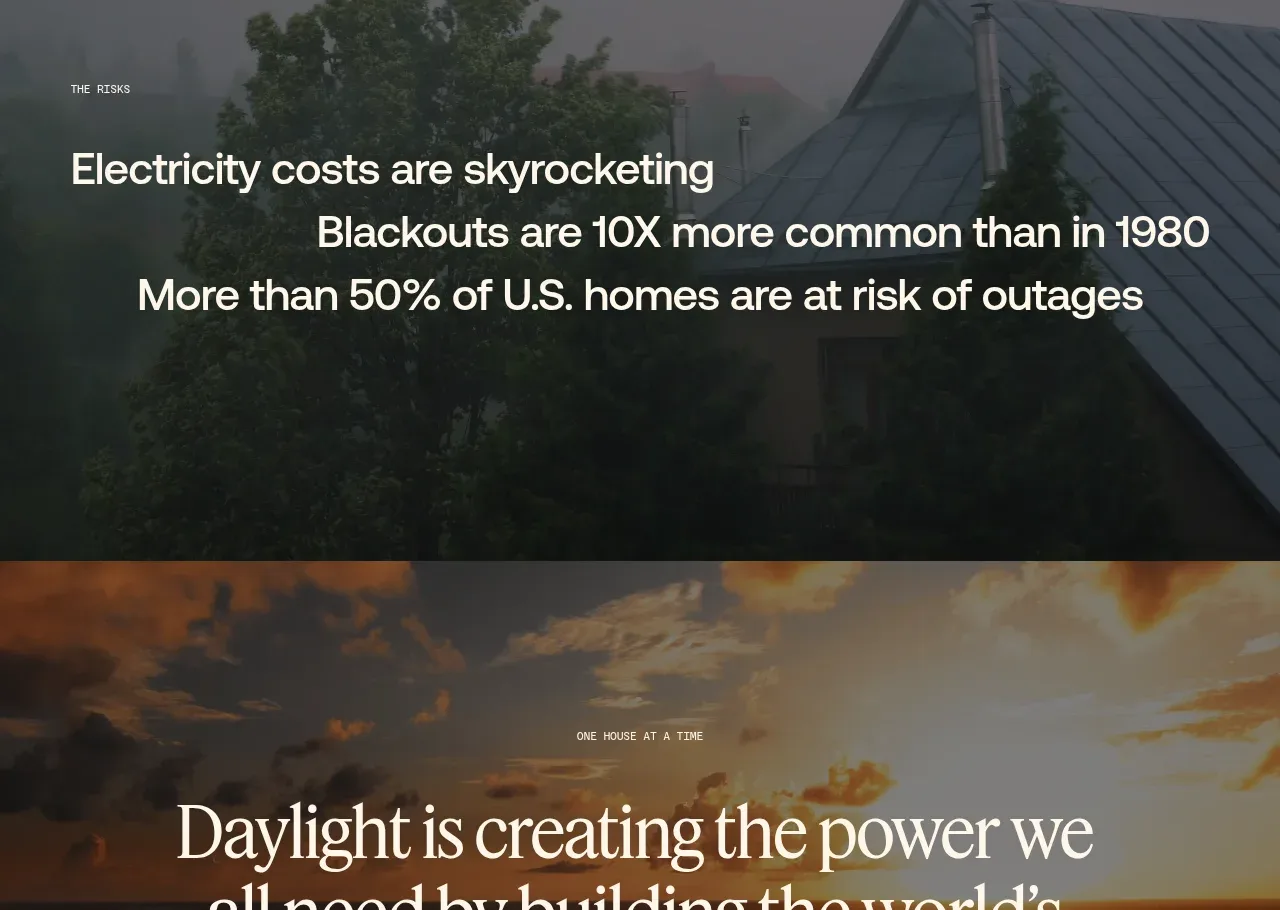
 Decentralized energy statement
godaylight.com · Hero
Decentralized energy statement
godaylight.com · Hero
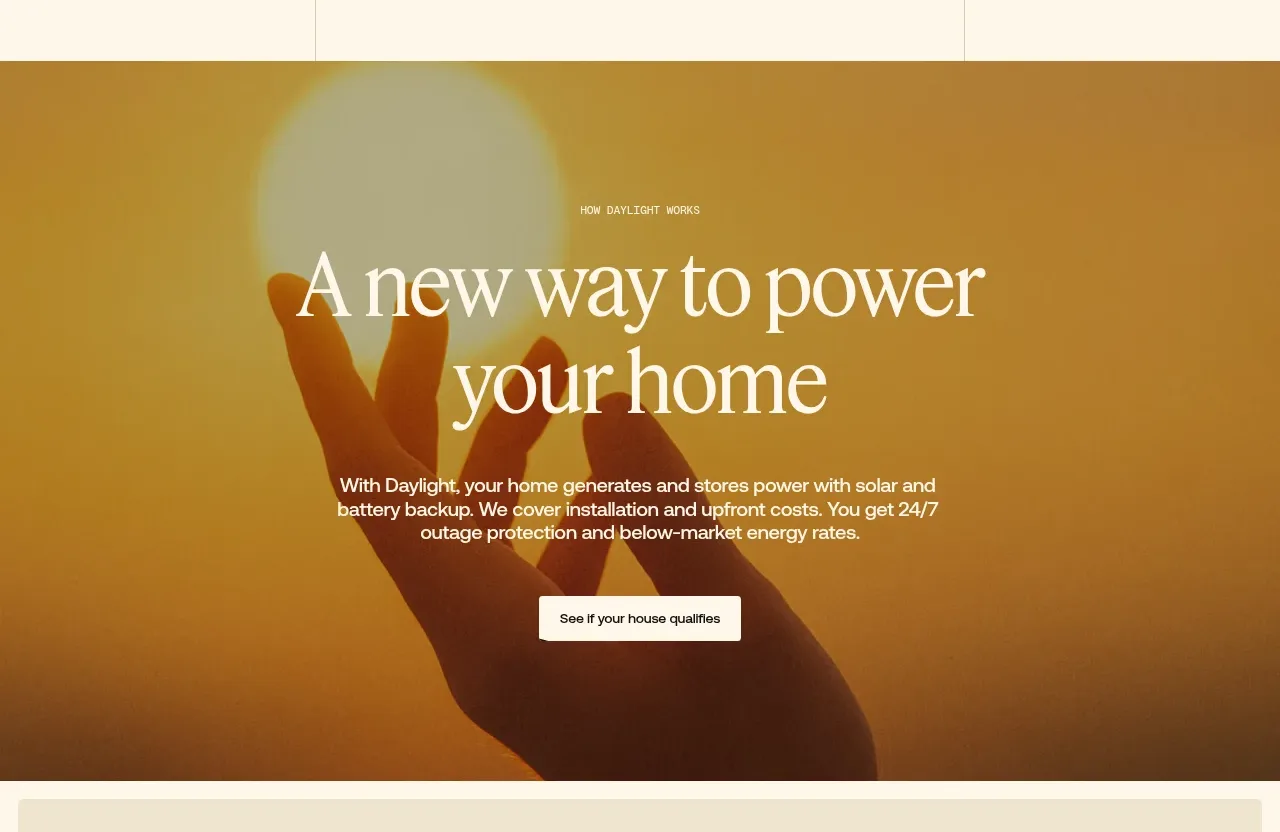 Warm mission statement panel
godaylight.com · Hero
Warm mission statement panel
godaylight.com · Hero
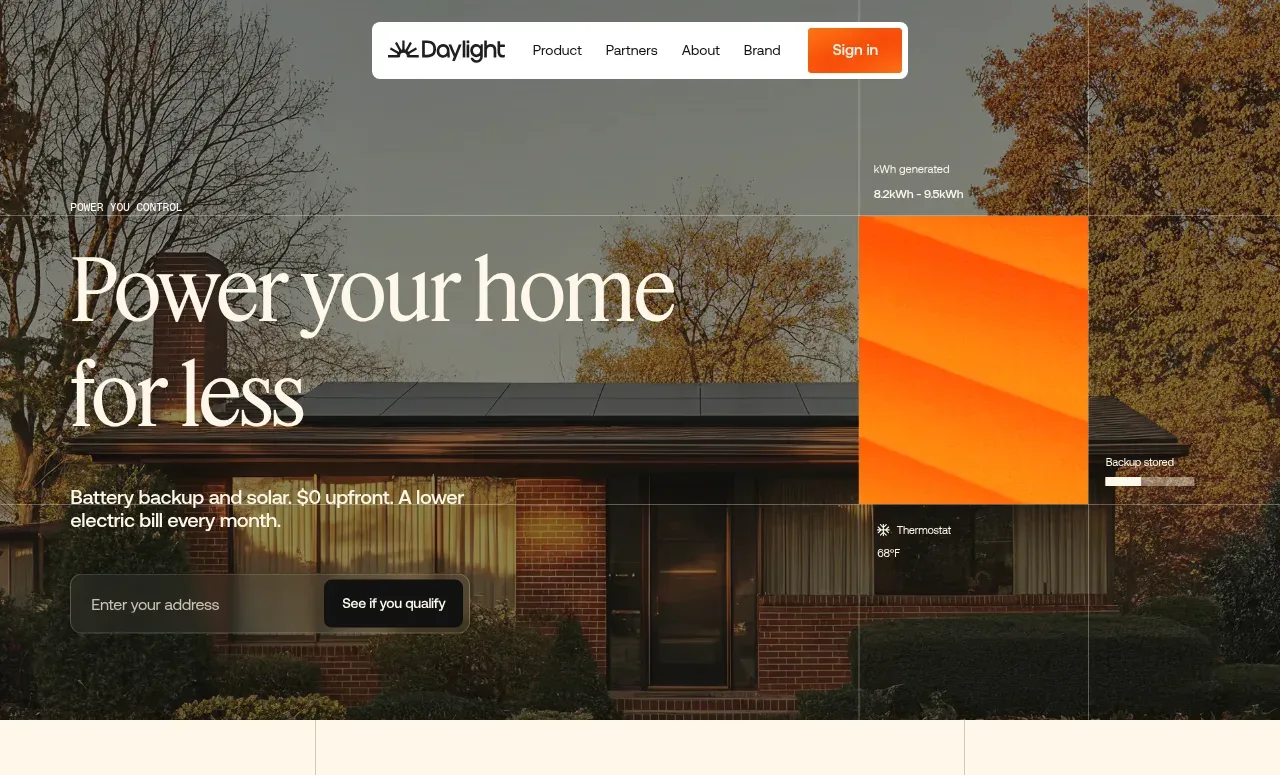 Photographic power-home hero
godaylight.com · Hero
Photographic power-home hero
godaylight.com · Hero
 Grid problem statement
godaylight.com · Hero
Grid problem statement
godaylight.com · Hero
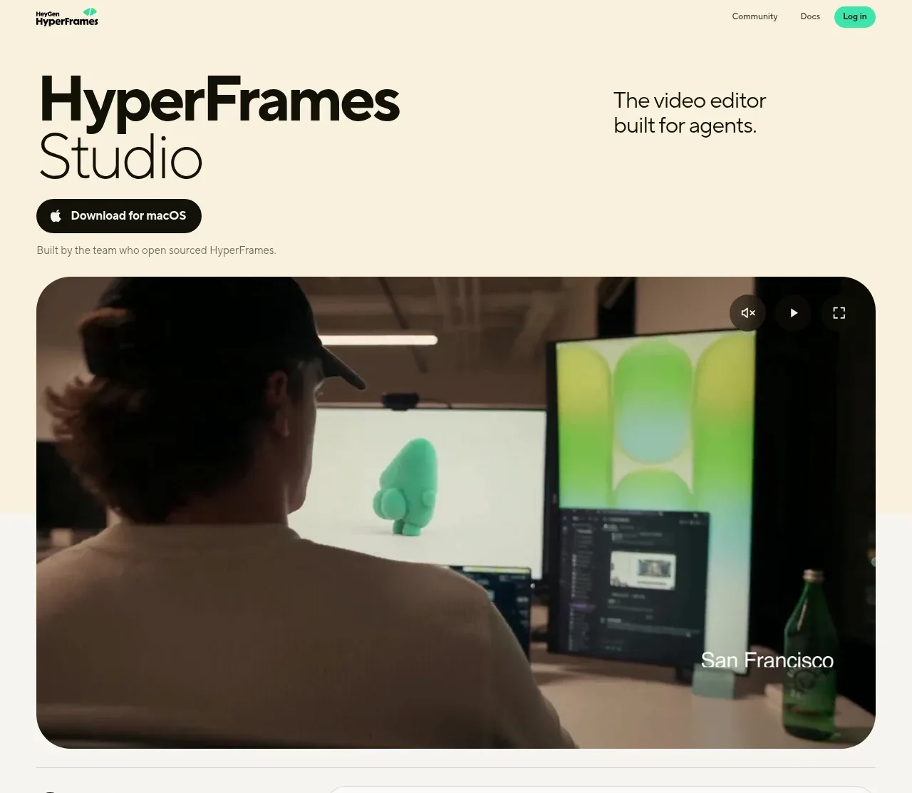
 Product hero with download action and video
HyperFrames Studio (Desktop) · Hero
Product hero with download action and video
HyperFrames Studio (Desktop) · Hero