 kage
kage
promptic.eu
Design analysis
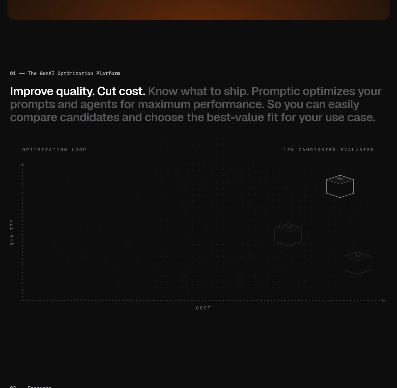
A numbered statement explains the economic value in one bold sentence, followed by a sparse quality-versus-cost evaluation field with candidate markers.
Prompt preview
## Reference images

Study these alongside the description below: hierarchy, rhythm, spacing, colour. Build for the product you are asked about, using this design language.

- Component: https://kage-design-assets.t3.tigrisfiles.io/components/promptic/b6d3638e-158e-4f4b-839a-22e1c64a625e-1790402541-2.webp
- Full page it was cut from: https://kage-design-assets.t3.tigrisfiles.io/screenshots/promptic/b6d3638e-158e-4f4b-839a-22e1c64a625e-1790402502341-full.webp
- Component on Kage: https://kage.design/component/promptic-hero-2

## Before you start
Ask what measurable outcome the user's product improves and which two variables customers trade off. Ask about brand colours and whether the visual should be interactive.

Build a dark value-proposition section with a small monospaced eyebrow, then a large sentence where the first benefit is bright and the supporting phrase is muted gray. Below it, create a generous data-inspired diagram: a faint dotted grid, dashed horizontal and vertical axes, tiny uppercase axis labels, and a few outlined candidate markers distributed across the field. Use #0b0b0b as the base, #1f1f1f for grid lines, #8b8b8b for secondary labels, and a restrained orange highlight around #d85b24. The graphic should communicate better quality at lower cost without requiring an image asset. Add subtle motion only when visible and respect reduced motion.

Never: use logos, product names, copy, illustrations, or imagery from the reference.
More components

 AI workflow hero
Incredible · Hero
AI workflow hero
Incredible · Hero

 Decentralized energy statement
godaylight.com · Hero
Decentralized energy statement
godaylight.com · Hero
 Warm mission statement panel
godaylight.com · Hero
Warm mission statement panel
godaylight.com · Hero
 Photographic power-home hero
godaylight.com · Hero
Photographic power-home hero
godaylight.com · Hero
 Grid problem statement
godaylight.com · Hero
Grid problem statement
godaylight.com · Hero

 Product hero with download action and video
HyperFrames Studio (Desktop) · Hero
Product hero with download action and video
HyperFrames Studio (Desktop) · Hero