 kage
kage
promptic.eu
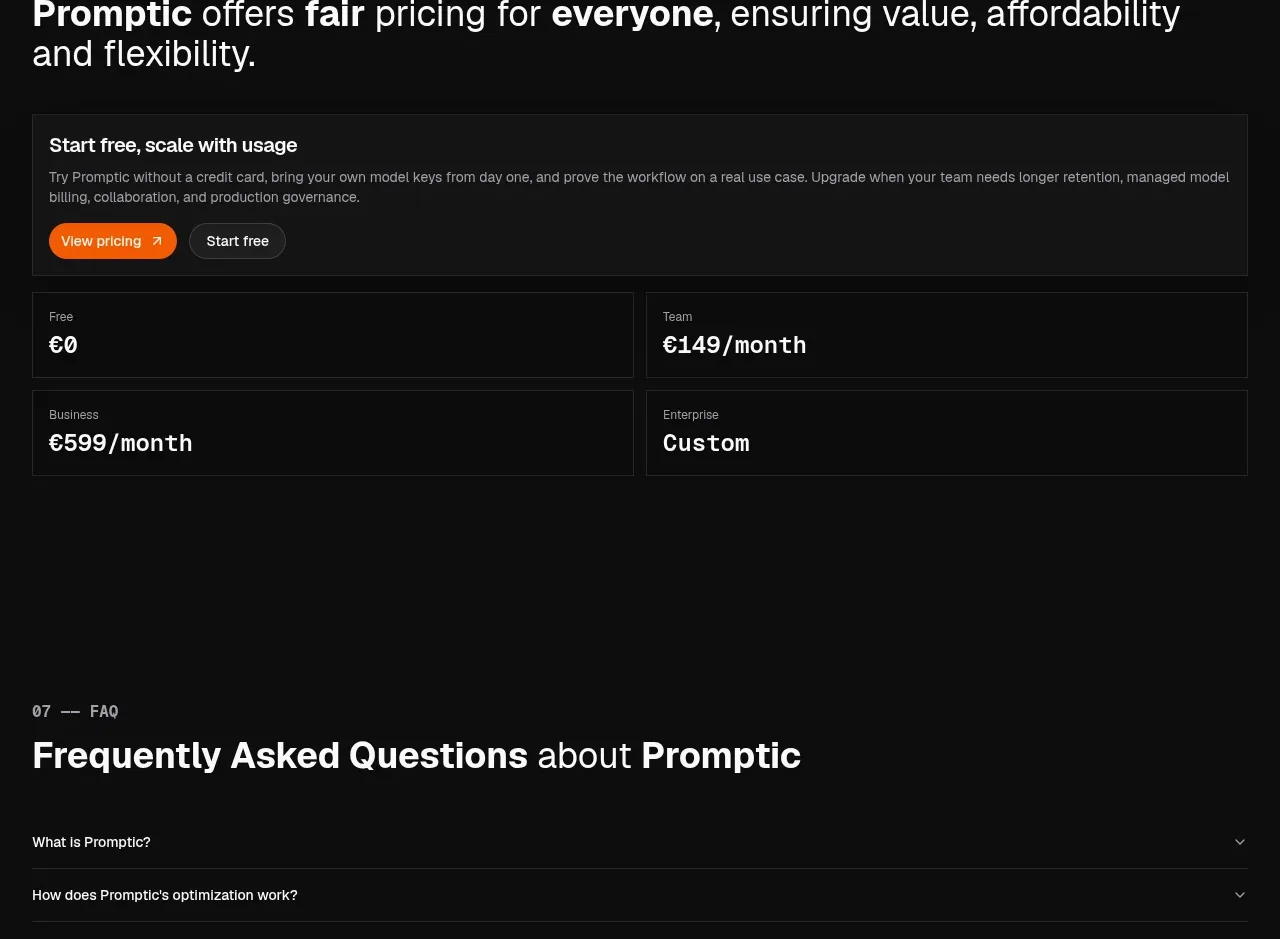
Design analysis
A strong pricing claim leads into a broad trial CTA card and four compact plan summaries. The sparse treatment emphasizes affordability and makes plan comparison fast.
Prompt preview
## Reference images

Study these alongside the description below: hierarchy, rhythm, spacing, colour. Build for the product you are asked about, using this design language.

- Component: https://kage-design-assets.t3.tigrisfiles.io/components/promptic/b6d3638e-158e-4f4b-839a-22e1c64a625e-1790402543-7.webp
- Full page it was cut from: https://kage-design-assets.t3.tigrisfiles.io/screenshots/promptic/b6d3638e-158e-4f4b-839a-22e1c64a625e-1790402502341-full.webp
- Component on Kage: https://kage.design/component/promptic-pricing-table

## Before you start
Ask about the user's pricing model, billing cadence, free offer, enterprise motion, and which plan should be emphasized. Use that information instead of copying any plan labels or amounts.

Build a dark pricing section with a small monospaced eyebrow and a large heading that emphasizes fairness and flexibility. Add a full-width introductory card with a subtle #1a1a1a fill, 1px #292929 border, 8px radius, supporting copy, an orange primary CTA, and a dark outlined secondary CTA. Under it, place four equal plan summary cards in a 2x2 desktop grid or four columns where space allows. Keep cards sparse: plan name, price/value, and a short qualifier; use strong typographic contrast rather than many bullets. Palette: #0b0b0b background, #f4f4f4 type, #999999 supporting type, #f26a21 accent. Include responsive stacking and clear focus states.

Never: use logos, product names, copy, illustrations, or imagery from the reference.
More components
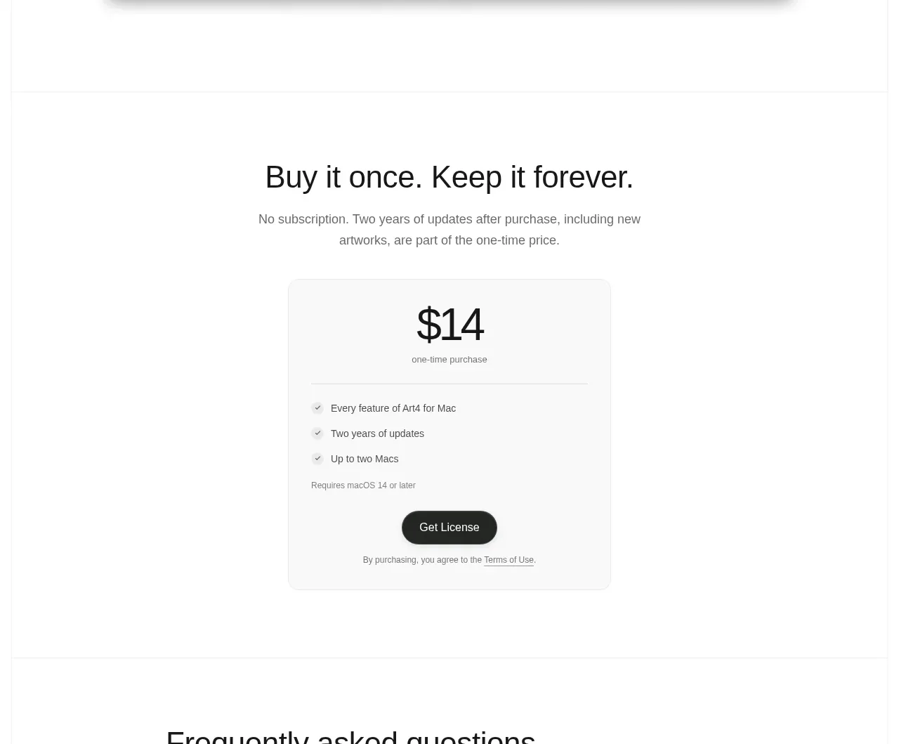
 Single purchase pricing card
Art4 · Pricing table
Single purchase pricing card
Art4 · Pricing table
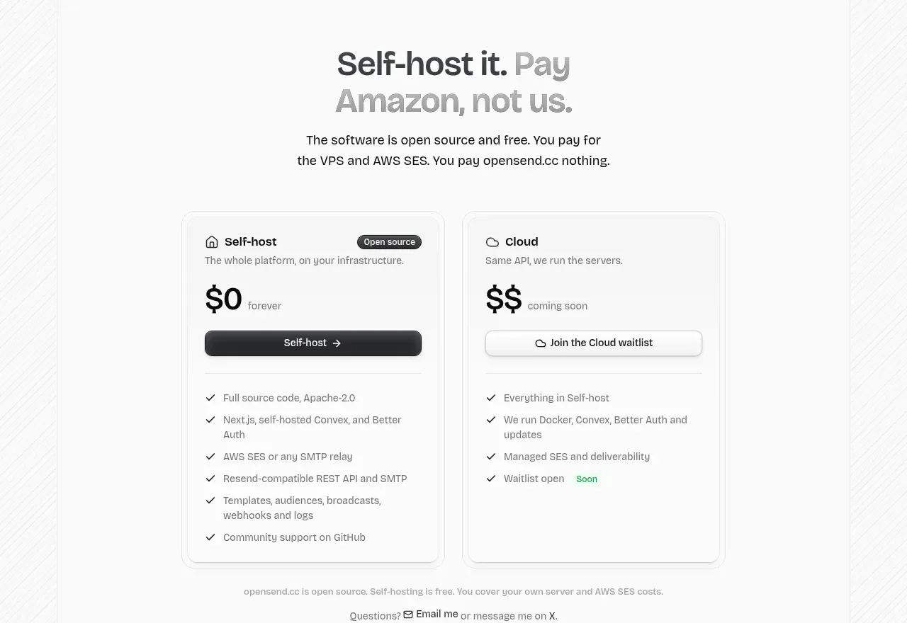
 Self-host versus cloud pricing
opensend.cc · Pricing table
Self-host versus cloud pricing
opensend.cc · Pricing table
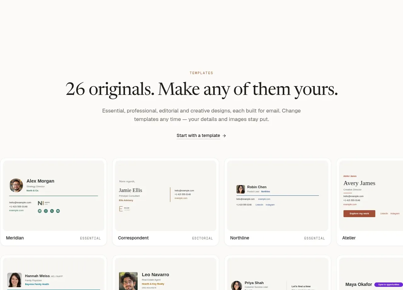
 Two-tier pricing table
esigna · Pricing table
Two-tier pricing table
esigna · Pricing table
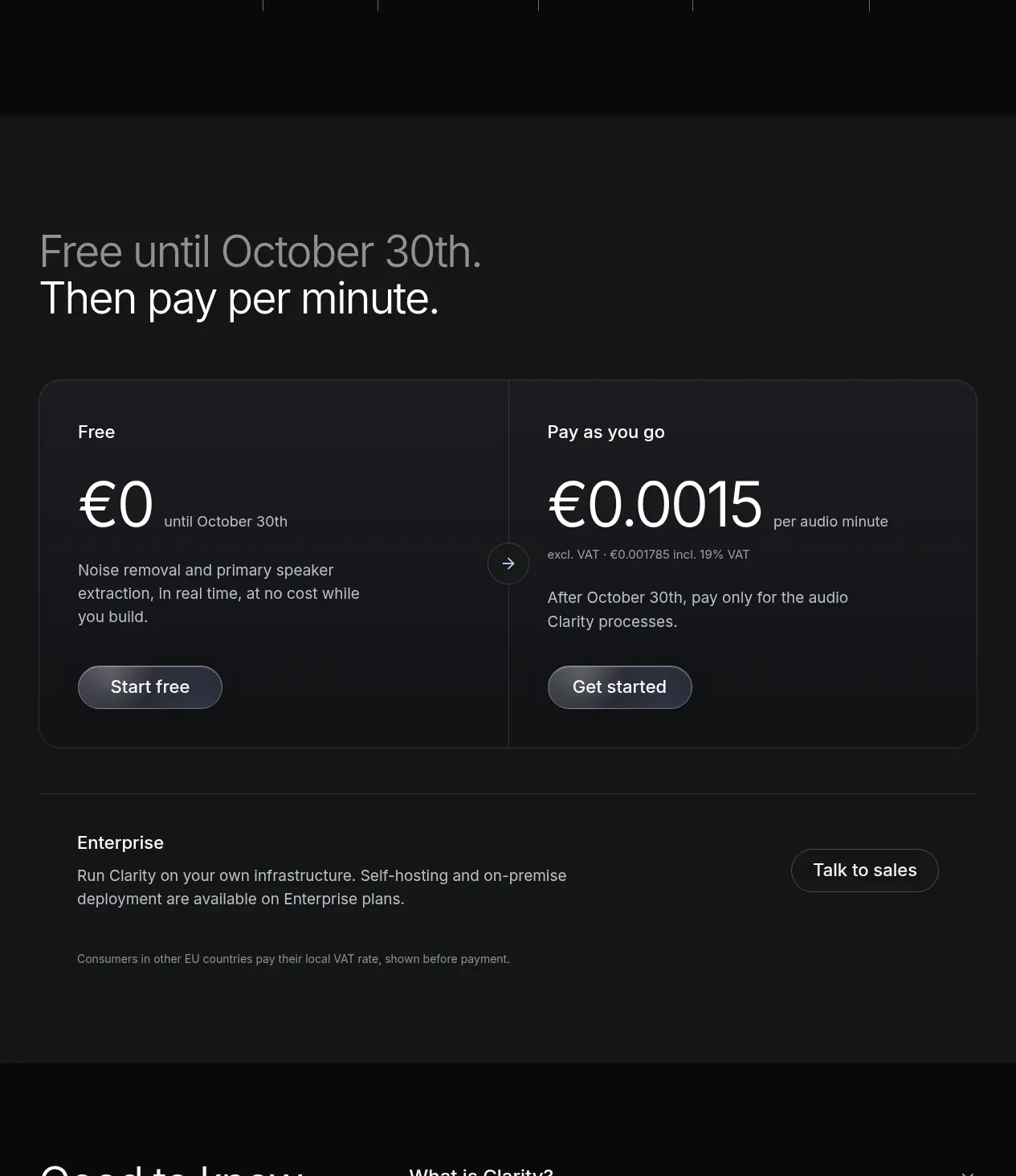
 Usage-based pricing
Clarity · Pricing table
Usage-based pricing
Clarity · Pricing table
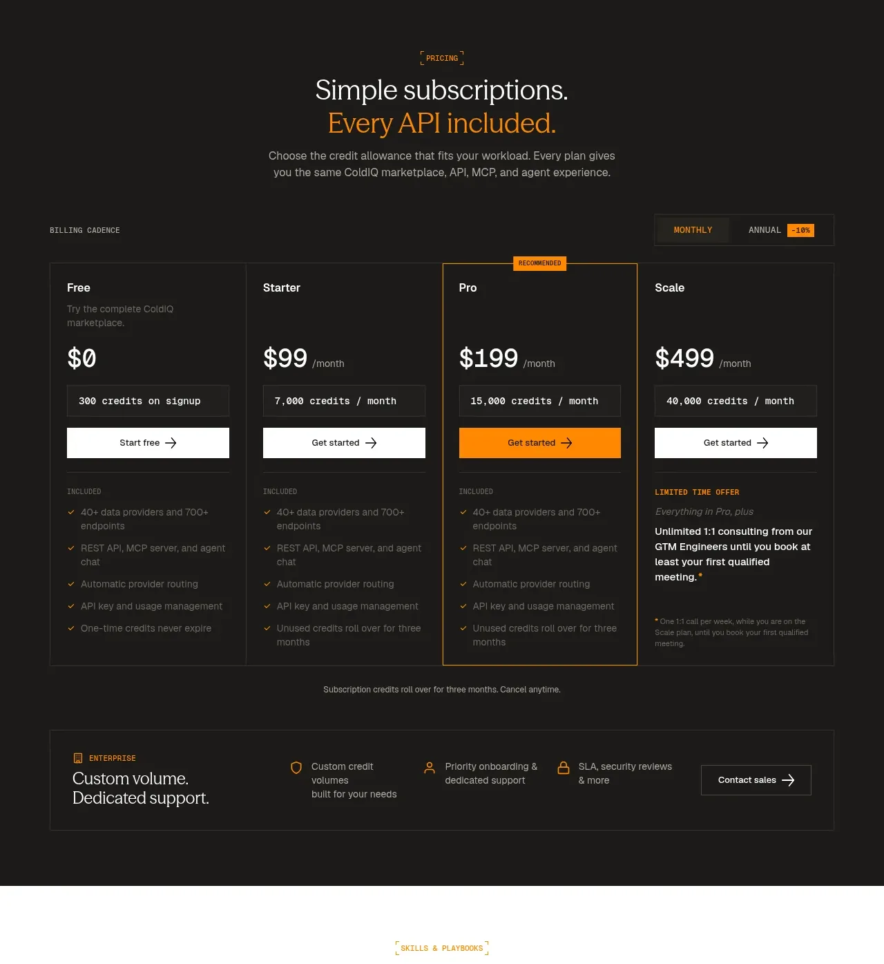
 Four-tier subscription pricing
ColdIQ x Slack · Pricing table
Four-tier subscription pricing
ColdIQ x Slack · Pricing table
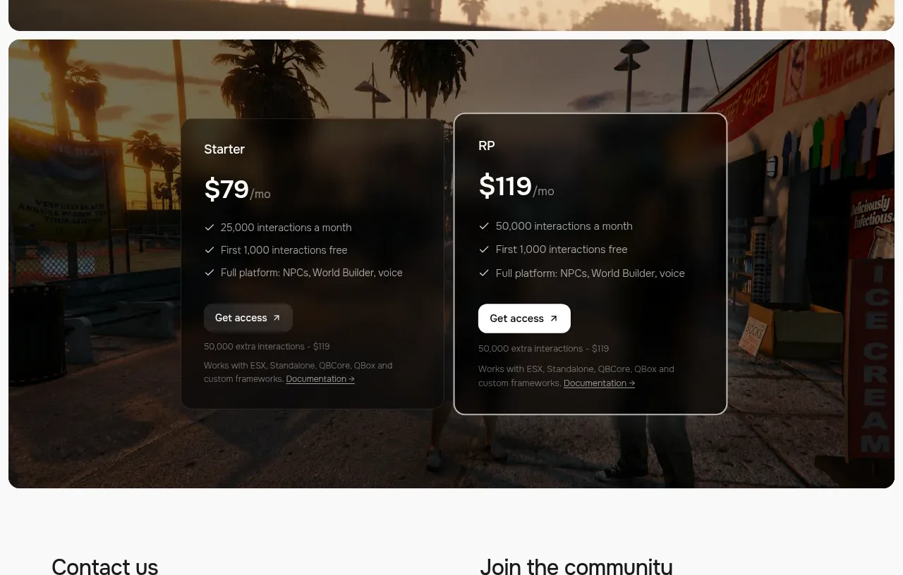
 Two-plan access pricing
Humalike x GTA RP · Pricing table
Two-plan access pricing
Humalike x GTA RP · Pricing table