 kage
kage
proofrr.com
Design analysis
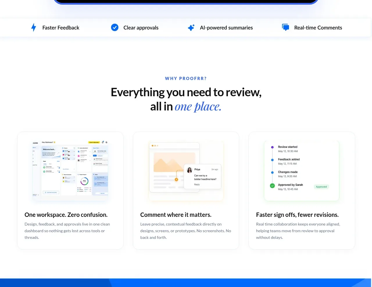
A slim benefit strip transitions into a centered section heading and three equal cards, each pairing a product screenshot with a concise outcome-led explanation.
Prompt preview
## Reference images

Study these alongside the description below: hierarchy, rhythm, spacing, colour. Build for the product you are asked about, using this design language.

- Component: https://kage-design-assets.t3.tigrisfiles.io/components/proofrr/efb49965-9fe0-4b8e-8298-39615e0bc43e-1789538490-2.webp
- Full page it was cut from: https://kage-design-assets.t3.tigrisfiles.io/screenshots/proofrr/efb49965-9fe0-4b8e-8298-39615e0bc43e-1789538465981-full.webp
- Component on Kage: https://kage.design/component/proofrr-feature-grid

## Before you start
Ask what the user's product and brand are, then adapt this component to their feature set and visual language.

Build a benefits section with two layers: first, a full-width horizontal strip of four evenly distributed benefits with small blue icons and concise labels; second, a spacious section heading with an uppercase eyebrow, bold dark title, and italic accent phrase. Follow it with a three-column card grid. Each white card should have a very light gray border, subtle shadow, 14–18px radius, and a visual preview area on top with a neutral product mockup placeholder. Below, use a 18–20px semibold card title and 14px muted explanatory copy. Maintain equal card heights, 24px internal padding, 24–28px column gaps, and generous section whitespace. On mobile, stack cards and allow the benefit strip to wrap.

Never: use logos, product names, copy, illustrations, or imagery from the reference.
More components

 Authentication product capabilities
tiun. · Feature grid
Authentication product capabilities
tiun. · Feature grid
 Customer data and user management
tiun. · Feature grid
Customer data and user management
tiun. · Feature grid
 Problem and unified solution narrative
tiun. · Feature grid
Problem and unified solution narrative
tiun. · Feature grid
 Integration and agent workflow
tiun. · Feature grid
Integration and agent workflow
tiun. · Feature grid
 Billing and checkout capabilities
tiun. · Feature grid
Billing and checkout capabilities
tiun. · Feature grid

 Receiving money channels
Payflip · Feature grid
Receiving money channels
Payflip · Feature grid