 kage
kage
proofrr.com
Design analysis
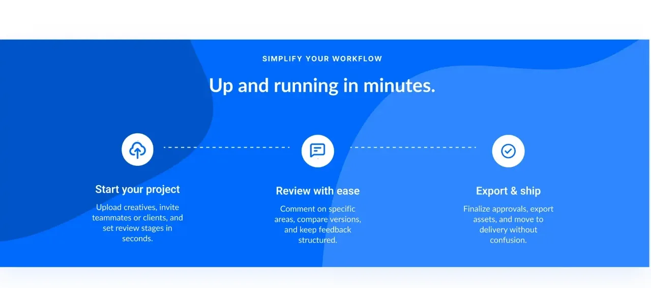
A saturated blue, abstractly layered band explains the workflow in three connected steps with circular icons, dotted connectors, and short descriptions.
Prompt preview
## Reference images

Study these alongside the description below: hierarchy, rhythm, spacing, colour. Build for the product you are asked about, using this design language.

- Component: https://kage-design-assets.t3.tigrisfiles.io/components/proofrr/efb49965-9fe0-4b8e-8298-39615e0bc43e-1789538490-3.webp
- Full page it was cut from: https://kage-design-assets.t3.tigrisfiles.io/screenshots/proofrr/efb49965-9fe0-4b8e-8298-39615e0bc43e-1789538465981-full.webp
- Component on Kage: https://kage.design/component/proofrr-feature-grid-2

## Before you start
Ask what the user's product and brand are, then tailor the workflow stages and visual treatment to them.

Create a full-width process section on a vivid blue gradient background, approximately #0757D9 to #2F86F6, with soft oversized organic shapes or tonal blobs for depth. Center an uppercase eyebrow and a large white heading. Under it, arrange three equal steps horizontally: each has a white circular icon badge, a dotted connector between adjacent steps, a white semibold title, and a short low-contrast white description. Use 20–24px gaps, centered alignment, and enough padding that the band feels like a distinct visual chapter. On mobile, stack the steps and replace horizontal connectors with vertical ones. Keep icons simple and generic.

Never: use logos, product names, copy, illustrations, or imagery from the reference.
More components

 Authentication product capabilities
tiun. · Feature grid
Authentication product capabilities
tiun. · Feature grid
 Customer data and user management
tiun. · Feature grid
Customer data and user management
tiun. · Feature grid
 Problem and unified solution narrative
tiun. · Feature grid
Problem and unified solution narrative
tiun. · Feature grid
 Integration and agent workflow
tiun. · Feature grid
Integration and agent workflow
tiun. · Feature grid
 Billing and checkout capabilities
tiun. · Feature grid
Billing and checkout capabilities
tiun. · Feature grid

 Receiving money channels
Payflip · Feature grid
Receiving money channels
Payflip · Feature grid