 kage
kage
proofrr.com
Design analysis
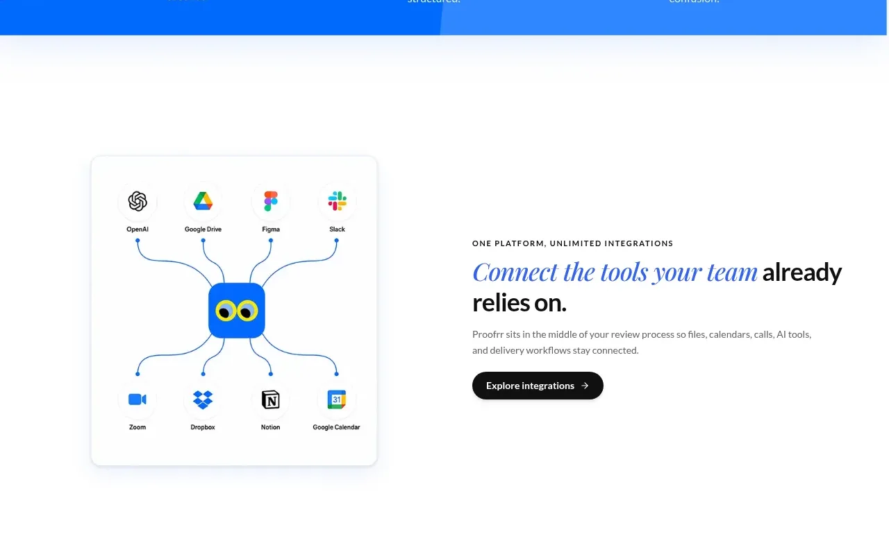
A two-column section pairs an integration-network visual with an editorial heading, explanatory copy, and a dark rounded action button.
Prompt preview
## Reference images

Study these alongside the description below: hierarchy, rhythm, spacing, colour. Build for the product you are asked about, using this design language.

- Component: https://kage-design-assets.t3.tigrisfiles.io/components/proofrr/efb49965-9fe0-4b8e-8298-39615e0bc43e-1789538491-4.webp
- Full page it was cut from: https://kage-design-assets.t3.tigrisfiles.io/screenshots/proofrr/efb49965-9fe0-4b8e-8298-39615e0bc43e-1789538465981-full.webp
- Component on Kage: https://kage.design/component/proofrr-feature-grid-3

## Before you start
Ask what the user's product connects to and what their brand feels like, then build an original version using these principles.

Build a spacious two-column integrations section on white. Place a framed, softly shadowed square illustration area on the left showing a generic central product node connected by thin curved lines to abstract app tiles; use placeholder symbols rather than recognizable third-party logos. On the right, add a small uppercase eyebrow, a large editorial heading with one italic blue accent, a muted paragraph, and a compact dark charcoal pill CTA with a right arrow. Align both columns vertically around their content center. Use approximate colors #111827, #2563EB, #64748B, and #FFFFFF; 16–20px radius; 24–32px column gap; and collapse to a stacked layout on mobile.

Never: use logos, product names, copy, illustrations, or imagery from the reference.
More components

 Authentication product capabilities
tiun. · Feature grid
Authentication product capabilities
tiun. · Feature grid
 Customer data and user management
tiun. · Feature grid
Customer data and user management
tiun. · Feature grid
 Problem and unified solution narrative
tiun. · Feature grid
Problem and unified solution narrative
tiun. · Feature grid
 Integration and agent workflow
tiun. · Feature grid
Integration and agent workflow
tiun. · Feature grid
 Billing and checkout capabilities
tiun. · Feature grid
Billing and checkout capabilities
tiun. · Feature grid

 Receiving money channels
Payflip · Feature grid
Receiving money channels
Payflip · Feature grid