kage
kage
proofrr.com
Design analysis
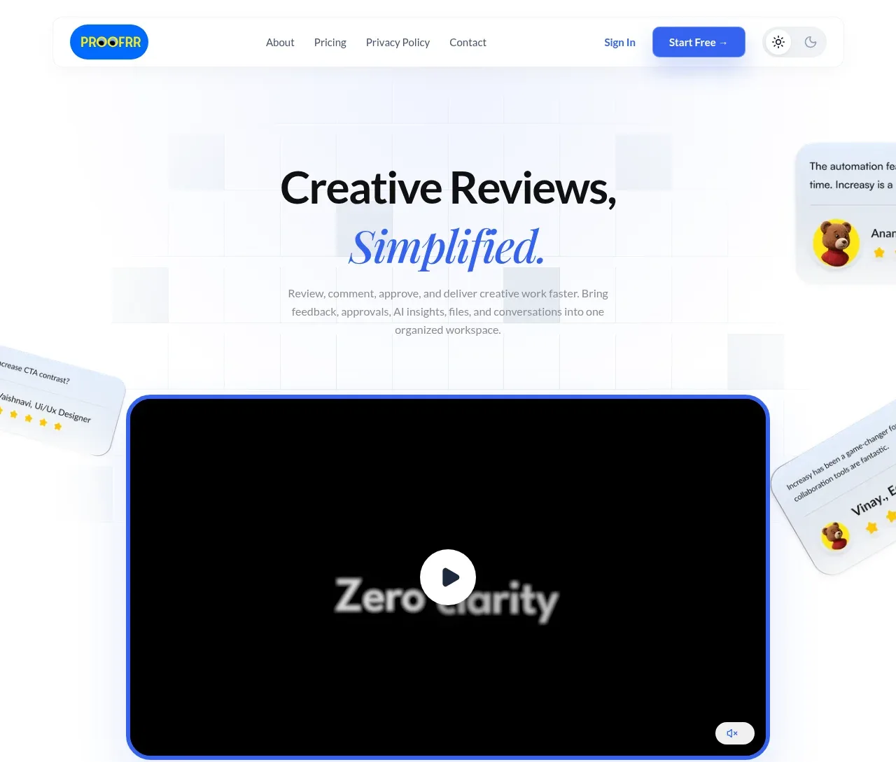
A centered editorial headline and supporting paragraph introduce the product above a large rounded video/demo panel, with floating review cards reinforcing the workflow.
Prompt preview
## Reference images

Study these alongside the description below: hierarchy, rhythm, spacing, colour. Build for the product you are asked about, using this design language.

- Component: https://kage-design-assets.t3.tigrisfiles.io/components/proofrr/efb49965-9fe0-4b8e-8298-39615e0bc43e-1789538490-1.webp
- Full page it was cut from: https://kage-design-assets.t3.tigrisfiles.io/screenshots/proofrr/efb49965-9fe0-4b8e-8298-39615e0bc43e-1789538465981-full.webp
- Component on Kage: https://kage.design/component/proofrr-hero

## Before you start
Ask what the user's product, audience, and brand are, then use those answers to create an original hero applying these principles.

Build a SaaS hero directly below the navigation. Center a large two-line headline with the first line in a dark near-black sans-serif and a short emphasized phrase in an elegant italic serif or display face, using an approximate palette of #111827, #2563EB, and #F7F9FC. Add a concise centered paragraph beneath it with a 15–17px muted gray color and a comfortable line height. Below the copy, place a wide 16:9 demo/video frame with a 3–4px vivid-blue outline, 22–28px radius, dark media placeholder, centered circular play control, and a small muted control in the lower corner. Let a few partially cropped, softly shadowed feedback cards float at the outer edges without competing with the main media. Use a pale grid or glow background, generous vertical spacing, and responsive scaling.

Never: use logos, product names, copy, illustrations, or imagery from the reference.