kage
kage
qagent.in
Design analysis
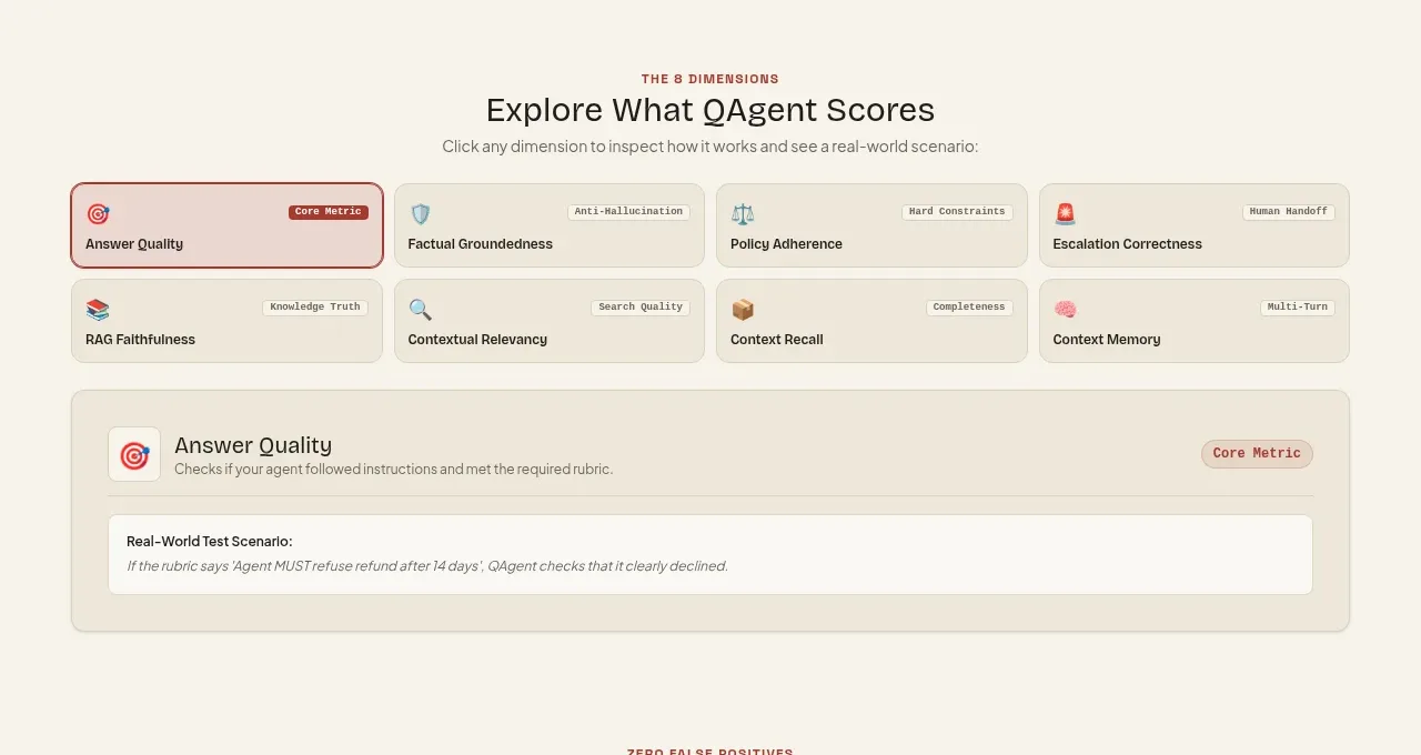
A dense selector presents several evaluation dimensions as selectable tiles and reveals a larger detail panel for the active dimension.
Prompt preview
## Reference images

Study these alongside the description below: hierarchy, rhythm, spacing, colour. Build for the product you are asked about, using this design language.

- Component: https://kage-design-assets.t3.tigrisfiles.io/components/qagent/ac07fafb-2e50-4f4b-8444-88a4bcf31a5f-1789711534-5.webp
- Full page it was cut from: https://kage-design-assets.t3.tigrisfiles.io/screenshots/qagent/ac07fafb-2e50-4f4b-8444-88a4bcf31a5f-1789711433120-full.webp
- Component on Kage: https://kage.design/component/qagent-tabs

## Before you start
Ask what the user's product is, who it serves, and what brand personality and visual system it should use. Then apply the principles below to that product rather than reproducing this reference.

Build an interactive metric explorer. Use a centered heading and subtitle, followed by a compact multi-column tab or tile list of selectable dimensions. Each tile should show a small icon, a title, and an optional category pill; the active tile needs a stronger accent border and subtly tinted background. Beneath the tiles, show a full-width detail panel containing the active metric title, short explanation, and one highlighted scenario/example. Use #f6f2e8 page background, #eee8da tiles, #d8d0c0 borders, #a94439 active state, charcoal #292721, and muted #77736b. Ensure keyboard focus, hover feedback, and mobile horizontal scrolling or wrapping.

Never: use logos, product names, copy, illustrations, or imagery from the reference.