 kage
kage
quiethint.com
Design analysis
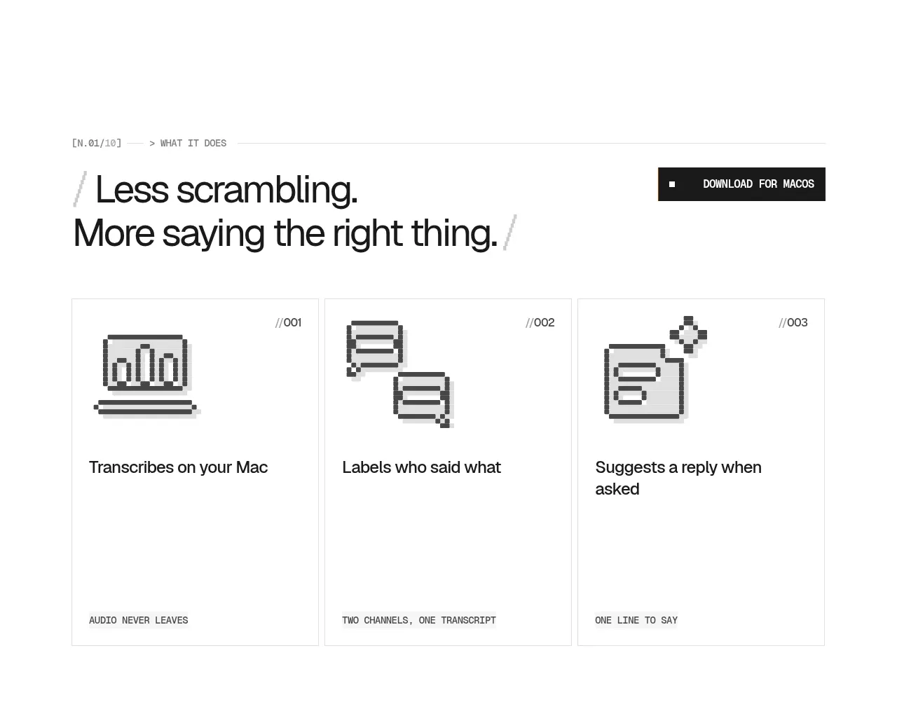
A numbered three-card grid turns the product promise into memorable jobs: capture, attribute, and suggest. Pixel-like icons, thin borders, and short descriptions make the section scannable while retaining the site’s editorial rhythm.
Prompt preview
## Reference images

Study these alongside the description below: hierarchy, rhythm, spacing, colour. Build for the product you are asked about, using this design language.

- Component: https://kage-design-assets.t3.tigrisfiles.io/components/quiethint-r/a06c27ca-94cd-4cb7-8750-fd2be8cedd1f-1789711423-2.webp
- Full page it was cut from: https://kage-design-assets.t3.tigrisfiles.io/screenshots/quiethint-r/a06c27ca-94cd-4cb7-8750-fd2be8cedd1f-1789711327026-full.webp
- Component on Kage: https://kage.design/component/quiethint-r-feature-grid

## Before you start
Ask me about my product’s three most valuable user outcomes and its brand system. Then build an original feature section using these principles.

Create a three-column feature grid inside a centered content rail. Start with a tiny mono section index, a large two-line heading, and a compact CTA aligned to the heading row. Below it, use equal-width cards with 1px #e6e6e2 borders, white backgrounds, square corners, and generous internal padding. Each card needs a small numbered marker, a simple monochrome geometric icon, a concise outcome-oriented title, and one or two lines of supporting copy. Keep the grid airy: roughly 24px card gaps, 32px top padding, and a strong blank margin below. Use #171817 text, #f05b16 for tiny labels or rules, and #8f8f89 for metadata. Make the cards subtly lift or tint on hover, but avoid decorative animation. The cards should read as a coherent sequence rather than unrelated tiles.

Never use the reference's logos, product names, copy, illustrations, imagery, or exact icon artwork.
More components

 AI-powered helpdesk feature section
intercom.com · Feature grid
AI-powered helpdesk feature section
intercom.com · Feature grid
 Integrations and ecosystem section
intercom.com · Feature grid
Integrations and ecosystem section
intercom.com · Feature grid
 AI agent capabilities section
intercom.com · Feature grid
AI agent capabilities section
intercom.com · Feature grid
 Unified support experience overview
intercom.com · Feature grid
Unified support experience overview
intercom.com · Feature grid

 Core invoicing capabilities
sendinvo.com · Feature grid
Core invoicing capabilities
sendinvo.com · Feature grid
 Audience and trade types
sendinvo.com · Feature grid
Audience and trade types
sendinvo.com · Feature grid