 kage
kage
quiethint.com
Design analysis
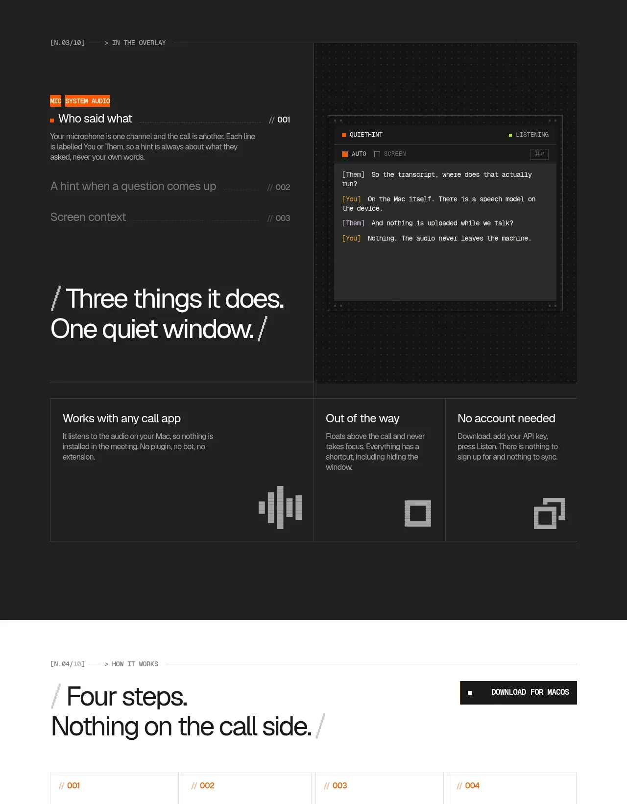
The darkest band demonstrates the product in context: a focused left narrative, a faux overlay panel on the right, and three supporting benefits below. High contrast and a visible interface mockup communicate how quietly the tool works.
Prompt preview
## Reference images

Study these alongside the description below: hierarchy, rhythm, spacing, colour. Build for the product you are asked about, using this design language.

- Component: https://kage-design-assets.t3.tigrisfiles.io/components/quiethint-r/a06c27ca-94cd-4cb7-8750-fd2be8cedd1f-1789711424-4.webp
- Full page it was cut from: https://kage-design-assets.t3.tigrisfiles.io/screenshots/quiethint-r/a06c27ca-94cd-4cb7-8750-fd2be8cedd1f-1789711327026-full.webp
- Component on Kage: https://kage.design/component/quiethint-r-feature-grid-2

## Before you start
Ask me what workflow my product improves and which interface state best demonstrates it. Then build an original dark feature section around that workflow.

Create a full-width near-black section around #1c1d1c with a subtle graphite grid. Use a centered two-column rail: left side has a small orange category chip, a short explanatory heading, and a large editorial statement; right side has a framed dark UI mockup with restrained controls, text rows, and one orange or lime status accent. The mockup should be a generic interface invented for my product, not a replica. Beneath the hero row, place three equal feature columns divided by thin #353634 rules. Each includes a concise title, muted supporting text, and one simple blocky icon. Use #f4f4ef for primary headings, #a7a7a1 for body copy, and orange #ef5b16 sparingly. Keep corners square or nearly square, borders 1px, and spacing deliberate. Add only subtle hover/focus feedback to the mockup and cards.

Never use the reference's logos, product names, copy, illustrations, imagery, or exact interface screenshot.
More components

 AI-powered helpdesk feature section
intercom.com · Feature grid
AI-powered helpdesk feature section
intercom.com · Feature grid
 Integrations and ecosystem section
intercom.com · Feature grid
Integrations and ecosystem section
intercom.com · Feature grid
 AI agent capabilities section
intercom.com · Feature grid
AI agent capabilities section
intercom.com · Feature grid
 Unified support experience overview
intercom.com · Feature grid
Unified support experience overview
intercom.com · Feature grid

 Core invoicing capabilities
sendinvo.com · Feature grid
Core invoicing capabilities
sendinvo.com · Feature grid
 Audience and trade types
sendinvo.com · Feature grid
Audience and trade types
sendinvo.com · Feature grid