 kage
kage
quiethint.com
Design analysis
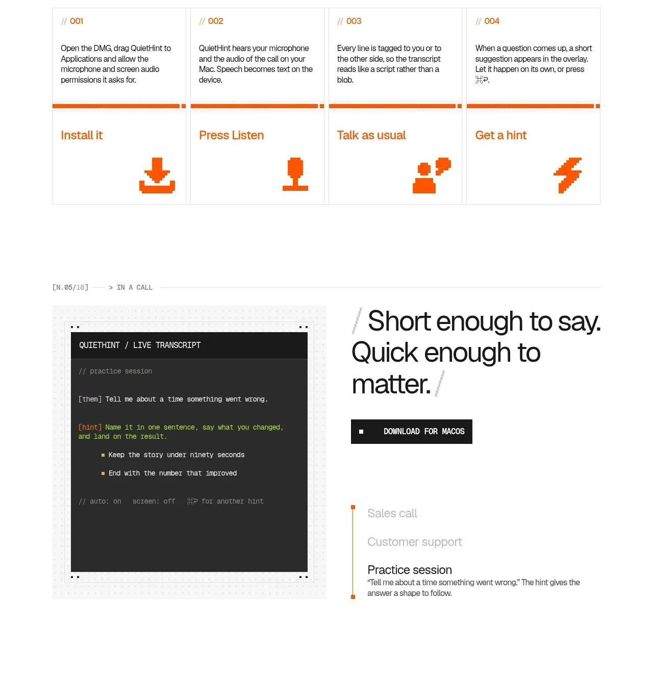
A four-column process makes setup feel finite and low-risk. Each card pairs a short instruction with a bold orange action label and a large pixel-like symbol, reinforcing the product’s practical, no-disruption positioning.
Prompt preview
## Reference images

Study these alongside the description below: hierarchy, rhythm, spacing, colour. Build for the product you are asked about, using this design language.

- Component: https://kage-design-assets.t3.tigrisfiles.io/components/quiethint-r/a06c27ca-94cd-4cb7-8750-fd2be8cedd1f-1789711424-5.webp
- Full page it was cut from: https://kage-design-assets.t3.tigrisfiles.io/screenshots/quiethint-r/a06c27ca-94cd-4cb7-8750-fd2be8cedd1f-1789711327026-full.webp
- Component on Kage: https://kage.design/component/quiethint-r-feature-grid-3

## Before you start
Ask me what the setup journey for my product is, how many steps it truly needs, and what users might worry about. Then create a clear original step section.

Build a light-background four-step onboarding grid. Begin with a small mono index and a two-line heading, with an optional download CTA on the same row. Use four equal cards with thin #e7e7e2 borders and a narrow orange #ef5b16 rule separating the explanation from the action area. Each card should show a tiny step number, a short paragraph, a bold orange action title, and a large simple monochrome symbol anchored near the bottom. Maintain a strict baseline grid and equal card heights. Use #171817 for headings, #6f706c for body copy, and orange only for progression and calls to action. Make cards keyboard accessible and let the current step receive a stronger orange border or focus treatment. Stack cards into a vertical sequence on small screens.

Never use the reference's logos, product names, copy, illustrations, imagery, or exact symbols.
More components

 AI-powered helpdesk feature section
intercom.com · Feature grid
AI-powered helpdesk feature section
intercom.com · Feature grid
 Integrations and ecosystem section
intercom.com · Feature grid
Integrations and ecosystem section
intercom.com · Feature grid
 AI agent capabilities section
intercom.com · Feature grid
AI agent capabilities section
intercom.com · Feature grid
 Unified support experience overview
intercom.com · Feature grid
Unified support experience overview
intercom.com · Feature grid

 Core invoicing capabilities
sendinvo.com · Feature grid
Core invoicing capabilities
sendinvo.com · Feature grid
 Audience and trade types
sendinvo.com · Feature grid
Audience and trade types
sendinvo.com · Feature grid