 kage
kage
quiethint.com
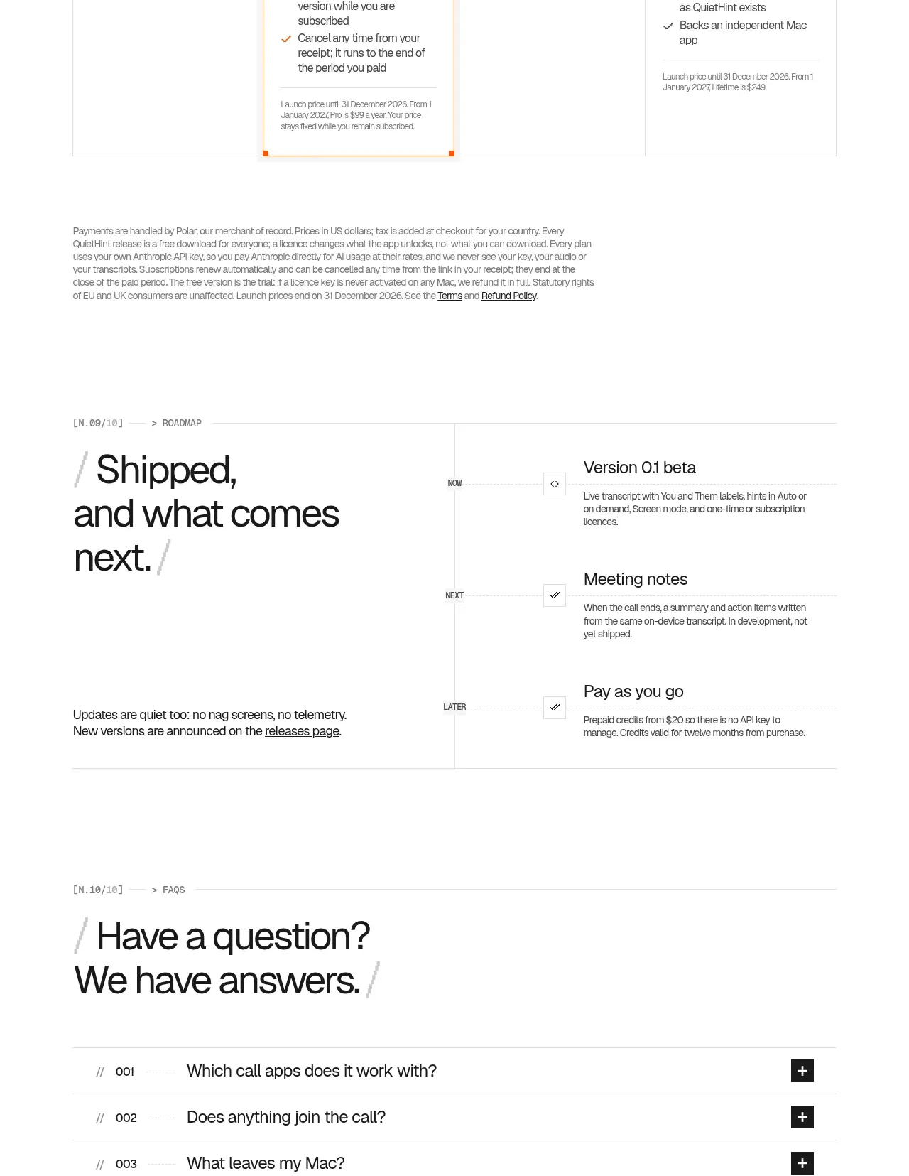
Design analysis
The pricing section offers a free entry point, a highlighted recommended plan, a usage-based option, and a lifetime option. A billing toggle, strong price hierarchy, included-feature lists, and fine-print notes support comparison without hiding tradeoffs.
Prompt preview
## Reference images

Study these alongside the description below: hierarchy, rhythm, spacing, colour. Build for the product you are asked about, using this design language.

- Component: https://kage-design-assets.t3.tigrisfiles.io/components/quiethint-r/a06c27ca-94cd-4cb7-8750-fd2be8cedd1f-1789711426-8.webp
- Full page it was cut from: https://kage-design-assets.t3.tigrisfiles.io/screenshots/quiethint-r/a06c27ca-94cd-4cb7-8750-fd2be8cedd1f-1789711327026-full.webp
- Component on Kage: https://kage.design/component/quiethint-r-pricing-table

## Before you start
Ask me about my product’s actual plans, billing model, limits, and target customer. Then build a transparent pricing section using the rules below.

Create a four-column pricing table on a white background with a centered rail. Use a large two-line heading and a compact monthly/yearly toggle above the cards. Every card should have a plan label, title, short value statement, prominent price with billing unit, primary CTA, included-feature list with checkmarks, and concise terms. Make the recommended plan visually distinct using an orange #ef5b16 top or side rule and a very pale warm tint #fffaf5, not a heavy shadow. Use 1px #e5e5e0 borders, square or 2px corners, black #171817 typography, muted gray #777873 metadata, and orange only for emphasis. Keep all cards equal height with aligned CTAs and price rows. Include an accessible toggle with a clear selected state, and make the table horizontally scrollable or stack gracefully on mobile. Display taxes, renewals, limits, and cancellation details honestly below the grid.

Never use the reference's logos, product names, copy, illustrations, imagery, or copied prices.
More components
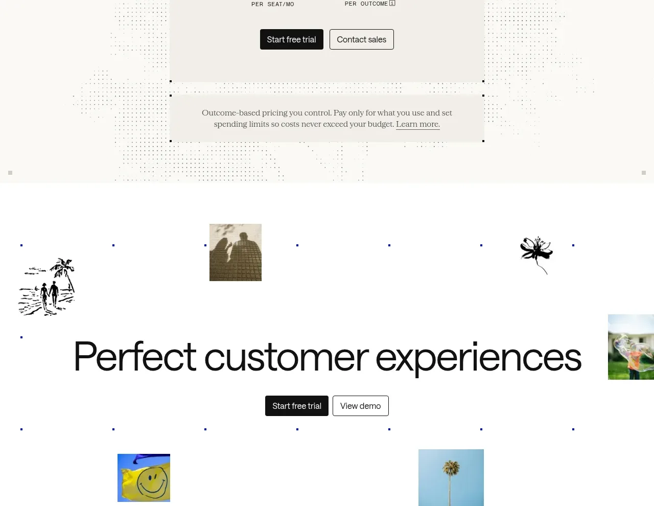
 Transparent pricing card
intercom.com · Pricing table
Transparent pricing card
intercom.com · Pricing table
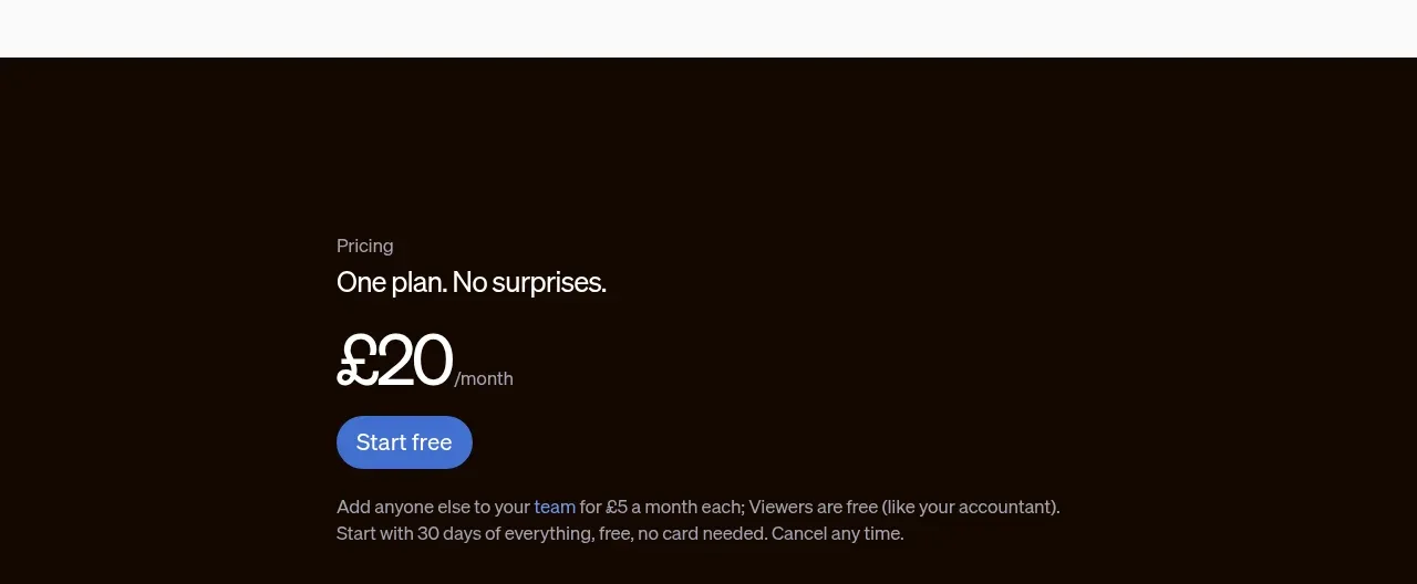
 Single-plan pricing offer
sendinvo.com · Pricing table
Single-plan pricing offer
sendinvo.com · Pricing table
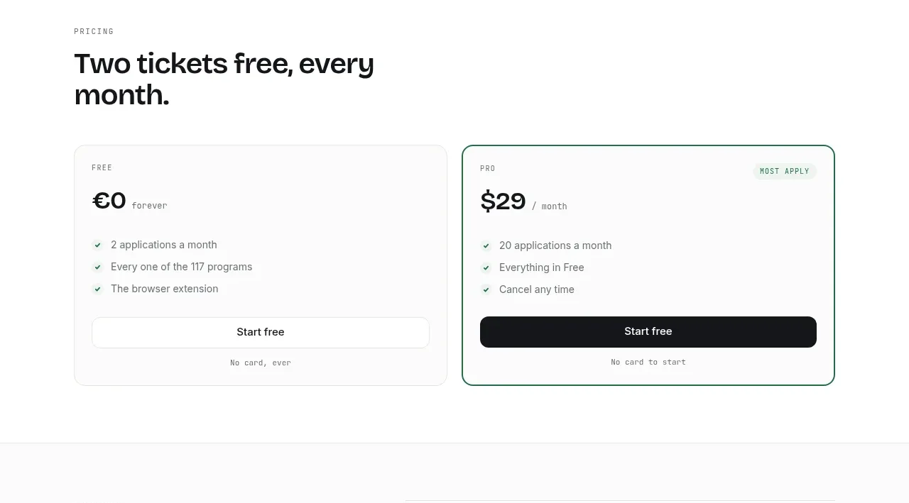
 Two-tier pricing table
ApplySeed · Pricing table
Two-tier pricing table
ApplySeed · Pricing table
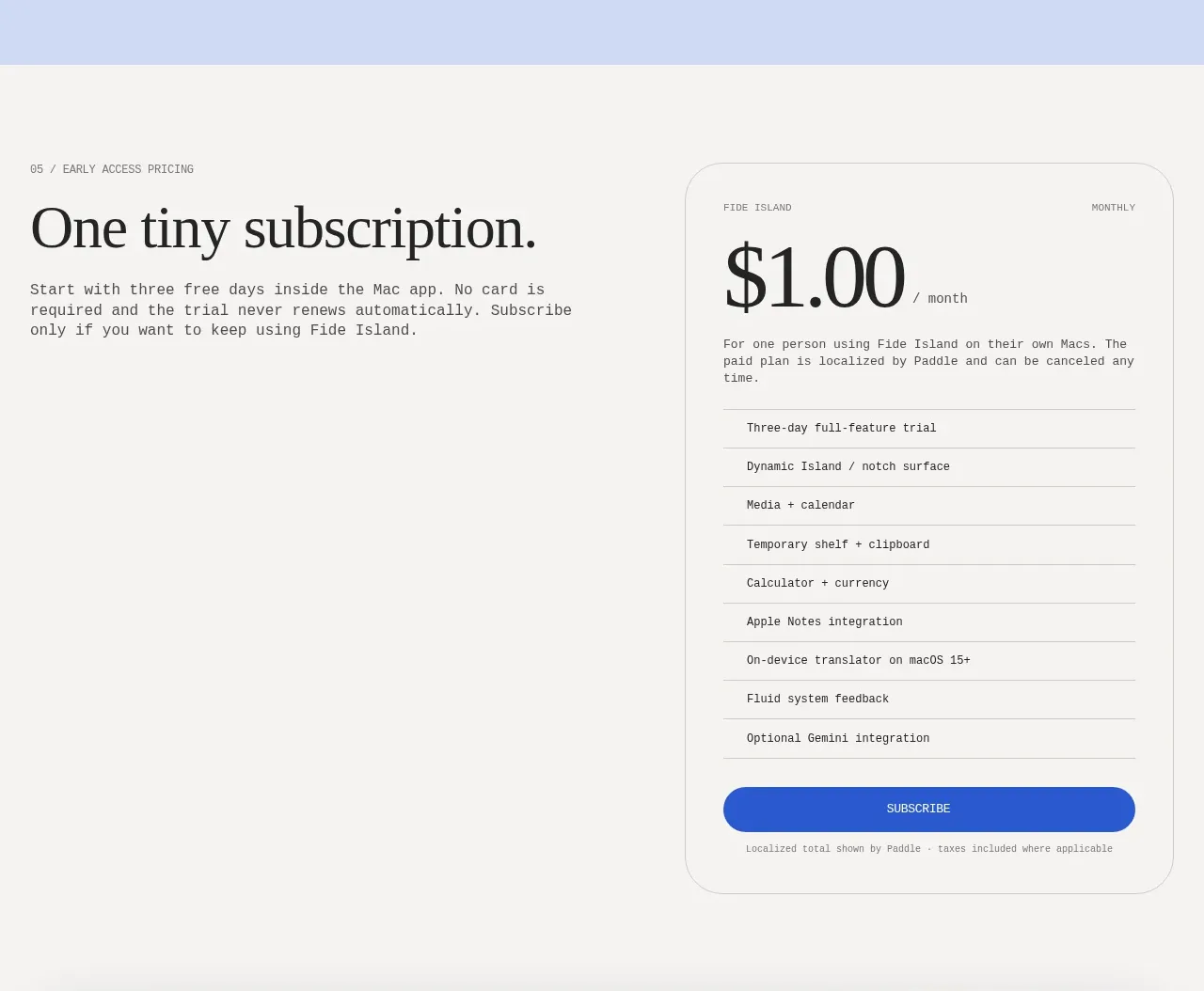
F
Single-plan early access pricing
Fide Island · Pricing table
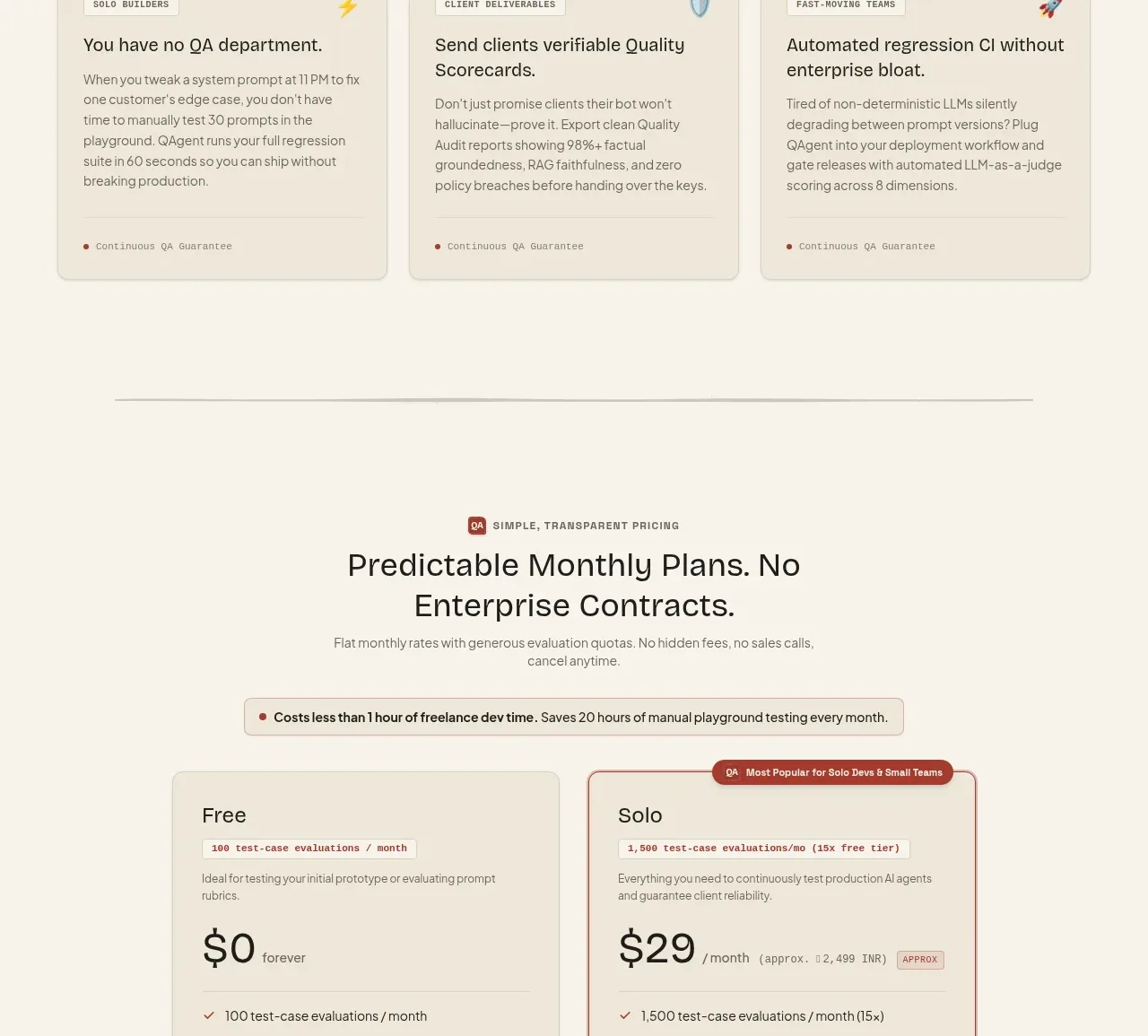
 Two-tier pricing table
QAgent · Pricing table
Two-tier pricing table
QAgent · Pricing table
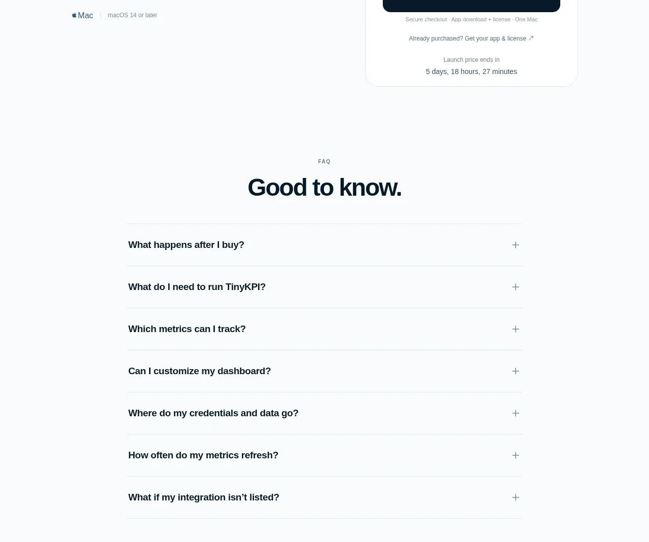
 Single launch price offer
TinyKPI · Pricing table
Single launch price offer
TinyKPI · Pricing table