kage
kage
quiethint.com
Design analysis
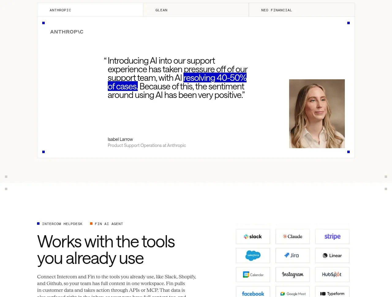
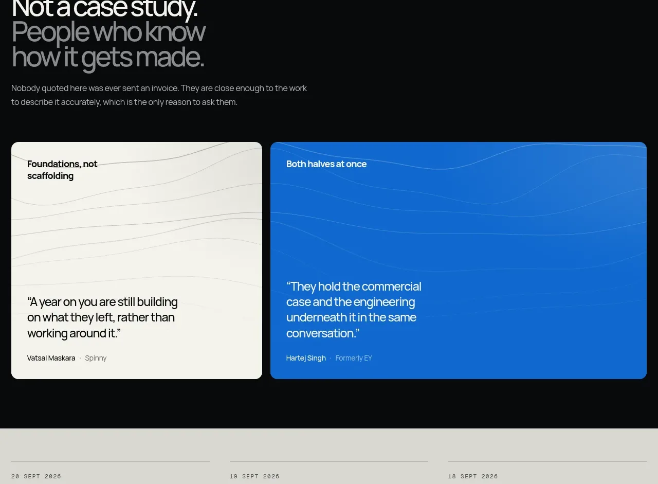
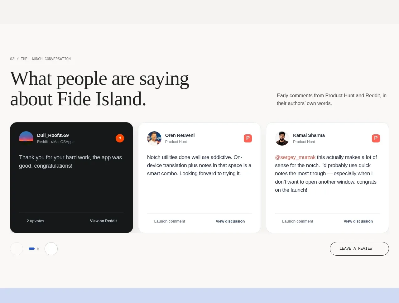
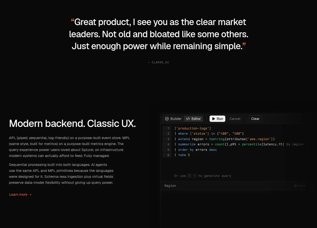
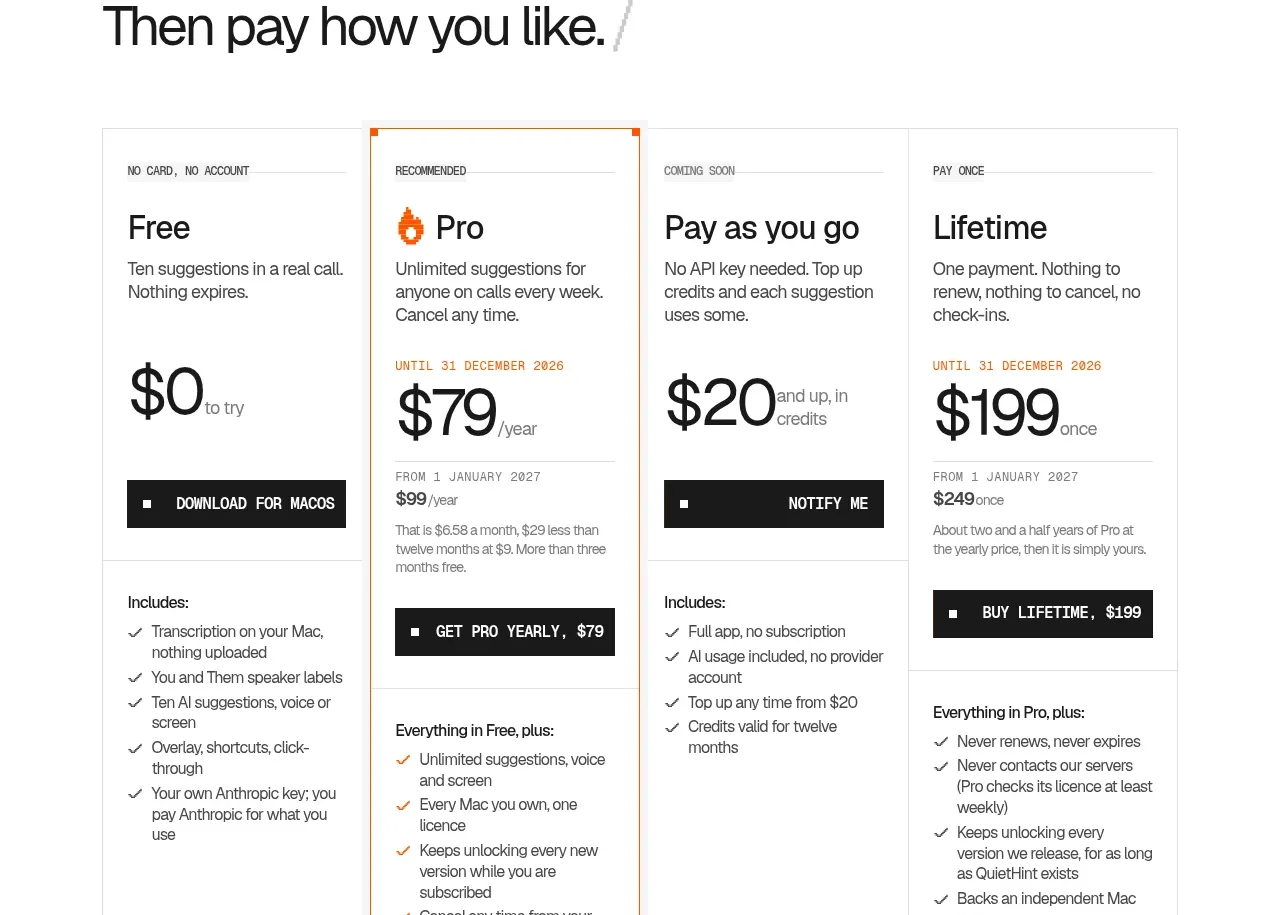
Instead of conventional praise, the dark testimonial band presents realistic objections and the concise responses they prompt. The horizontally clipped card row and arrow controls invite browsing while keeping the tone credible.
Prompt preview
## Reference images

Study these alongside the description below: hierarchy, rhythm, spacing, colour. Build for the product you are asked about, using this design language.

- Component: https://kage-design-assets.t3.tigrisfiles.io/components/quiethint-r/a06c27ca-94cd-4cb7-8750-fd2be8cedd1f-1789711425-7.webp
- Full page it was cut from: https://kage-design-assets.t3.tigrisfiles.io/screenshots/quiethint-r/a06c27ca-94cd-4cb7-8750-fd2be8cedd1f-1789711327026-full.webp
- Component on Kage: https://kage.design/component/quiethint-r-testimonials

## Before you start
Ask me who uses my product, what objections they raise, and what authentic outcomes or responses are available. Then build an original proof section.

Create a full-width dark testimonial band using #1d1e1d with a subtle grid and a centered content rail. Start with a small mono index, a two-line heading, and compact previous/next controls aligned to the right. Below, show a horizontally scrollable row of bordered cards, each with a small colored category tag, a short customer concern or quote, a divider, and a practical response or outcome. Use #f5f5ef for primary text, #aaa9a2 for supporting copy, orange #ef5b16 for tags, and #383936 for borders. Cards should be wide enough to feel editorial and may be partially clipped at the edge to signal horizontal scrolling. Provide accessible buttons, keyboard scrolling, snap points, and visible focus rings. Do not invent unverifiable customer names; anonymous or role-based attribution is acceptable.

Never use the reference's logos, product names, copy, illustrations, imagery, or fabricated testimonials.