 kage
kage
ravio.com

Design analysis
A tab strip introduces product capabilities above a large pale-blue product interface preview, making the software tangible before the next content block.
Prompt preview
## Reference images

Study these alongside the description below: hierarchy, rhythm, spacing, colour. Build for the product you are asked about, using this design language.

- Component: https://kage-design-assets.t3.tigrisfiles.io/components/ravio/21fc8fab-2ae9-4a70-87c8-10ebee6c9a8e-1789142159-2.webp
- Full page it was cut from: https://kage-design-assets.t3.tigrisfiles.io/screenshots/ravio/21fc8fab-2ae9-4a70-87c8-10ebee6c9a8e-1789141806972-full.webp
- Component on Kage: https://kage.design/component/ravio-tabs

## Before you start
Ask what product capability should be demonstrated first and what other capabilities belong in the tab set. Apply these principles to the user's product and brand.

Build a product showcase section with a horizontal tab bar above a large framed interface preview. Use four or five concise tabs, equal or flexible widths, a white background, thin #dfe4e4 dividers, and an active tab indicated by a blue-gray border and a subtle tinted background. Place the preview inside a wide pale blue-gray stage (#dceff4 or an appropriate brand tint), with a centered white application window, 10–14px radius, soft shadow, and enough internal padding to feel like a real product screenshot. Ensure the preview is a responsive mock interface rather than a static image: tabs should switch the visible conceptual screen, with keyboard focus and mobile horizontal scrolling. Keep the visual hierarchy calm and product-led.

Never: copy the reference's logo, product name, tab labels, copy, screenshots, illustrations, imagery, or exact interface.
More components

 Directory filters and sorting
The Brains · Tabs & steps
Directory filters and sorting
The Brains · Tabs & steps
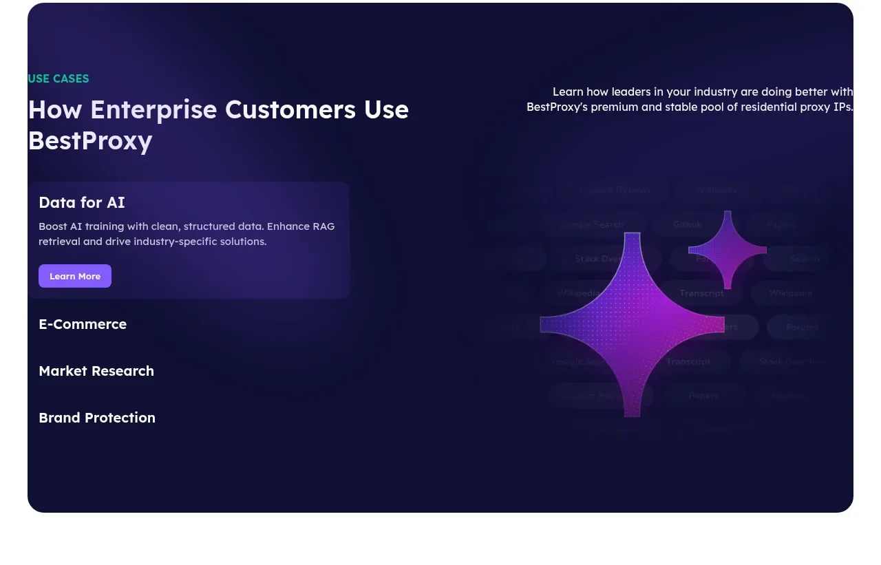
 Enterprise use cases
bestproxy.com · Tabs & steps
Enterprise use cases
bestproxy.com · Tabs & steps
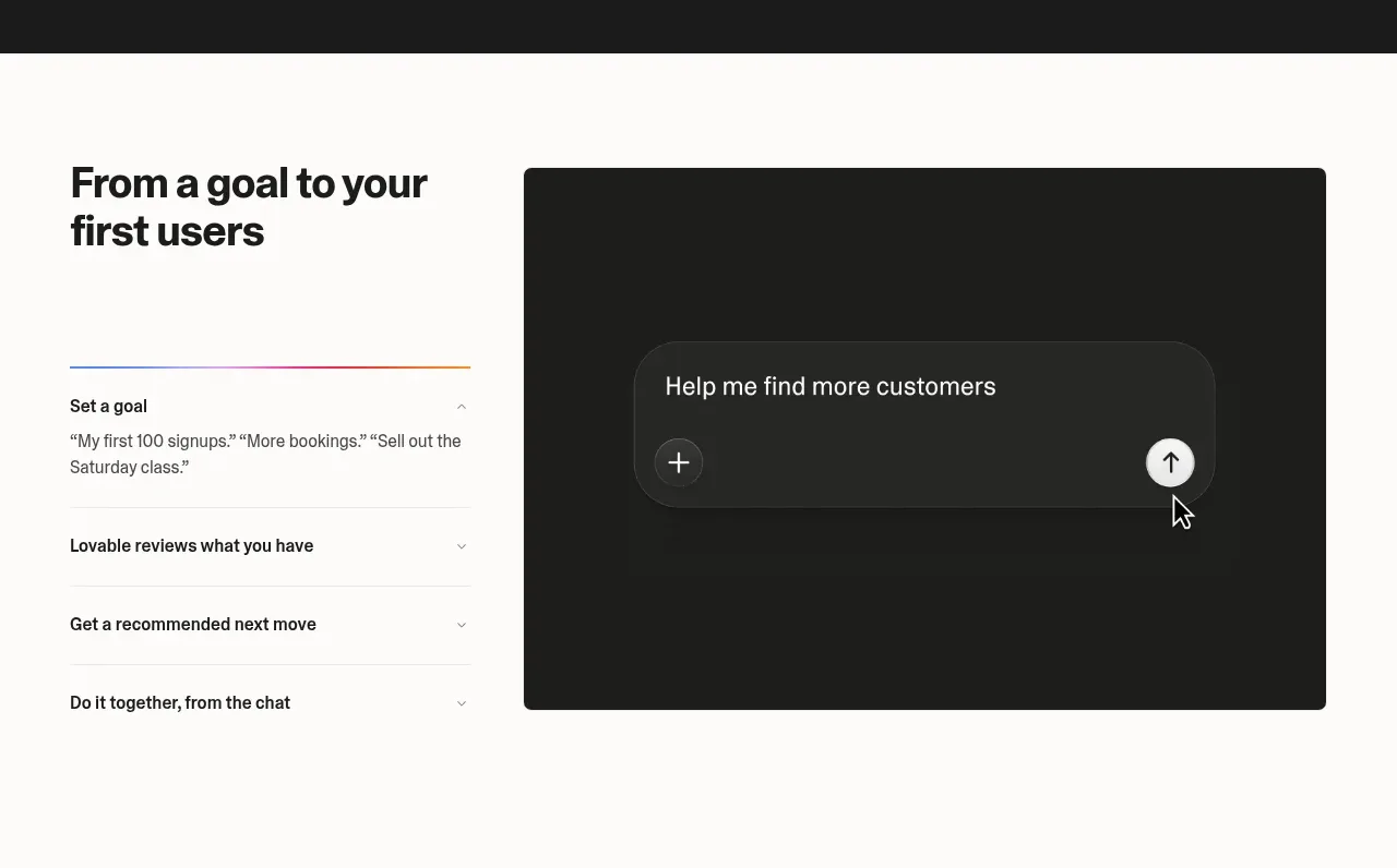
 Goal-to-first-users assistant
Lovable Growth Tools · Tabs & steps
Goal-to-first-users assistant
Lovable Growth Tools · Tabs & steps
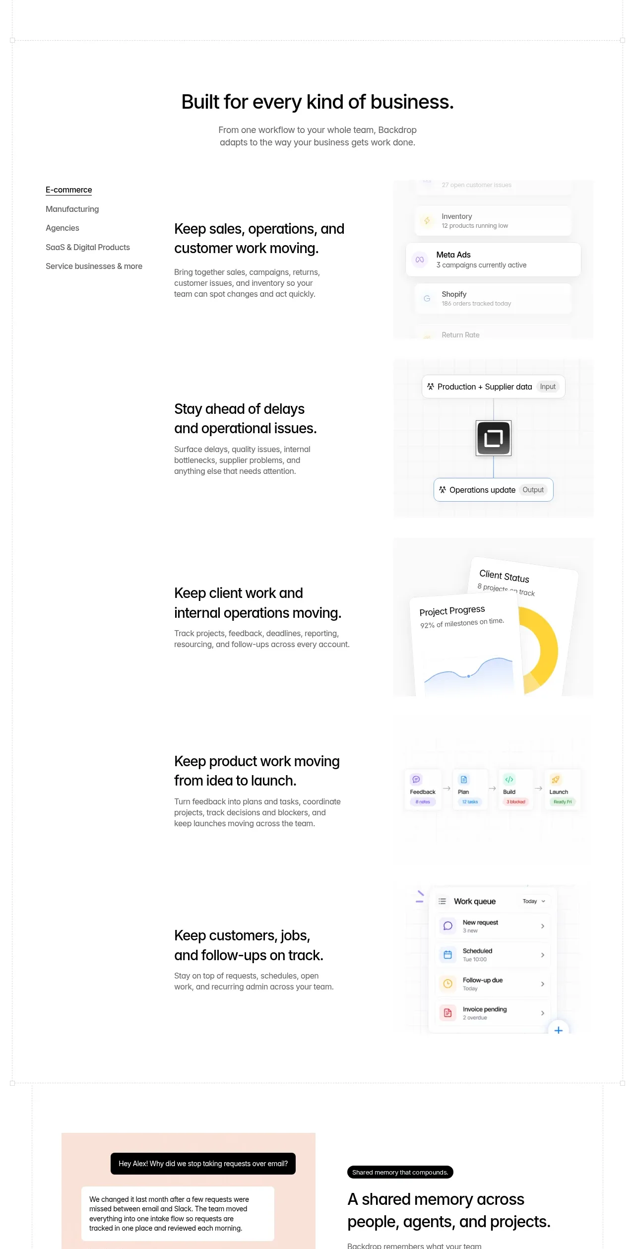
 Business use cases tabs
Backdrop · Tabs & steps
Business use cases tabs
Backdrop · Tabs & steps
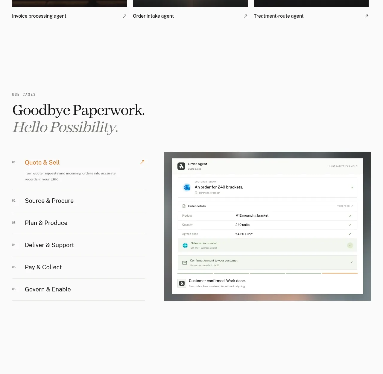
 Workflow stages with product preview
Lleverage · Tabs & steps
Workflow stages with product preview
Lleverage · Tabs & steps
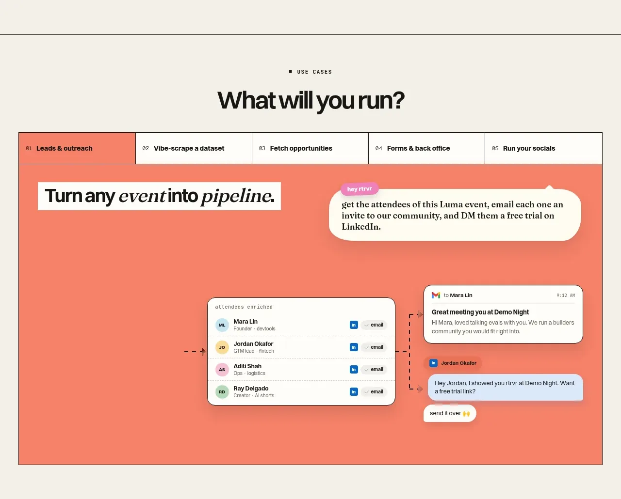
 Use-case selector and interactive showcase
Retriever AI · Tabs & steps
Use-case selector and interactive showcase
Retriever AI · Tabs & steps