kage
kage
reikacode.com
Design analysis
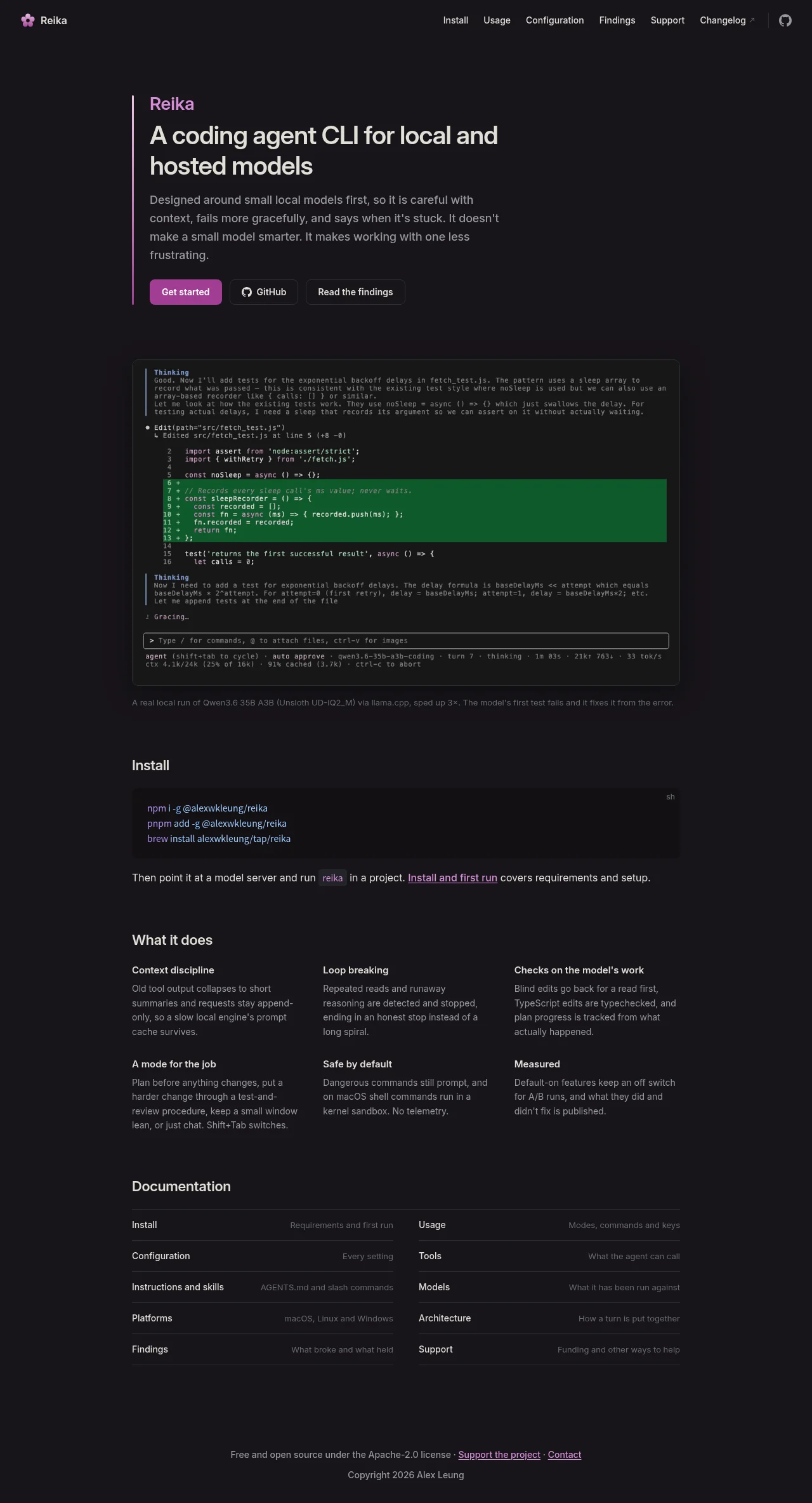
A near-black single-column landing page where one magenta accent — a vertical bar beside the hero, the product label and the filled CTA — does all the colour work against white headlines and grey body text. The hero hands off to an authentic terminal transcript (thinking labels, a numbered diff with green additions, a token-metrics status bar, a caption underneath) that serves as the page's proof rather than a marketing claim. Below, the rhythm alternates: a compact install block, an airy text-only 3×2 feature grid with no cards or icons, a dense hairline-ruled two-column documentation index, and a centred minimal footer.
Prompt preview
## Reference images

Study these alongside the description below: hierarchy, rhythm, spacing, colour. Build for the product you are asked about, using this design language.

- Full page: https://kage-design-assets.t3.tigrisfiles.io/screenshots/reika/dbc92e41-38c4-497a-81df-7bf52356b7a2-1791439420892-full.webp
- Above the fold: https://kage-design-assets.t3.tigrisfiles.io/screenshots/reika/dbc92e41-38c4-497a-81df-7bf52356b7a2-1791439419753.webp
- Design on Kage: https://kage.design/designs/reika-landing-page

## Before you start
Ask the user what they are building, who it is for, and what brand assets they already have (product name, accent colour, type preferences). Wait for the answers before writing code. Everything below is applied to their product, not to the reference site.

## Page structure
Build one dark landing page as a single centred content column (max-width ≈ 720px) with a full-width top nav. Top to bottom:

1. **Top nav** — logo mark + small wordmark left; on the right, 5–6 small muted text links, one external link suffixed with `↗`, and an outlined rounded icon button at the far edge. ~13px type, low contrast.
2. **Hero** — left-aligned text block with a 3px vertical accent bar running down its left edge: a small accent-coloured product label, a two-line white headline (~40px), a four-line muted grey lede paragraph, then a row of three buttons: one filled accent CTA, one outlined button with an icon, one plain outlined button.
3. **Terminal demo** — the visual centrepiece: a rounded panel slightly lighter than the page background showing a believable CLI agent transcript — dim `Thinking` label blocks with grey prose, edit events with file paths, a numbered code diff where added lines are green-highlighted, a status line, a bordered prompt input row (`> Type / for commands…`), and a small metrics status bar (turn count, tokens up/down, tok/s, context %). Directly below, one line of small grey caption text explaining what the run demonstrates.
4. **Install** — a modest white section heading; a dark rounded code block with 2–3 install commands in accent-tinted text and a `sh` label top-right; then one short paragraph containing an inline code chip and one underlined link.
5. **What it does** — white section heading; a 3-column × 2-row grid of six features. Each is a bold white title plus 2–3 lines of grey body text. No cards, borders, icons or illustrations — text only.
6. **Documentation** — white section heading; a two-column list of link rows separated by 1px hairlines. Each row: white link name on the left, grey one-line description right-aligned on the right.
7. **Footer** — centred and small: a license sentence with two underlined links separated by middots, then a more muted copyright line below.

## Design language
- **Palette**: near-black page background (#0c0c0e), panels one step lighter (#131316), code blocks lighter still (#1a1a1e), 1px hairlines #26262b. One saturated accent (magenta/pink ≈ #c95fb2) used only for the hero bar, the product label, the primary CTA and tinted command text. Everything else is white (#f0f0f2), grey body (#9a9aa2) and dim grey (#6b6b72).
- **Functional colour inside the demo**: diff additions as green text (#46c07a) on a dark green fill (#16301f); install commands in a blue-violet tint (#9aa0f8). Colour carries meaning only — never decoration.
- **Type**: a system sans stack for all UI copy paired with a monospace face for the terminal, code blocks, inline chips and the metrics bar. Scale: headline ~40px/1.15, section headings ~22px, body 15–16px, nav/captions/status bars 12–13px. Headings white, body grey — hierarchy comes from size and colour, never weight gimmicks.
- **Layout**: one narrow centred column; everything left-aligned inside it except the centred footer. Generous vertical rhythm: ~110–130px between sections.
- **Rhythm down the page**: hero is open and airy → terminal block is dense, colourful and tall (the peak) → install is short and compact → feature grid returns to airy text → docs index is dense, scan-friendly rows → footer is minimal. Alternate density so each section feels distinct.
- **Borders, radius, shadow**: no shadows anywhere. Small radii (6–8px) on buttons, the terminal panel and code blocks; the prompt input inside the terminal gets a 1px border. Hairline dividers only in the docs list.
- **Interaction**: minimal motion. Links shift grey→white or gain an underline on hover; inline links are always underlined; external links carry `↗`. Buttons: filled accent, dark outlined with subtle border, no gradients.
- **The demo transcript**: make it specific and plausible for the user's product — labelled reasoning, a file edit with a real-looking diff, an honest status/metrics bar. It should read like an actual session log, not a mockup, with a small caption underneath grounding it.

## Never
- Do not reuse the reference's product name, flower logo, any of its copy, its install commands, the specific diff/test content, the author name or its documentation taxonomy.
- Do not present the result as the reference product; the page must be built around the user's own brand, name and accent colour.
- Do not add gradients, drop shadows, illustration or photography — this language is flat, typographic and monochrome-plus-one-accent.
Components from this page
All components
 Compact dark navigation bar
Reika · Navigation
Compact dark navigation bar
Reika · Navigation
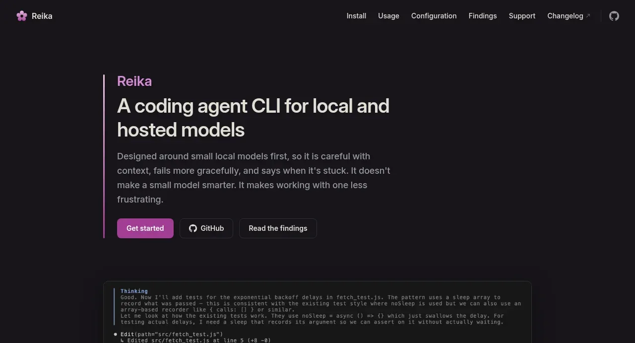 Product introduction hero
Reika · Hero
Product introduction hero
Reika · Hero
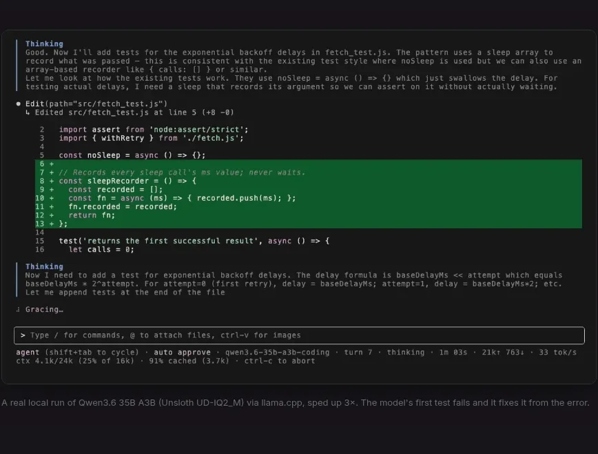 Terminal product demonstration
Reika · Card
Terminal product demonstration
Reika · Card
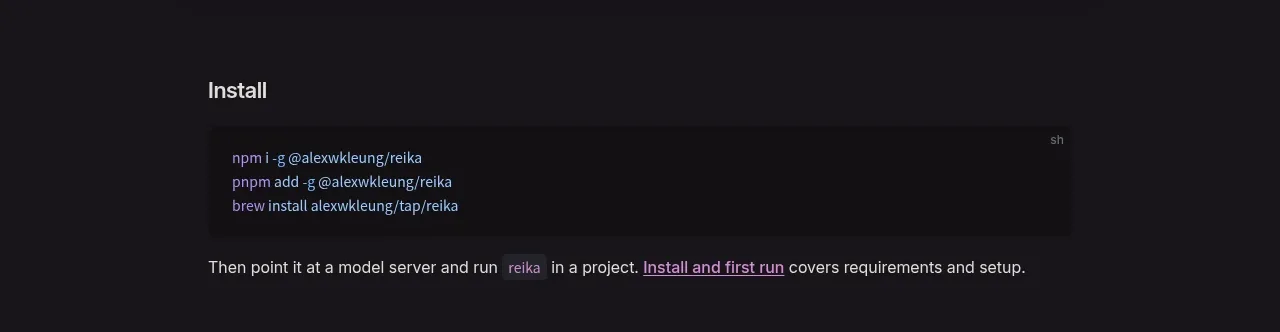 Installation instructions
Reika · Feature grid
Installation instructions
Reika · Feature grid
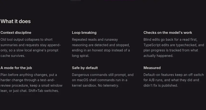 Six capability cards
Reika · Feature grid
Six capability cards
Reika · Feature grid
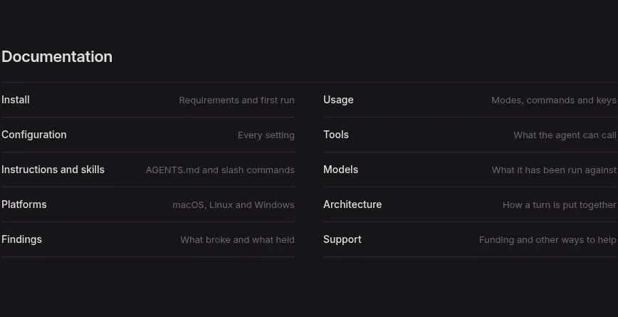 Documentation link directory
Reika · Tabs & steps
Documentation link directory
Reika · Tabs & steps
 Minimal project footer
Reika · Footer
Minimal project footer
Reika · Footer