 kage
kage
reikacode.com
Design analysis
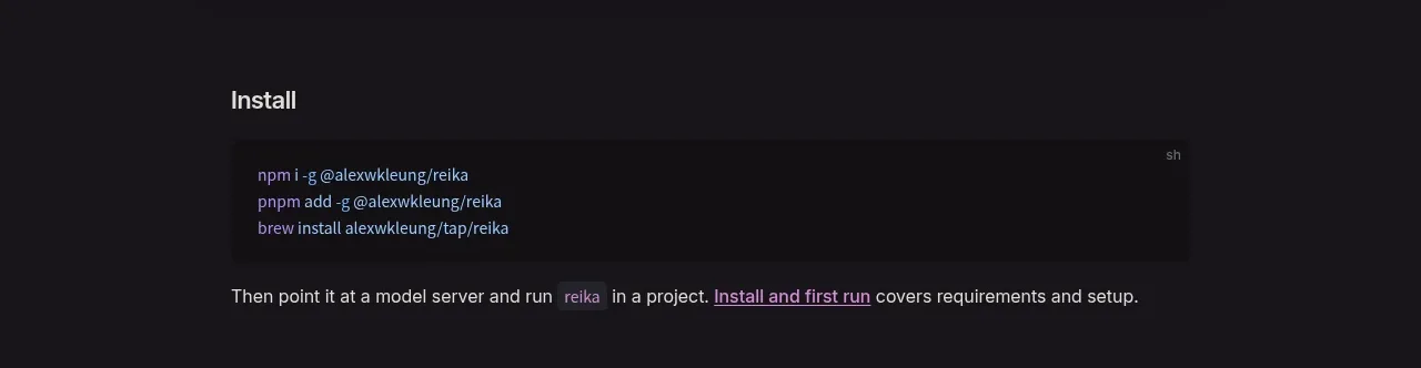
A focused setup section presents a heading, a wide command block, and one sentence of follow-up guidance with an inline link.
Prompt preview
## Reference images

Study these alongside the description below: hierarchy, rhythm, spacing, colour. Build for the product you are asked about, using this design language.

- Component: https://kage-design-assets.t3.tigrisfiles.io/components/reika/dbc92e41-38c4-497a-81df-7bf52356b7a2-1791439501-3.webp
- Full page it was cut from: https://kage-design-assets.t3.tigrisfiles.io/screenshots/reika/dbc92e41-38c4-497a-81df-7bf52356b7a2-1791439420892-full.webp
- Component on Kage: https://kage.design/component/reika-feature-grid

## Before you start
Ask what the user's product is, who it serves, and what its brand personality and preferred visual identity are. Apply the principles below to that product rather than reproducing this reference.

Create a compact installation section inside a centered max-width container. Use a clear 18–20px off-white heading, then a wide dark code block with a slightly lighter surface #111014, subtle shadow, 8px radius, and 14px monospace text with syntax accents in muted purple and blue. Keep the commands left aligned and include a small language label at the top-right only if useful. Follow with a 14px gray instruction sentence and one accent-colored underlined link. Use approximately 28–36px spacing between the heading, code block, and explanatory line.

Never: use logos, product names, copy, illustrations, or imagery from the reference.
More components

 Privacy and optional intelligence
Mailwell · Feature grid
Privacy and optional intelligence
Mailwell · Feature grid
 Reliable, recoverable actions
Mailwell · Feature grid
Reliable, recoverable actions
Mailwell · Feature grid
 Unified account setup
Mailwell · Feature grid
Unified account setup
Mailwell · Feature grid
 Fast local workflow and calm reading
Mailwell · Feature grid
Fast local workflow and calm reading
Mailwell · Feature grid

 Cloud layer workflows
ProcBoss · Feature grid
Cloud layer workflows
ProcBoss · Feature grid
 Operational blind spots
ProcBoss · Feature grid
Operational blind spots
ProcBoss · Feature grid