 kage
kage
reikacode.com
Design analysis
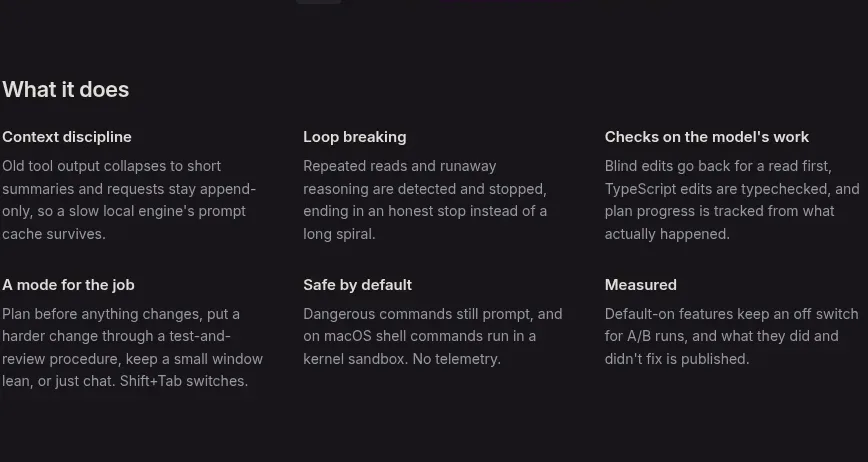
A simple three-column grid and two rows quickly communicate product principles without card chrome, relying on typographic grouping and consistent spacing.
Prompt preview
## Reference images

Study these alongside the description below: hierarchy, rhythm, spacing, colour. Build for the product you are asked about, using this design language.

- Component: https://kage-design-assets.t3.tigrisfiles.io/components/reika/dbc92e41-38c4-497a-81df-7bf52356b7a2-1791439501-4.webp
- Full page it was cut from: https://kage-design-assets.t3.tigrisfiles.io/screenshots/reika/dbc92e41-38c4-497a-81df-7bf52356b7a2-1791439420892-full.webp
- Component on Kage: https://kage.design/component/reika-feature-grid-2

## Before you start
Ask what the user's product is, who it serves, and what its brand personality and preferred visual identity are. Apply the principles below to that product rather than reproducing this reference.

Build a six-item feature grid in three equal columns and two rows within a centered container. Begin with an 18–20px section heading. Each item should have a short semibold title in #e7e4e8 at 12–14px and a two- or three-line description in #8b878f at 12–14px with about 1.5 line height. Do not use heavy cards; let the dark background #151318, whitespace, and column alignment provide structure. Use 32–40px row gaps and 28–34px column gaps, with responsive collapse to one column on small screens. Keep titles and descriptions aligned to a consistent grid.

Never: use logos, product names, copy, illustrations, or imagery from the reference.
More components

 Privacy and optional intelligence
Mailwell · Feature grid
Privacy and optional intelligence
Mailwell · Feature grid
 Reliable, recoverable actions
Mailwell · Feature grid
Reliable, recoverable actions
Mailwell · Feature grid
 Unified account setup
Mailwell · Feature grid
Unified account setup
Mailwell · Feature grid
 Fast local workflow and calm reading
Mailwell · Feature grid
Fast local workflow and calm reading
Mailwell · Feature grid

 Cloud layer workflows
ProcBoss · Feature grid
Cloud layer workflows
ProcBoss · Feature grid
 Operational blind spots
ProcBoss · Feature grid
Operational blind spots
ProcBoss · Feature grid