kage
kage
reikacode.com
Design analysis
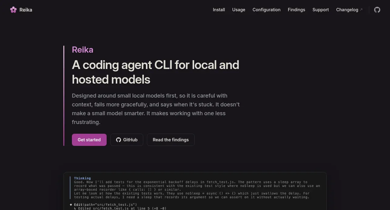
The hero uses a restrained two-column-feeling composition: a vertical pink accent line, a strong headline, explanatory paragraph, and two compact actions with ample dark breathing room.
Prompt preview
## Reference images

Study these alongside the description below: hierarchy, rhythm, spacing, colour. Build for the product you are asked about, using this design language.

- Component: https://kage-design-assets.t3.tigrisfiles.io/components/reika/dbc92e41-38c4-497a-81df-7bf52356b7a2-1791439501-1.webp
- Full page it was cut from: https://kage-design-assets.t3.tigrisfiles.io/screenshots/reika/dbc92e41-38c4-497a-81df-7bf52356b7a2-1791439420892-full.webp
- Component on Kage: https://kage.design/component/reika-hero

## Before you start
Ask what the user's product is, who it serves, and what its brand personality and preferred visual identity are. Apply the principles below to that product rather than reproducing this reference.

Create a dark, left-aligned hero directly beneath the navigation. Constrain the content to a readable column around 590px wide, offset from the page edge by a centered container, and add a thin vertical accent line in #d58bc6 beside the text. Establish hierarchy with a small accent-colored eyebrow at 18–20px, a large off-white headline around 30–34px with tight line height, and a muted supporting paragraph around 14–16px with a maximum width near 500px. Place a filled accent primary button beside a transparent bordered secondary button; use 12–14px semibold text, 8px radius, and 12–16px internal padding. Keep the section background #151318, with generous top and bottom whitespace and no decorative image required.

Never: use logos, product names, copy, illustrations, or imagery from the reference.