 kage
kage
relic.space
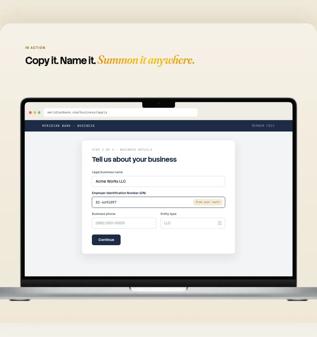
Design analysis
This section introduces the product through a large heading, a prominent browser/laptop demonstration, and three concise benefit cards that explain the mental model.
Prompt preview
## Reference images

Study these alongside the description below: hierarchy, rhythm, spacing, colour. Build for the product you are asked about, using this design language.

- Component: https://kage-design-assets.t3.tigrisfiles.io/components/relic/11197dbe-e39c-44cc-b0a1-5cdca0c05213-1789279379-2.webp
- Full page it was cut from: https://kage-design-assets.t3.tigrisfiles.io/screenshots/relic/11197dbe-e39c-44cc-b0a1-5cdca0c05213-1789279305759-full.webp
- Component on Kage: https://kage.design/component/relic-feature-grid

## Before you start
Ask what the user's product captures, organizes, or automates, and what proof would make that benefit credible. Build an original section around those answers.

Design an editorial feature section with a small numbered eyebrow, a bold headline with an italic accent, and a short explanatory paragraph. Place a large centered device or interface demonstration above or beside the copy, but use an original UI appropriate to the user's product. Beneath it, use three equal white cards with short labels, compact titles, and two-to-three sentence explanations. Keep the layout within a centered max-width, use a warm `#f5efe3` background, white cards `#fffdf8`, text `#171714`, muted text `#686257`, and a small amber accent `#d3971b`. Use 18–24px card radii, subtle shadows or 1px borders, 24px gaps, and clear responsive stacking. The section should explain the value before asking the user to act.

Never use logos, product names, copy, illustrations, or imagery from the reference.
More components

 Announcement and what’s-new feature list
DockFix 5.0 · Feature grid
Announcement and what’s-new feature list
DockFix 5.0 · Feature grid

 Agent context split feature
Cortex · Feature grid
Agent context split feature
Cortex · Feature grid
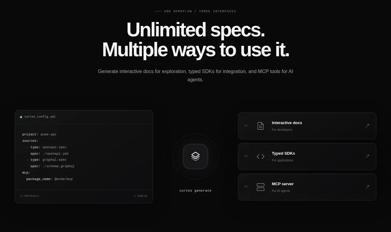 Three interfaces workflow section
Cortex · Feature grid
Three interfaces workflow section
Cortex · Feature grid
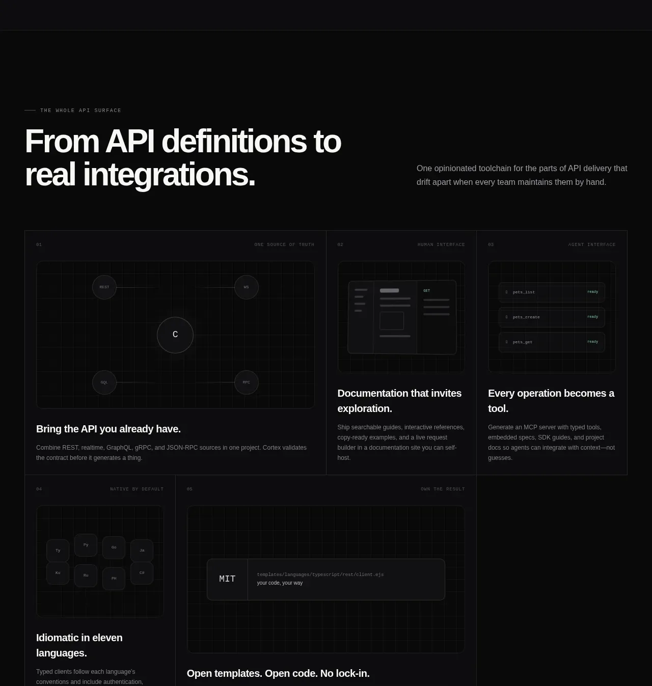 API surface capability cards
Cortex · Feature grid
API surface capability cards
Cortex · Feature grid
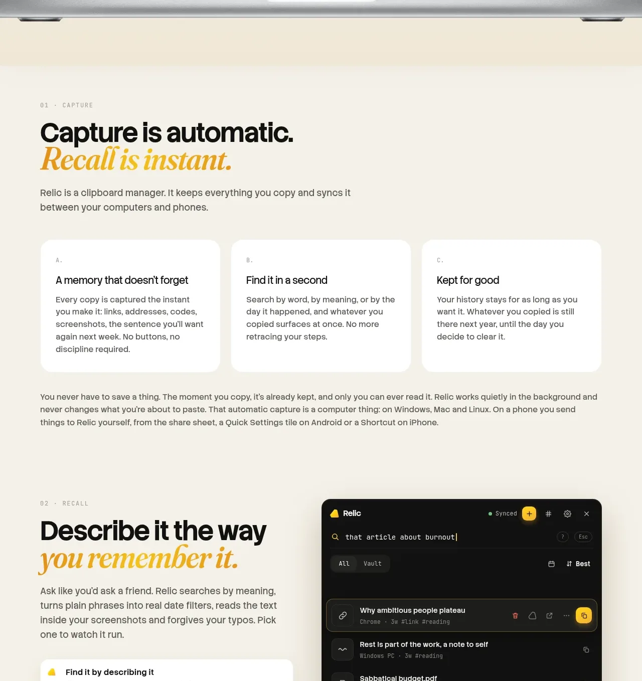
 Descriptive memory workflow
Relic · Feature grid
Descriptive memory workflow
Relic · Feature grid
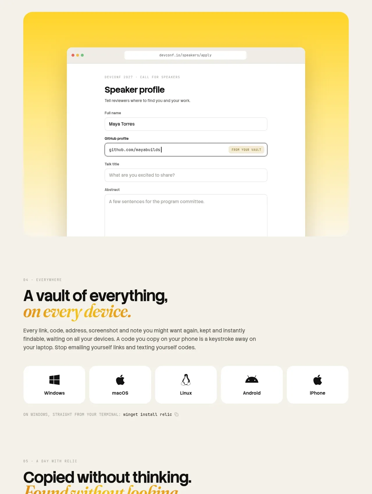 Platform availability and everyday uses
Relic · Feature grid
Platform availability and everyday uses
Relic · Feature grid