 kage
kage
relic.space
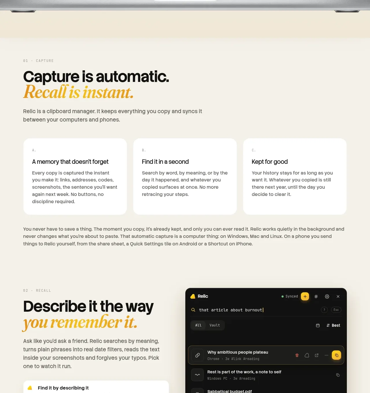
Design analysis
A two-column feature block pairs a detailed list of capabilities with a dark product-interface preview, making the mechanism tangible without overwhelming the reader.
Prompt preview
## Reference images

Study these alongside the description below: hierarchy, rhythm, spacing, colour. Build for the product you are asked about, using this design language.

- Component: https://kage-design-assets.t3.tigrisfiles.io/components/relic/11197dbe-e39c-44cc-b0a1-5cdca0c05213-1789279380-3.webp
- Full page it was cut from: https://kage-design-assets.t3.tigrisfiles.io/screenshots/relic/11197dbe-e39c-44cc-b0a1-5cdca0c05213-1789279305759-full.webp
- Component on Kage: https://kage.design/component/relic-feature-grid-2

## Before you start
Ask what the user's product understands or indexes, what inputs it supports, and how users retrieve results. Apply the structure to those capabilities.

Build a two-column workflow feature section. On the left, use an eyebrow, a bold headline with a contrasting italic phrase, a short paragraph, and a vertically spaced list of four capability rows; each row should have a small accent marker, a concise title, and supporting text. On the right, show an original dark UI preview with a clear hierarchy, restrained rows, and one highlighted result. Use cream `#f5efe3`, dark interface `#111210`, white cards `#fffdf8`, amber `#d49316`, and text `#171714`; use 32–48px column gaps, 14–18px row spacing, 16–24px radii, and soft shadows. On mobile, put the interface after the explanatory list. Add a small outlined technical note or badge only if it reinforces trust.

Never use logos, product names, copy, illustrations, or imagery from the reference.
More components

 Announcement and what’s-new feature list
DockFix 5.0 · Feature grid
Announcement and what’s-new feature list
DockFix 5.0 · Feature grid
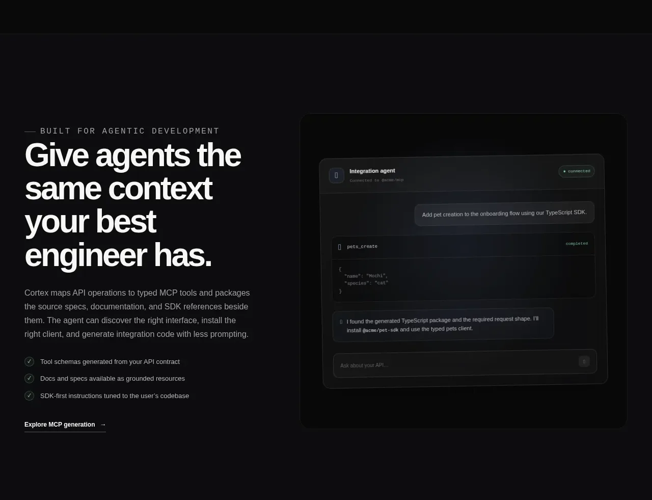
 Agent context split feature
Cortex · Feature grid
Agent context split feature
Cortex · Feature grid
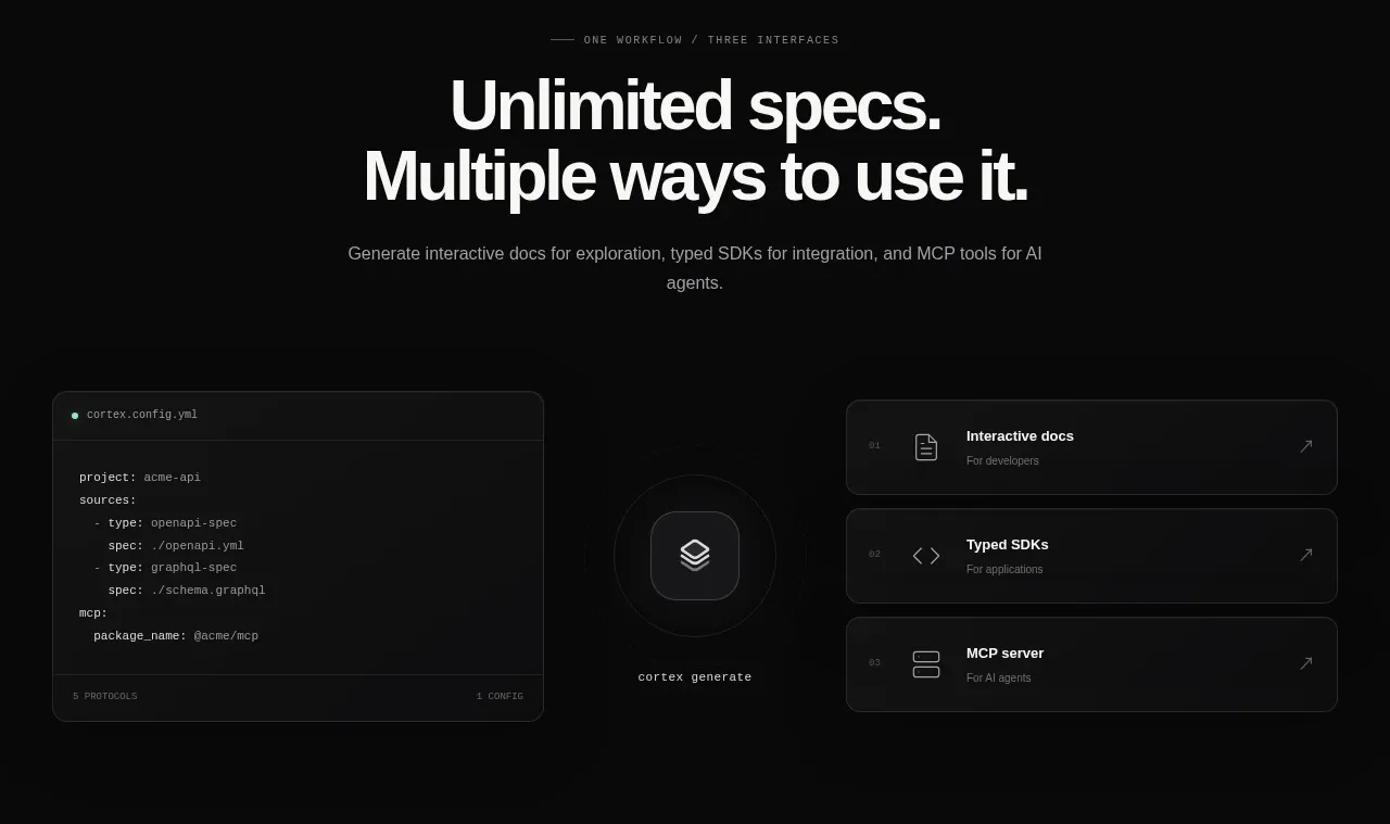 Three interfaces workflow section
Cortex · Feature grid
Three interfaces workflow section
Cortex · Feature grid
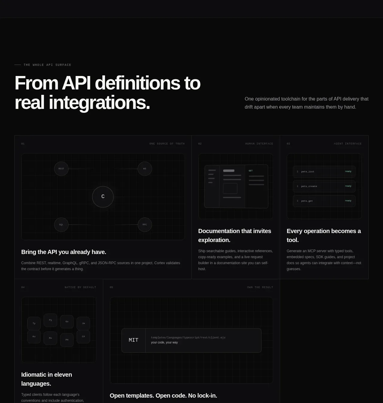 API surface capability cards
Cortex · Feature grid
API surface capability cards
Cortex · Feature grid
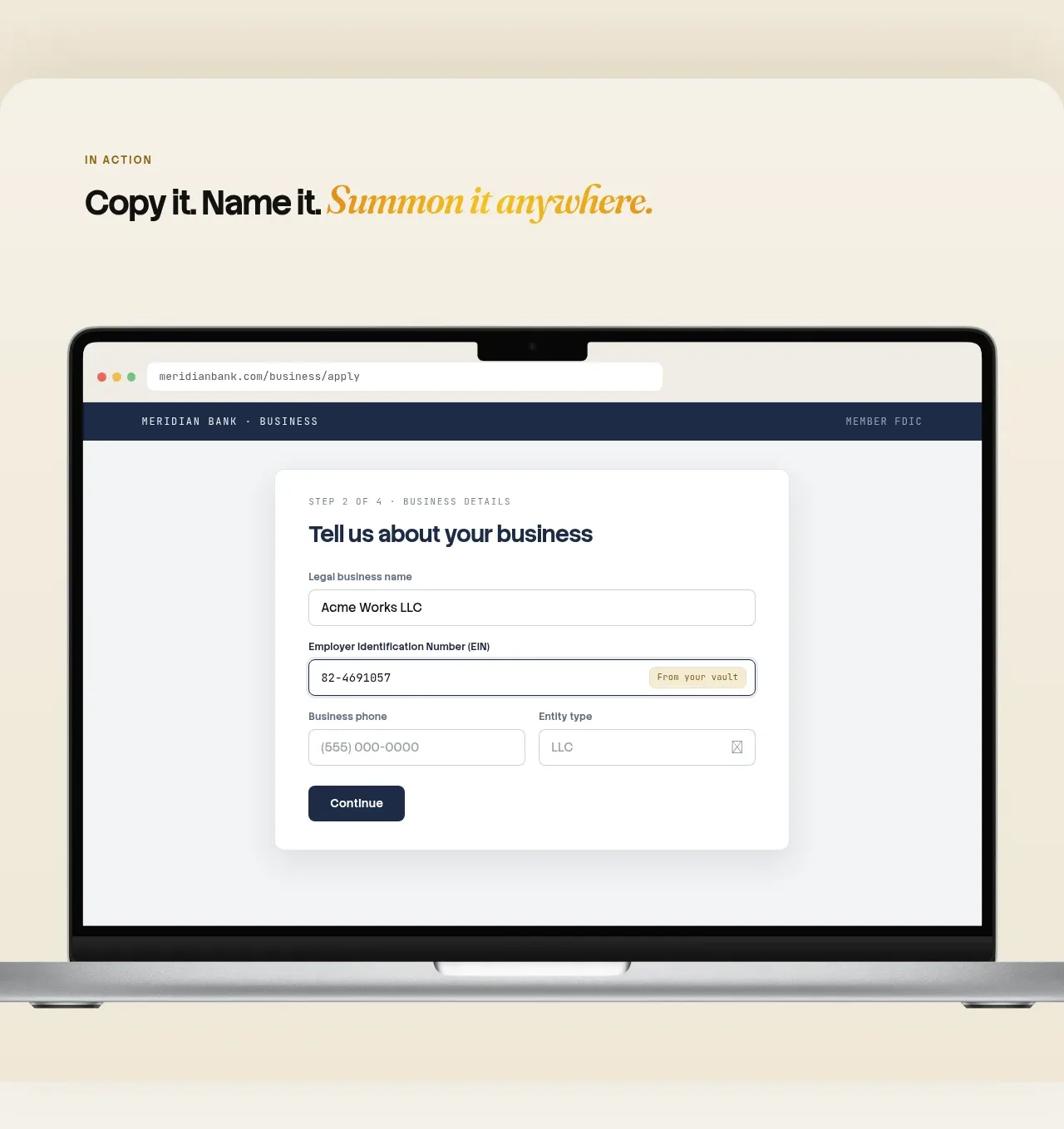
 Automatic capture and search
Relic · Feature grid
Automatic capture and search
Relic · Feature grid
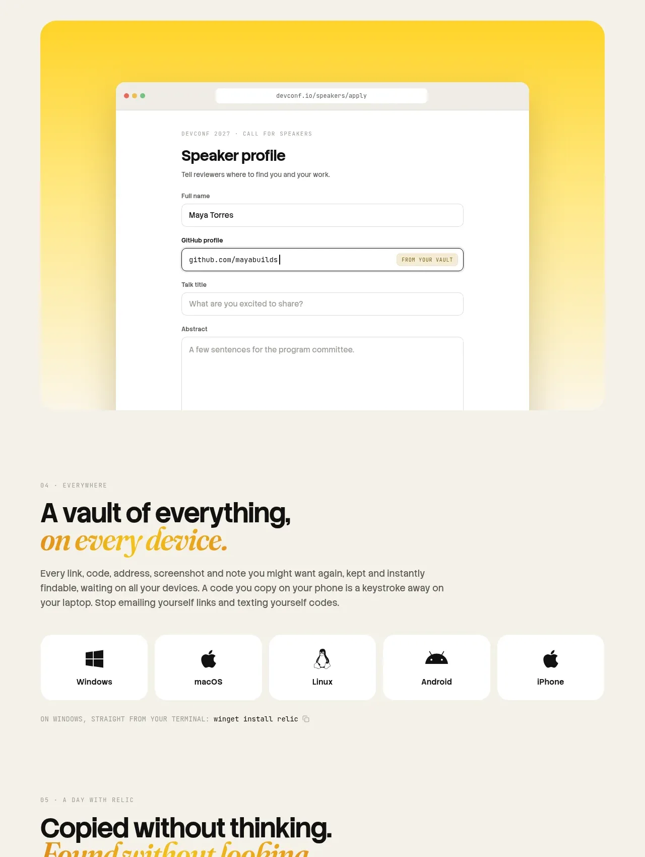 Platform availability and everyday uses
Relic · Feature grid
Platform availability and everyday uses
Relic · Feature grid