 kage
kage
relic.space
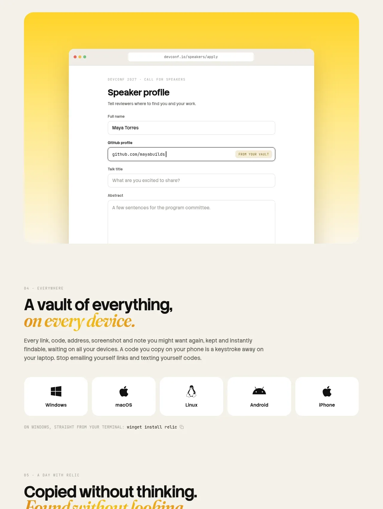
Design analysis
This combined utility area first reassures users about platform coverage, then translates the product into memorable everyday scenarios and small practical features.
Prompt preview
## Reference images

Study these alongside the description below: hierarchy, rhythm, spacing, colour. Build for the product you are asked about, using this design language.

- Component: https://kage-design-assets.t3.tigrisfiles.io/components/relic/11197dbe-e39c-44cc-b0a1-5cdca0c05213-1789279381-5.webp
- Full page it was cut from: https://kage-design-assets.t3.tigrisfiles.io/screenshots/relic/11197dbe-e39c-44cc-b0a1-5cdca0c05213-1789279305759-full.webp
- Component on Kage: https://kage.design/component/relic-feature-grid-3

## Before you start
Ask which platforms your product supports and which recurring moments or tasks it improves. Use those answers to create a useful, scannable section.

Build a stacked feature area. Start with a platform-availability block: an eyebrow, bold headline with one italic accent, a short paragraph, and five evenly sized platform chips with simple neutral system icons or text labels. Follow with a practical-use block containing a headline and a grid of small cards, each with a compact title and one-sentence benefit. Use warm cream `#f5efe3`, white cards `#fffdf8`, text `#171714`, muted `#6a645a`, and amber `#d39517`; use 12–18px radii, 12–16px card padding, 16px gaps, and a strong baseline grid. Keep icons generic and make the platform row wrap gracefully on mobile.

Never use logos, product names, copy, illustrations, or imagery from the reference.
More components

 Announcement and what’s-new feature list
DockFix 5.0 · Feature grid
Announcement and what’s-new feature list
DockFix 5.0 · Feature grid
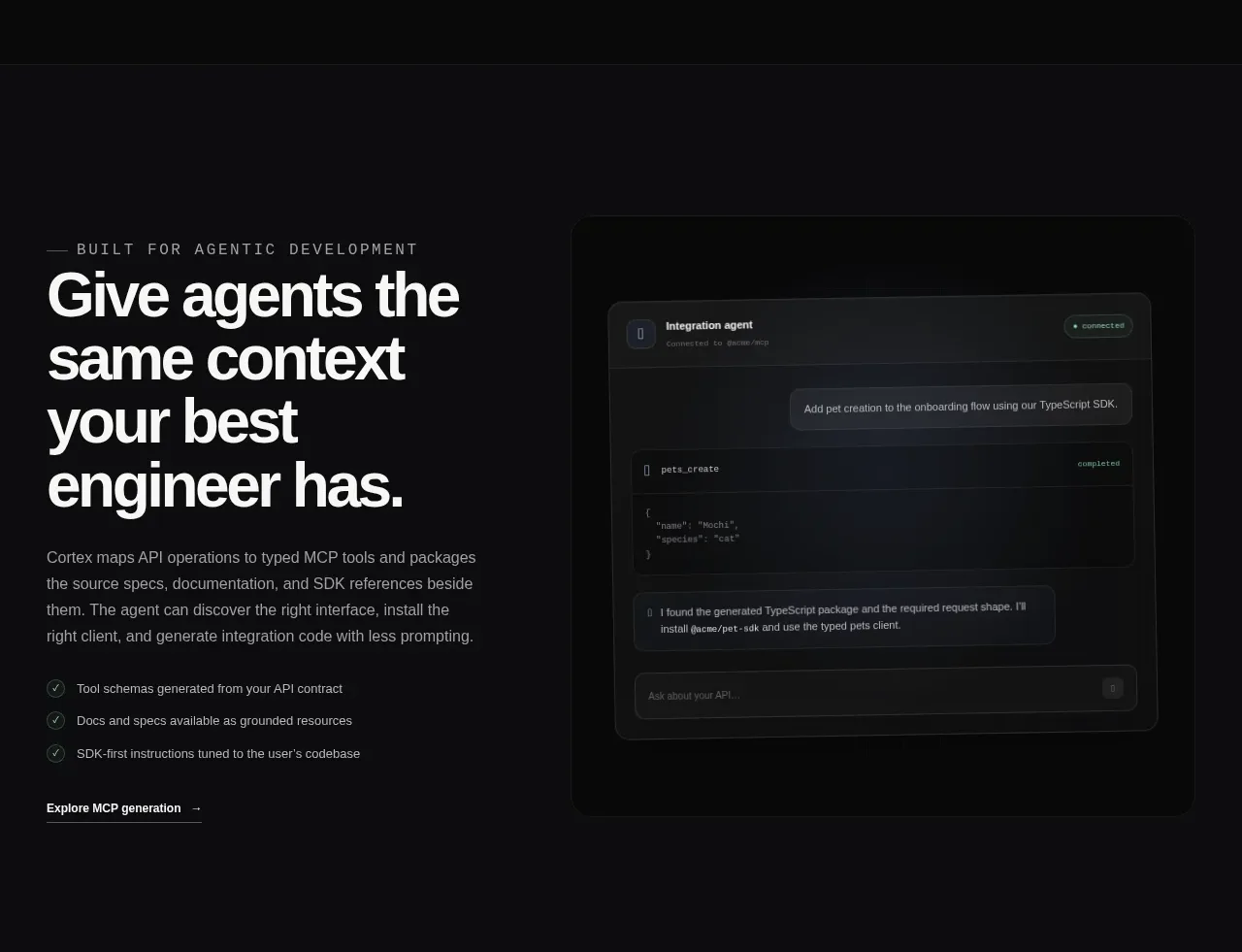
 Agent context split feature
Cortex · Feature grid
Agent context split feature
Cortex · Feature grid
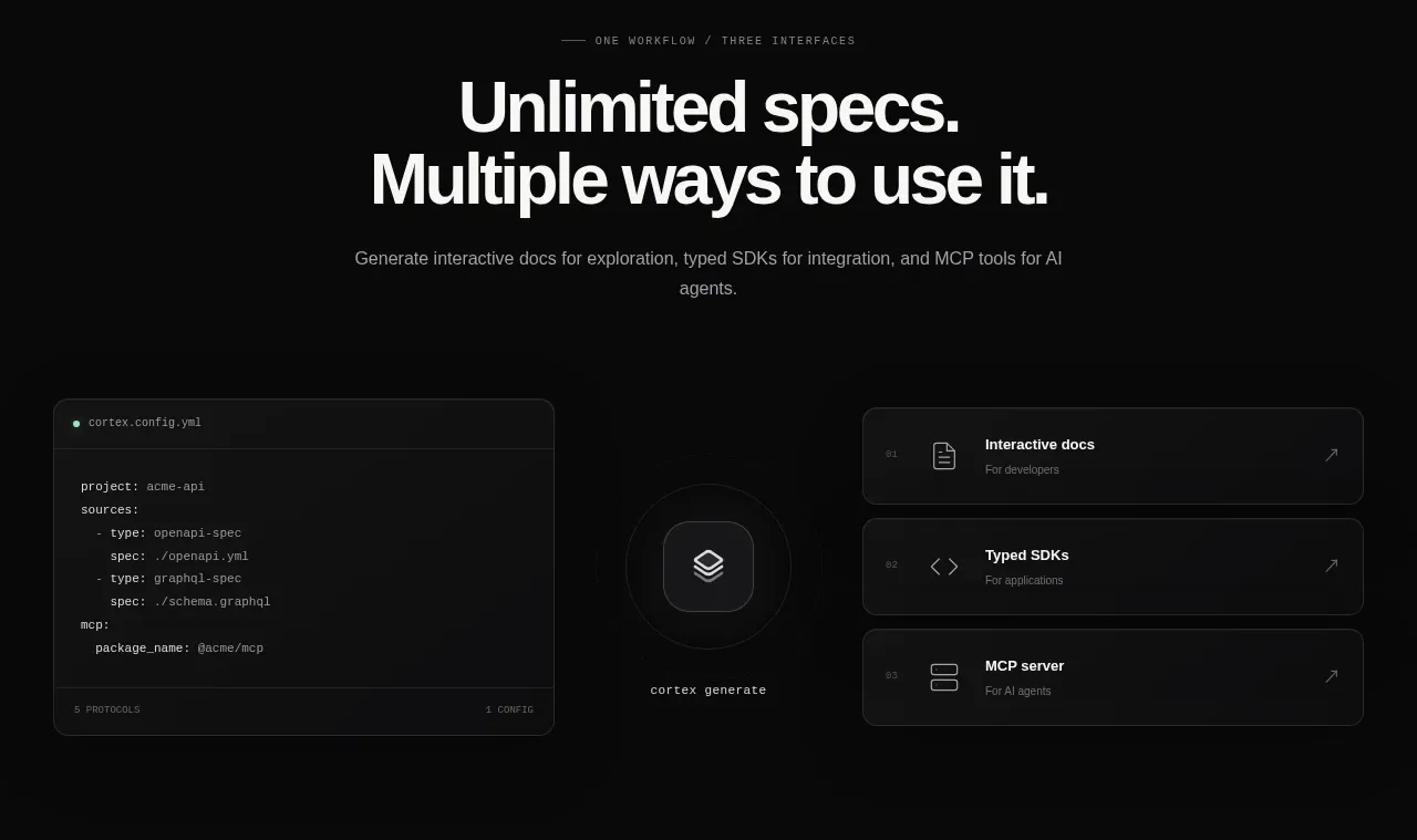 Three interfaces workflow section
Cortex · Feature grid
Three interfaces workflow section
Cortex · Feature grid
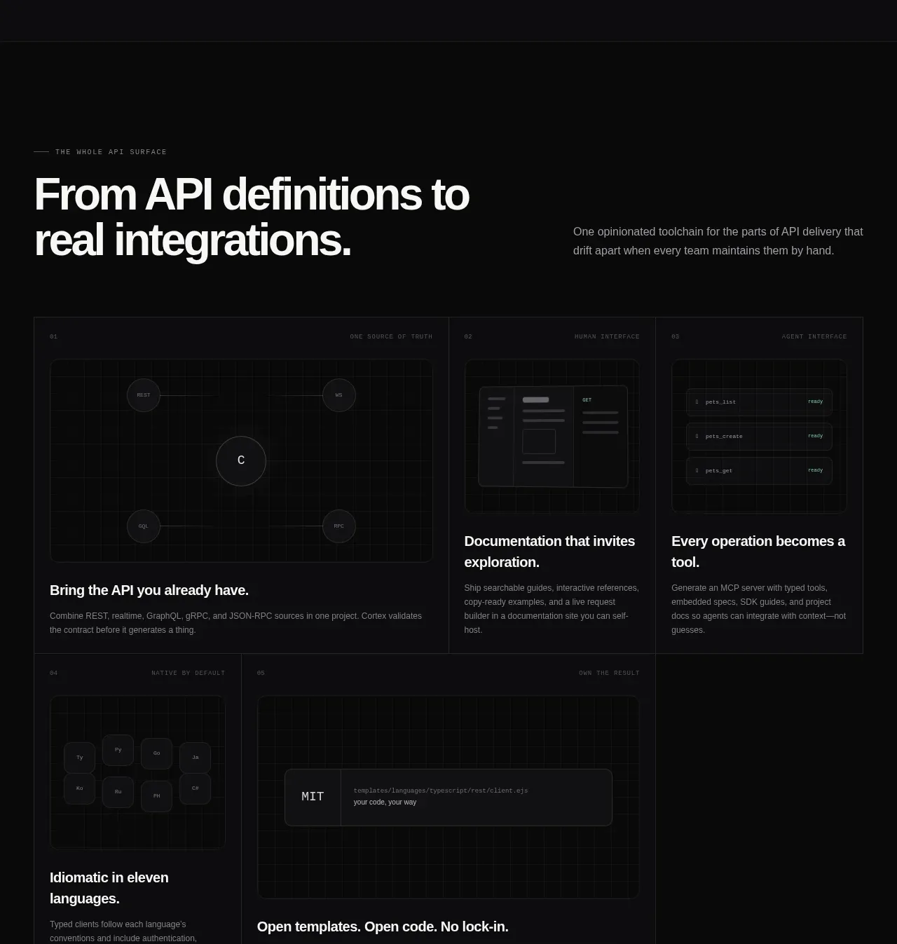 API surface capability cards
Cortex · Feature grid
API surface capability cards
Cortex · Feature grid
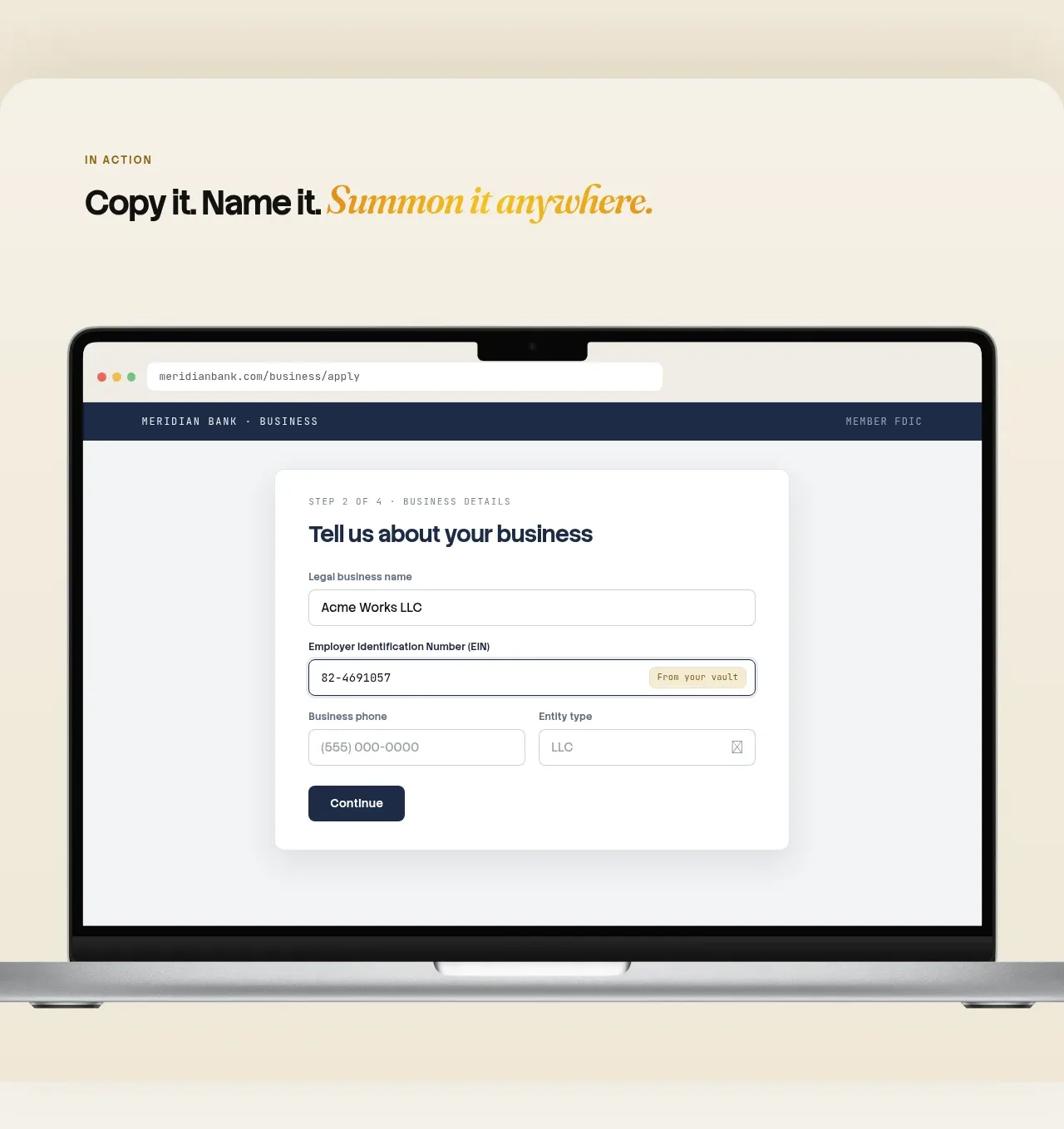
 Automatic capture and search
Relic · Feature grid
Automatic capture and search
Relic · Feature grid
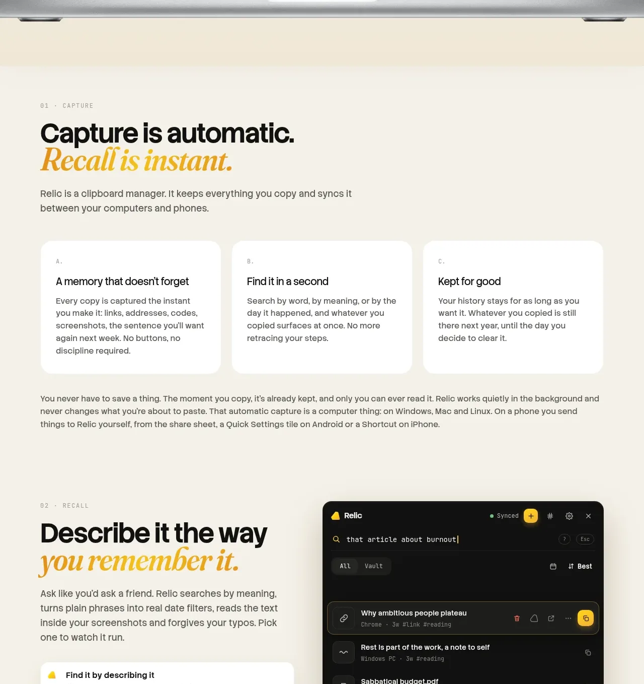 Descriptive memory workflow
Relic · Feature grid
Descriptive memory workflow
Relic · Feature grid