 kage
kage
requesteagle.tokarev.work

Design analysis
A minimal top bar pairs a small brand mark and wordmark with four compact anchor links and a high-contrast download button. The restrained height keeps attention on the oversized hero typography.
Prompt preview
## Reference images

Study these alongside the description below: hierarchy, rhythm, spacing, colour. Build for the product you are asked about, using this design language.

- Component: https://kage-design-assets.t3.tigrisfiles.io/components/request-eagle/fb8c7e5d-6253-47fd-b840-135fd368731b-1791612074-0.webp
- Full page it was cut from: https://kage-design-assets.t3.tigrisfiles.io/screenshots/request-eagle/fb8c7e5d-6253-47fd-b840-135fd368731b-1791612032869-full.webp
- Component on Kage: https://kage.design/component/request-eagle-navigation

## Before you start
Ask what the user's product is, who it is for, and what brand personality and primary action they need. Apply the principles below to that product rather than reproducing the reference.

Build a compact desktop-first navigation bar for a technical software landing page. Use a near-black navy background around `#080d18`, a small abstract brand mark area on the left, and a horizontal layout with generous side padding. Keep the brand lockup aligned vertically with the nav links. Use uppercase or small-cap utility links with muted blue-gray text around `#8b9bad`, then finish with one skewed or chamfered cyan action button around `#7dd3f4` and dark italic bold text.

Use a 64–72px height, a thin top accent rule, 24px horizontal padding, and 28–36px gaps between links. Typography should be condensed or geometric sans-serif: 11–12px for links, 13–14px for the brand, and bold italic uppercase text for the action. Give the button a subtle clipped/slanted edge rather than a soft pill; use a faint border and a hover state that brightens the cyan and slightly lifts the button. Collapse links into a menu at narrow widths.

Never use logos, product names, copy, illustrations, or imagery from the reference.
More components

 Minimal top navigation
Agibot · Navigation
Minimal top navigation
Agibot · Navigation

 Top navigation
Hypervibe · Navigation
Top navigation
Hypervibe · Navigation
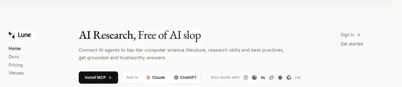
 Editorial research product navigation
Lune · Navigation
Editorial research product navigation
Lune · Navigation

 Minimal product navigation
Pine Computer · Navigation
Minimal product navigation
Pine Computer · Navigation

 Top experiment navigation
Playground by Google Labs · Navigation
Top experiment navigation
Playground by Google Labs · Navigation
 Sticky section navigation
Playground by Google Labs · Navigation
Sticky section navigation
Playground by Google Labs · Navigation