kage
kage
resurf.so
Design analysis
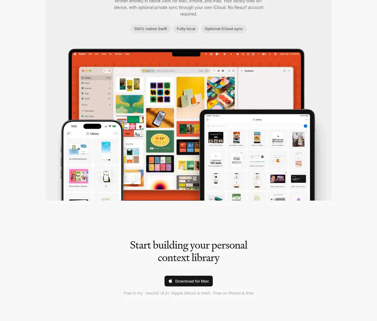
A large rounded panel communicates native availability with a heading, supporting text, compact capability chips, and a layered multi-device product visual.
Prompt preview
## Reference images

Study these alongside the description below: hierarchy, rhythm, spacing, colour. Build for the product you are asked about, using this design language.

- Component: https://kage-design-assets.t3.tigrisfiles.io/components/resurf/ff64fde5-ed9d-4c90-b5a1-3641329afaa7-1789365707-5.webp
- Full page it was cut from: https://kage-design-assets.t3.tigrisfiles.io/screenshots/resurf/ff64fde5-ed9d-4c90-b5a1-3641329afaa7-1789365667481-full.webp
- Component on Kage: https://kage.design/component/resurf-card

## Before you start
Ask which devices and operating systems the user's product supports and what “native” or cross-device means for its brand. Use those facts to create a credible showcase panel.

Build a wide, softly contrasting platform showcase card. Start with a centered serif heading and a short paragraph explaining the platform benefit, followed by three small rounded chips for key capabilities. Place a layered product visual below: use one primary desktop or tablet frame with smaller phone/tablet frames overlapping near the bottom edge. Keep the composition centered, clean, and partially clipped by the panel as a deliberate editorial device. Use panel background `#f1f1f1`, page background `#fafafa`, text `#272727`, muted text `#777777`, white chips `#fafafa`, and subtle gray borders. Use 24px panel radius, 16px chip radius, 80–96px internal top padding, and responsive device scaling that avoids horizontal overflow. Add a restrained fade or slight translate on entrance, and ensure alt text and reduced-motion support.

### Never
- Never use logos, product names, copy, illustrations, or imagery from the reference.
- Never claim platform support that the product does not have.
- Never turn the device composition into a decorative collage with no readable product relationship.