 kage
kage
resurf.so
Design analysis
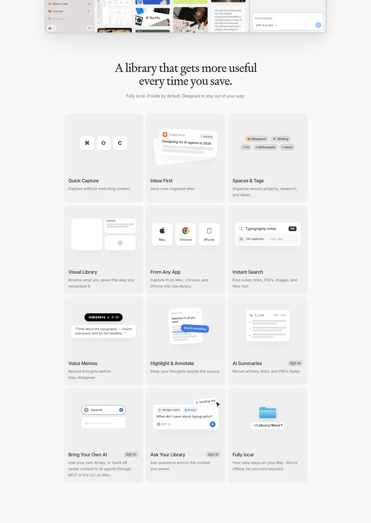
A short positioning statement introduces a structured three-column grid of soft cards, each pairing a small visual cue with a practical capability and concise explanation.
Prompt preview
## Reference images

Study these alongside the description below: hierarchy, rhythm, spacing, colour. Build for the product you are asked about, using this design language.

- Component: https://kage-design-assets.t3.tigrisfiles.io/components/resurf/ff64fde5-ed9d-4c90-b5a1-3641329afaa7-1789365707-2.webp
- Full page it was cut from: https://kage-design-assets.t3.tigrisfiles.io/screenshots/resurf/ff64fde5-ed9d-4c90-b5a1-3641329afaa7-1789365667481-full.webp
- Component on Kage: https://kage.design/component/resurf-feature-grid

## Before you start
Ask what the user's product does, which capabilities deserve emphasis, and what visual language the brand uses. Then build a distinct feature section using these principles.

Create a feature section with a centered serif heading, one restrained subtitle, and a three-column responsive grid of feature cards. Use approximately 9 cards so the section communicates breadth without becoming a dense catalogue. Each card should have a pale neutral surface, a small product-specific visual or icon area at the top, a short title, and one or two lines of outcome-focused copy. Keep card heights consistent within rows, align titles and descriptions to the same inset, and allow the cards to feel like a calm gallery rather than a dashboard. Use background `#fafafa`, cards `#f1f1f1`, text `#242424`, secondary text `#777777`, and very subtle borders or shadows. Use 14–16px card radius, 20–24px padding, 16px grid gaps, a 36–48px heading scale, and generous section padding. Add only restrained hover elevation or border emphasis.

### Never
- Never use logos, product names, copy, illustrations, or imagery from the reference.
- Never fill every card with decorative imagery that does not explain a capability.
- Never use long paragraphs or inconsistent card geometry.
More components
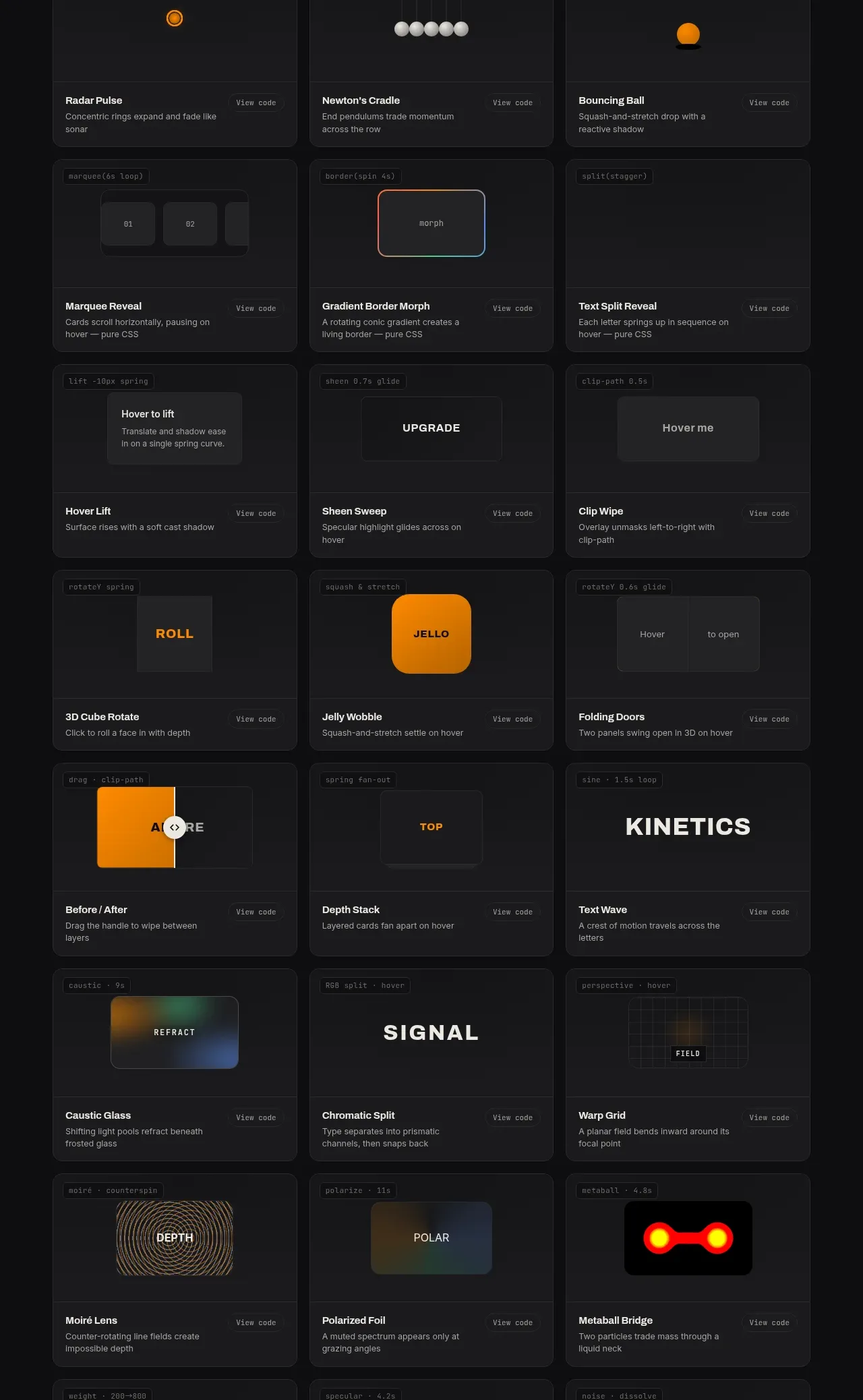
 Surface and motion pattern library
kinetics.colorion.co · Feature grid
Surface and motion pattern library
kinetics.colorion.co · Feature grid
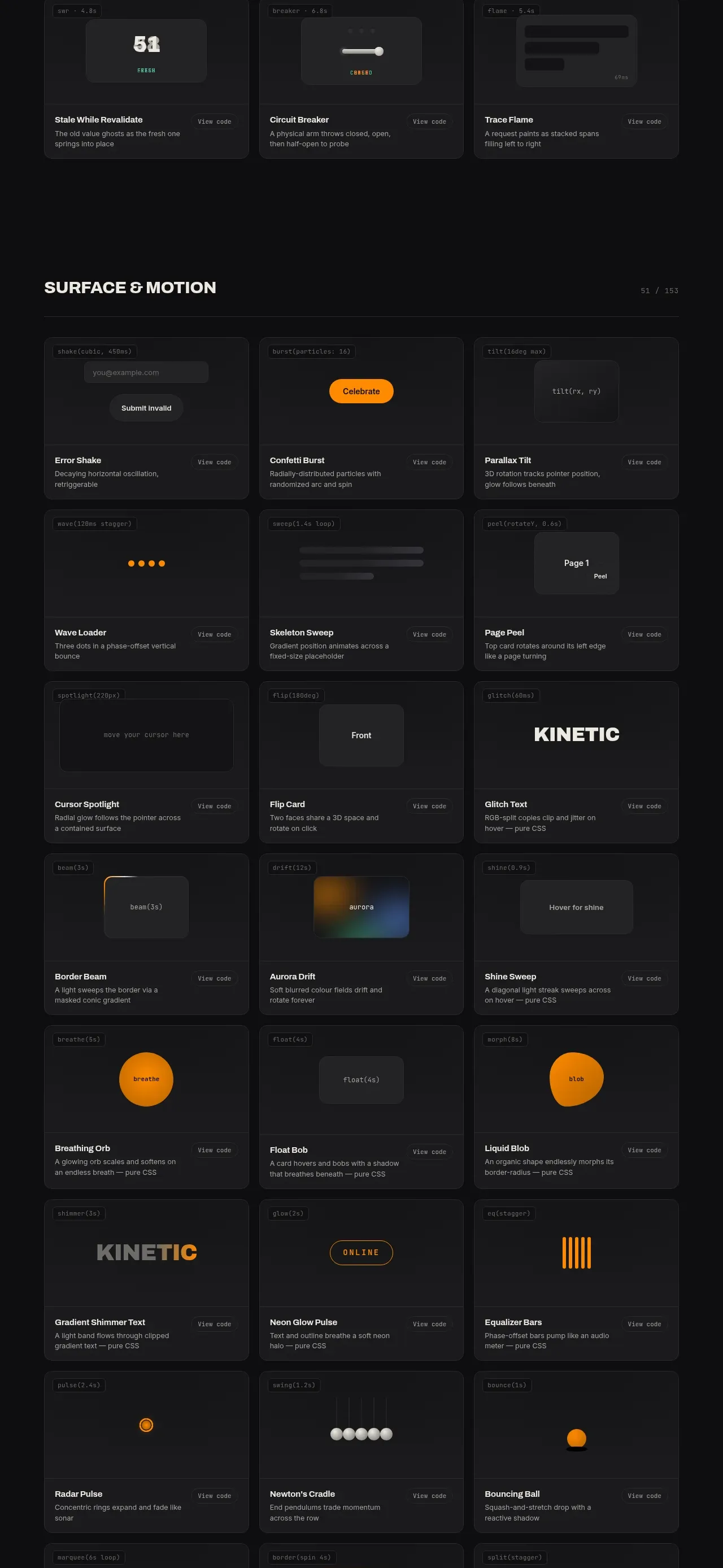 Feedback and state pattern library
kinetics.colorion.co · Feature grid
Feedback and state pattern library
kinetics.colorion.co · Feature grid
 Interaction and input pattern library
kinetics.colorion.co · Feature grid
Interaction and input pattern library
kinetics.colorion.co · Feature grid
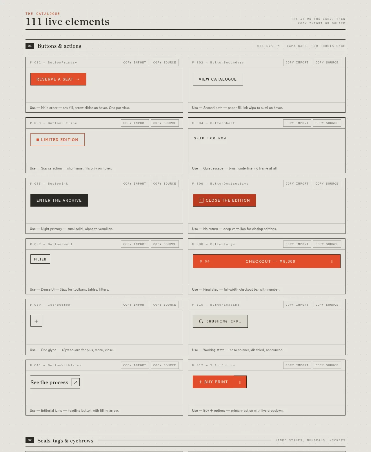
 Buttons and actions inventory
SHIUI · Feature grid
Buttons and actions inventory
SHIUI · Feature grid
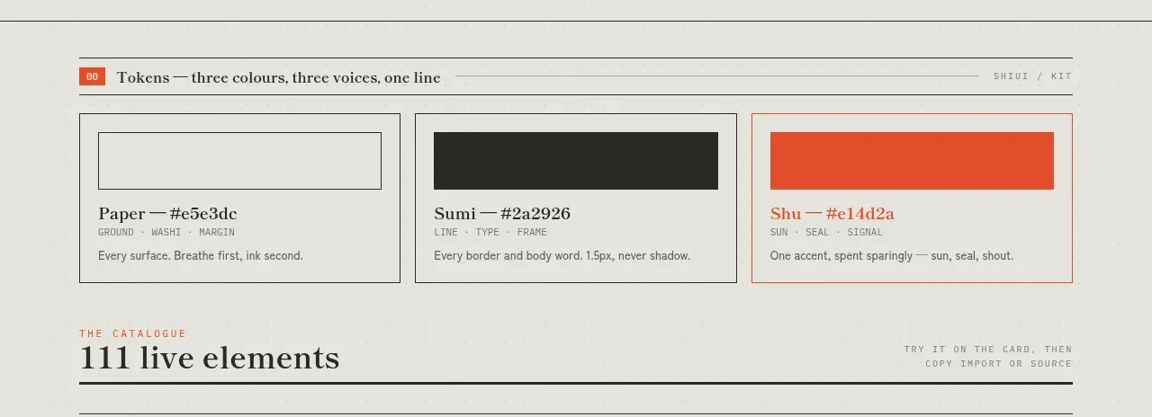 Colour and element catalogue
SHIUI · Feature grid
Colour and element catalogue
SHIUI · Feature grid
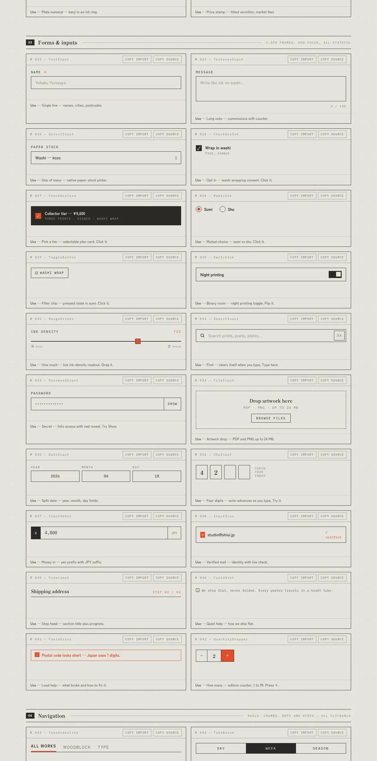 Forms and inputs inventory
SHIUI · Feature grid
Forms and inputs inventory
SHIUI · Feature grid