 kage
kage
resurf.so
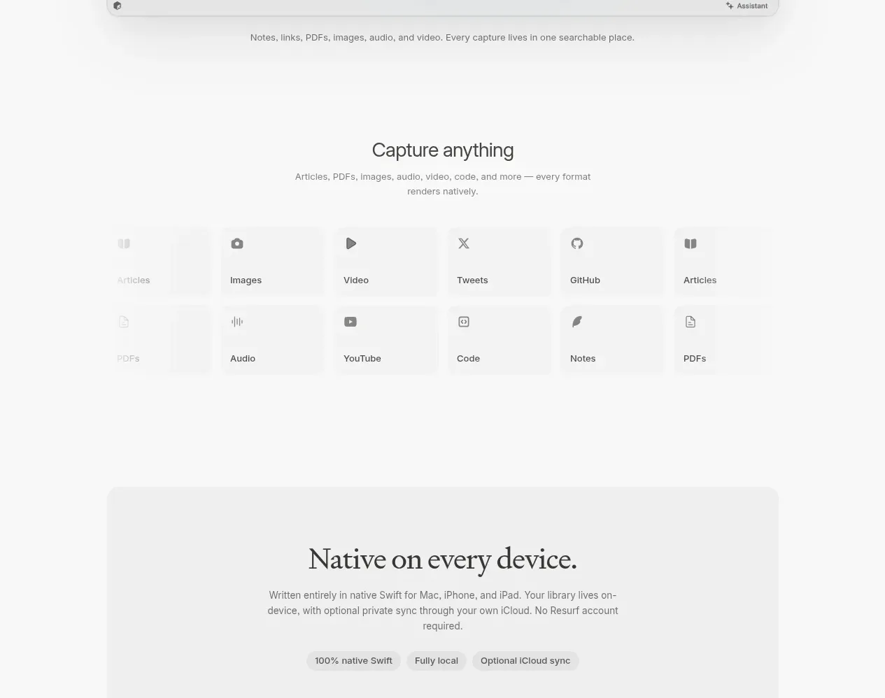
Design analysis
A focused capture section explains breadth through a compact matrix of content formats, using simple icon-and-label cells with plenty of whitespace.
Prompt preview
## Reference images

Study these alongside the description below: hierarchy, rhythm, spacing, colour. Build for the product you are asked about, using this design language.

- Component: https://kage-design-assets.t3.tigrisfiles.io/components/resurf/ff64fde5-ed9d-4c90-b5a1-3641329afaa7-1789365707-4.webp
- Full page it was cut from: https://kage-design-assets.t3.tigrisfiles.io/screenshots/resurf/ff64fde5-ed9d-4c90-b5a1-3641329afaa7-1789365667481-full.webp
- Component on Kage: https://kage.design/component/resurf-feature-grid-2

## Before you start
Ask what kinds of content the user's product handles and which formats matter to its audience. Translate those into a clear, brand-specific matrix.

Create a compact “capture anything” style section with a centered heading and supporting sentence followed by a balanced matrix of format tiles. Use two or three rows of evenly sized cells, each containing a simple monochrome icon and a short label. Keep the visual treatment intentionally quiet so the variety is understood at a glance. Use `#fafafa` for the page, `#f2f2f2` for tile surfaces, `#303030` for icons and labels, `#888888` for supporting text, 12–16px radius, 20–28px cell padding, and thin `#e8e8e8` separators only where helpful. Use a 36–44px serif heading and 14px sans-serif labels. On small screens, reduce columns while preserving scanability. Add subtle hover background changes, not elaborate animation.

### Never
- Never use logos, product names, copy, illustrations, or imagery from the reference.
- Never list formats the product cannot actually support.
- Never use complex icons that compete with the labels.
More components
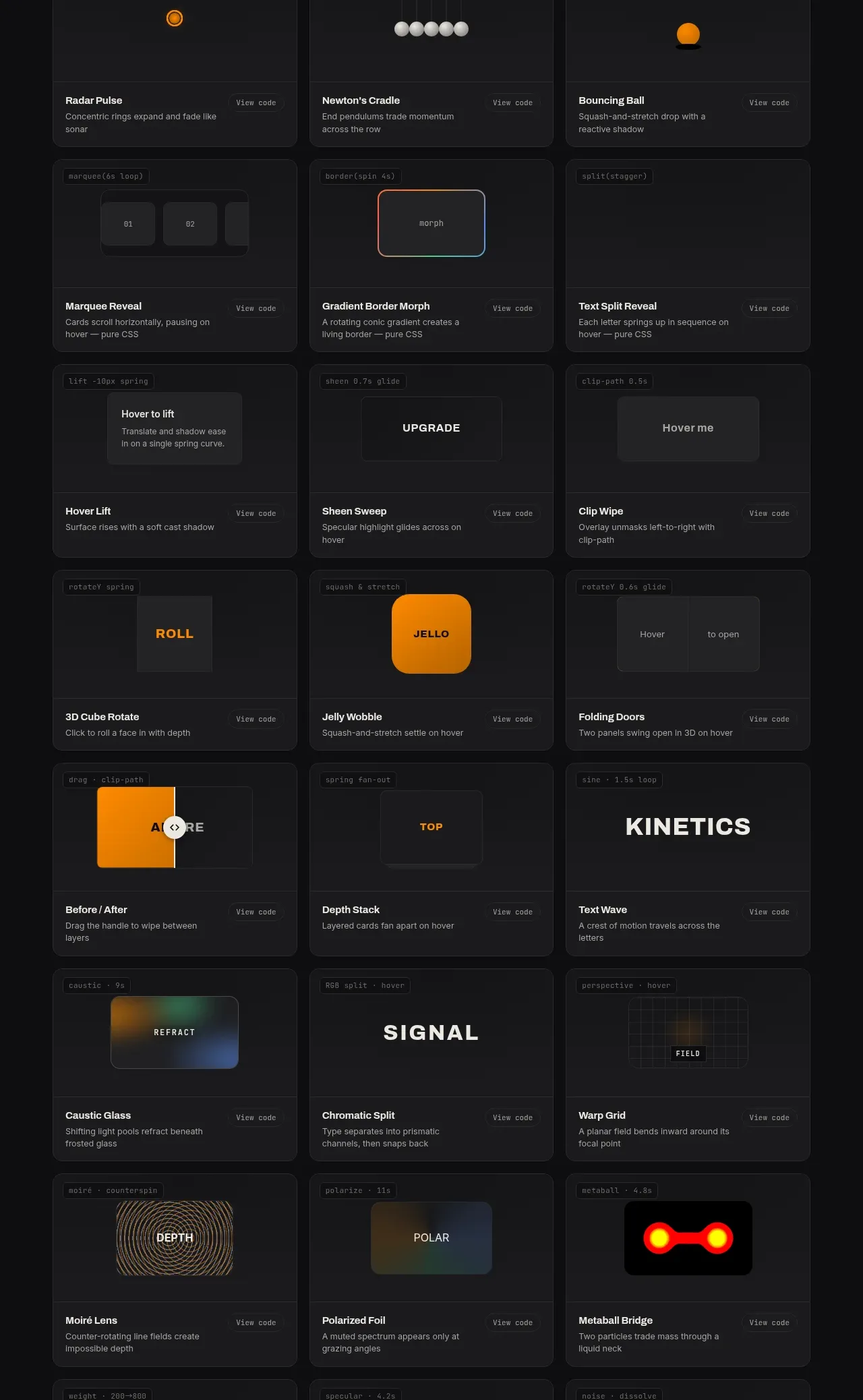
 Surface and motion pattern library
kinetics.colorion.co · Feature grid
Surface and motion pattern library
kinetics.colorion.co · Feature grid
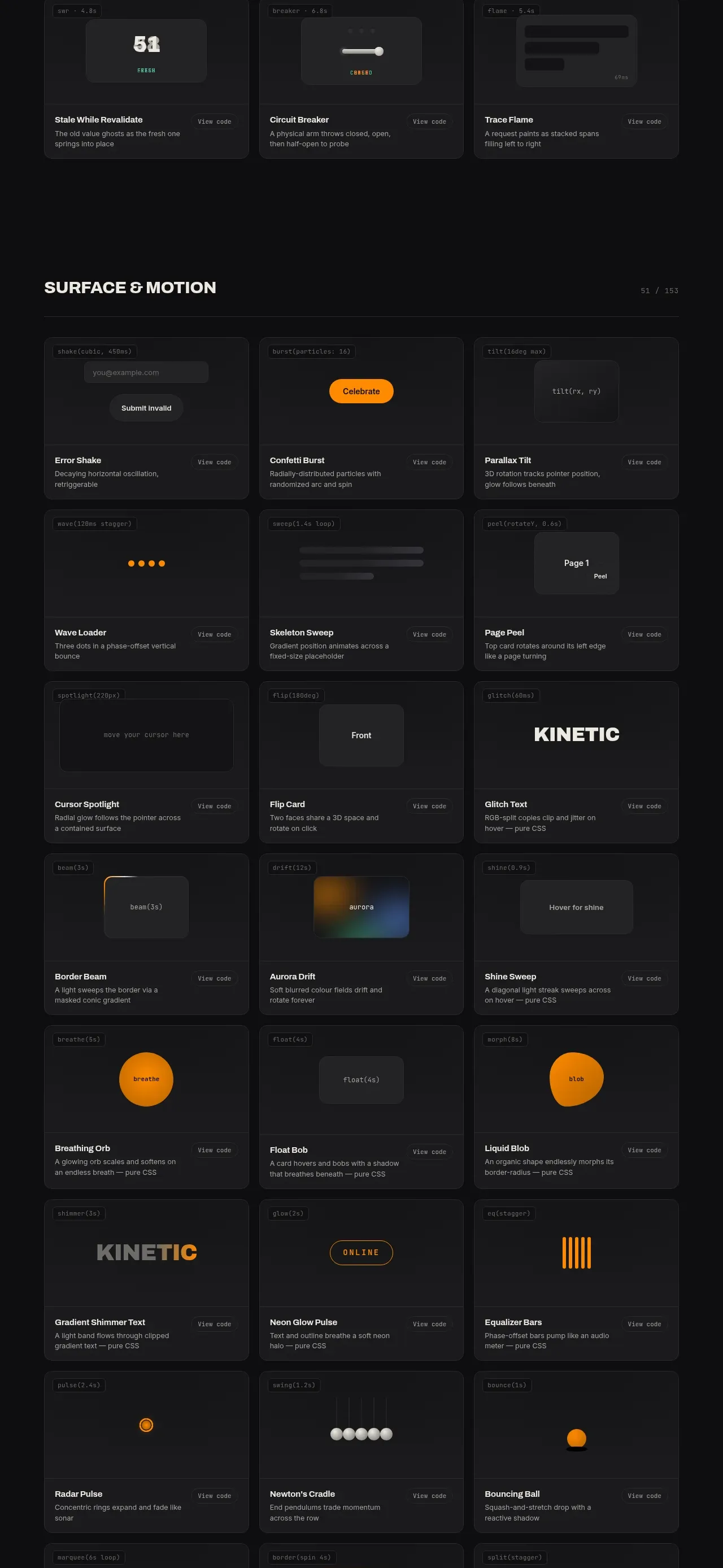 Feedback and state pattern library
kinetics.colorion.co · Feature grid
Feedback and state pattern library
kinetics.colorion.co · Feature grid
 Interaction and input pattern library
kinetics.colorion.co · Feature grid
Interaction and input pattern library
kinetics.colorion.co · Feature grid
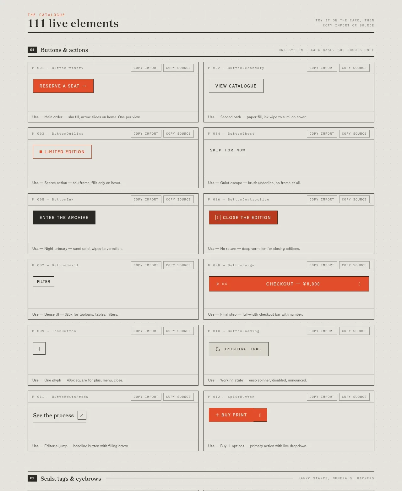
 Buttons and actions inventory
SHIUI · Feature grid
Buttons and actions inventory
SHIUI · Feature grid
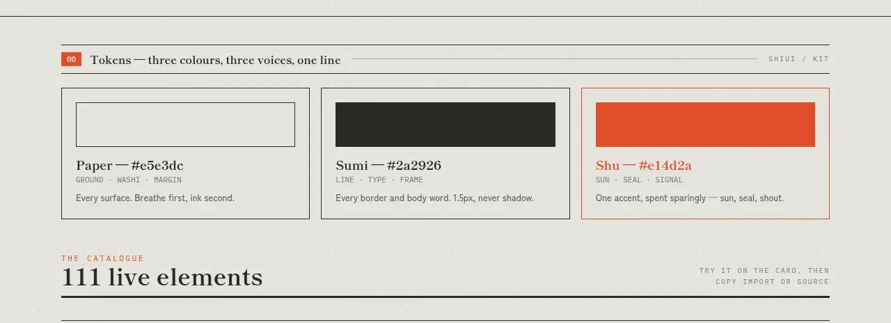 Colour and element catalogue
SHIUI · Feature grid
Colour and element catalogue
SHIUI · Feature grid
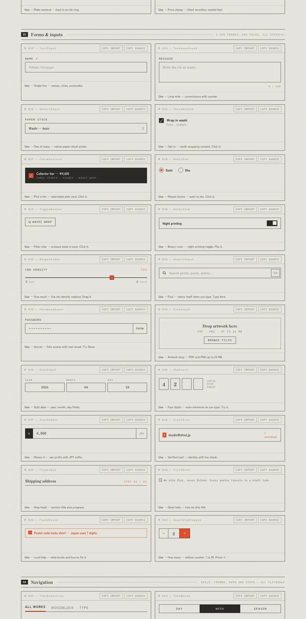 Forms and inputs inventory
SHIUI · Feature grid
Forms and inputs inventory
SHIUI · Feature grid