 kage
kage
saliency.dev
Design analysis
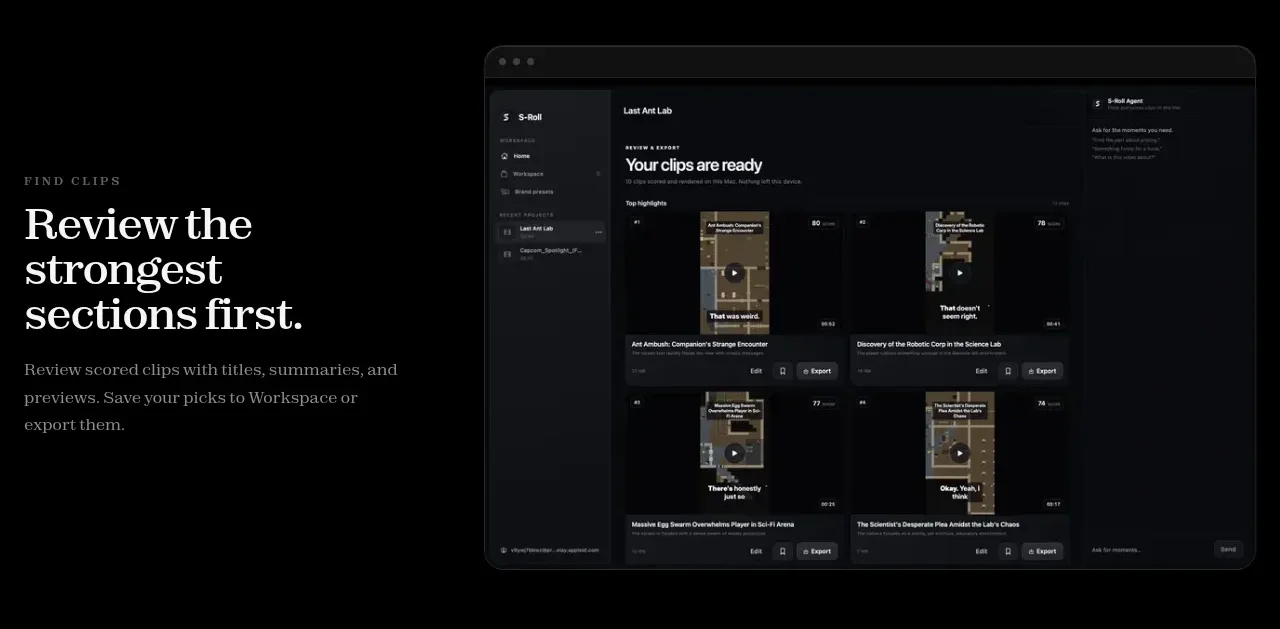
An editorial feature band pairs a left-aligned eyebrow, headline, and explanation with a large dark application screenshot on the right.
Prompt preview
## Reference images

Study these alongside the description below: hierarchy, rhythm, spacing, colour. Build for the product you are asked about, using this design language.

- Component: https://kage-design-assets.t3.tigrisfiles.io/components/s-roll/31ce67c8-e756-4d99-81ee-7a5fcf910ca7-1789711386-3.webp
- Full page it was cut from: https://kage-design-assets.t3.tigrisfiles.io/screenshots/s-roll/31ce67c8-e756-4d99-81ee-7a5fcf910ca7-1789711333877-full.webp
- Component on Kage: https://kage.design/component/s-roll-feature-grid

## Before you start
Ask what the user's first core capability is and what visual evidence best demonstrates it. Design the section around that product rather than copying the reference.

Create a two-column feature showcase on a black background. Put a compact uppercase eyebrow, large warm-white serif heading, and readable muted paragraph in a narrow left column; place a large rounded application-preview frame in the right column. Align the text vertically near the visual center and leave broad whitespace around both columns. Use #000000 background, #f1eee9 headings, #8b8785 body text, and a preview frame with #121316 fill, #25262b border, 18px radius, and a soft shadow. On smaller screens, stack text above the visual and preserve the visual's aspect ratio. The visual should communicate the feature through UI hierarchy, not decorative clutter.

Never use logos, product names, copy, illustrations, or imagery from the reference.
More components

 AI-powered helpdesk feature section
intercom.com · Feature grid
AI-powered helpdesk feature section
intercom.com · Feature grid
 Integrations and ecosystem section
intercom.com · Feature grid
Integrations and ecosystem section
intercom.com · Feature grid
 AI agent capabilities section
intercom.com · Feature grid
AI agent capabilities section
intercom.com · Feature grid
 Unified support experience overview
intercom.com · Feature grid
Unified support experience overview
intercom.com · Feature grid

 Core invoicing capabilities
sendinvo.com · Feature grid
Core invoicing capabilities
sendinvo.com · Feature grid
 Audience and trade types
sendinvo.com · Feature grid
Audience and trade types
sendinvo.com · Feature grid