kage
kage
saliency.dev
Design analysis
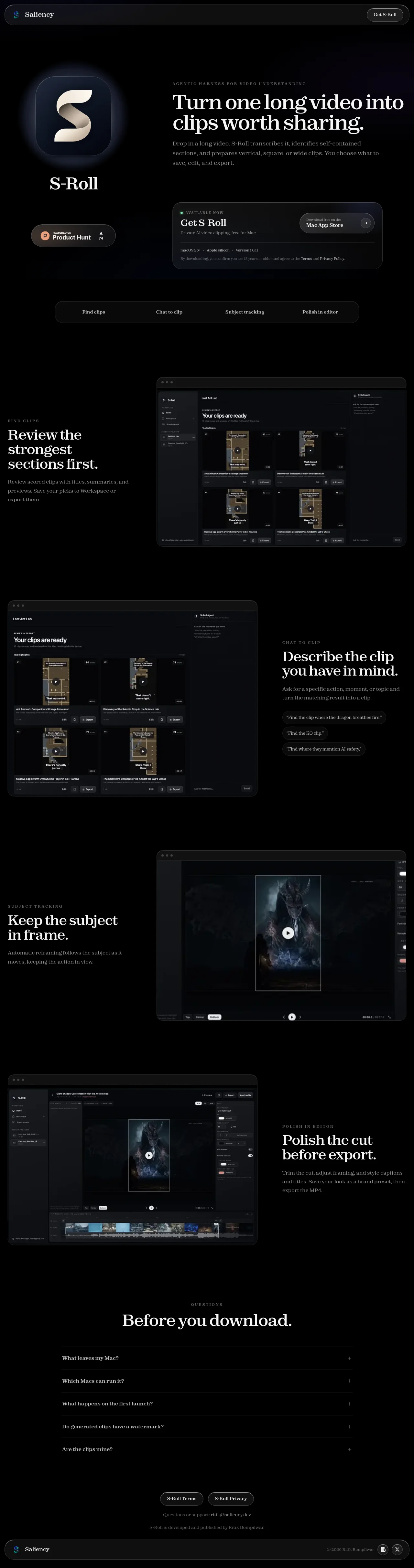
A near-black single-product landing page that pairs a warm classical serif display face with letter-spaced uppercase eyebrows, giving an editorial, almost print-like feel on a dark canvas. The hero splits asymmetrically between a glowing app icon block and a download card, then a pill-shaped feature index introduces four alternating two-column feature blocks, each anchored by a large macOS-window screenshot. Density stays low and spacing generous throughout; rhythm is set by mirroring text/screenshot sides, hairline dividers in the FAQ accordion, and pill-shaped buttons that repeat down the page until a quiet legal footer.
Prompt preview
## Reference images

Study these alongside the description below: hierarchy, rhythm, spacing, colour. Build for the product you are asked about, using this design language.

- Full page: https://kage-design-assets.t3.tigrisfiles.io/screenshots/s-roll/31ce67c8-e756-4d99-81ee-7a5fcf910ca7-1789711333877-full.webp
- Above the fold: https://kage-design-assets.t3.tigrisfiles.io/screenshots/s-roll/31ce67c8-e756-4d99-81ee-7a5fcf910ca7-1789711330896.webp
- Design on Kage: https://kage.design/designs/s-roll-landing-page

## Before you start
Ask the user what product they are building, who it is for, and what brand assets they already have (name, colours, type). Wait for the answers before writing any code. Everything below is a design language to apply to *their* product, not a page to reproduce.

## Page structure
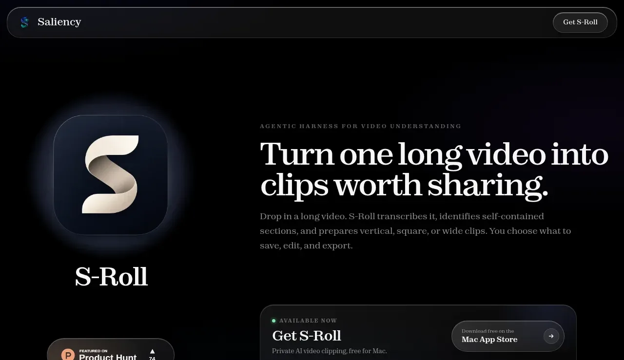
1. **Slim top bar** — near-black bar with a small wordmark and icon left, one pill-shaped CTA button right. No nav links.
2. **Hero, two columns** — left column: a large rounded-square app icon with a soft radial glow behind it, the product name set in the display serif below it, and a small social-proof badge underneath. Right column: an uppercase letter-spaced eyebrow, a two-line serif headline, a short muted paragraph, then a download card containing a status row (green dot + 'available now' label), a headline 'Get {Product}' line, a one-line benefit, a pill CTA button, a system-requirements line, and a tiny legal sentence with inline links.
3. **Feature index strip** — a full-width pill-shaped container with four evenly spaced text links, one per feature section, acting as anchor navigation between hero and feature tour.
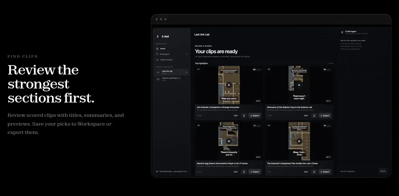
4. **Feature block 1 (text left / screenshot right)** — uppercase eyebrow, serif heading, short muted paragraph on the left; a large framed desktop-app screenshot on the right.
5. **Feature block 2 (screenshot left / text right)** — mirrored layout; the text column ends with two or three example prompt/quote chips rendered as small outlined pills.
6. **Feature block 3 (text left / screenshot right)** — same pattern, screenshot is a focused editor/player view.
7. **Feature block 4 (screenshot left / text right)** — final feature, mirrored again, closing the tour with the export step.
8. **FAQ section** — centred uppercase eyebrow and serif heading ('Before you download.'-style), then a single-column accordion of five questions with hairline top borders and '+' icons on the right.
9. **Legal pre-footer** — centred: two pill-shaped legal link buttons, a support-email line, and a one-line attribution sentence.
10. **Bottom bar** — wordmark left, copyright centre-right, two small circular social icon buttons right, separated from the page by a hairline border.

## Design language
- **Canvas:** near-black page background (~#0b0b0e) with panels and screenshots on slightly lifted darks (~#131318). Hairline borders at rgba(255,255,255,0.08–0.12) separate cards and accordion rows instead of shadows.
- **Type pairing:** a classical serif (Georgia/Playfair class) for all headlines — hero at ~64px, section headings ~40–44px, warm off-white (#ece7dc). Everything else is a small neutral sans: 15–16px body in muted grey (#8b8b93), 11–12px uppercase eyebrows with wide (0.15em+) letter-spacing in a dimmer grey. Headline/body contrast does all the hierarchy work; there are no bright accent headings.
- **Colour treatment:** strictly monochrome — black, cream-white text, greys. The only colour accents are functional: a small green status dot on the download card and any imagery inside screenshots. Add one or two very soft radial glows (dim blue/violet at ~10% opacity) behind the hero icon and hero background to keep the black from feeling flat.
- **Shape language:** pill radius (999px) for every button, badge, tab strip and quote chip; 12–16px radius for cards and screenshot frames. No heavy shadows; separate surfaces with borders and slight value steps.
- **Screenshots:** frame every product screenshot as a desktop app window — dark chrome, three traffic-light dots top-left, rounded corners, hairline border — so real UI reads as the hero imagery.
- **Rhythm:** hero is dense (icon + copy + card side by side), then each feature block opens up with big vertical padding (~120px+). Alternate the text/screenshot sides block to block to create a zig-zag pace, and close with the tight, centred FAQ and footer so the page ends quietly.
- **Interaction:** subtle only — pill buttons lighten slightly on hover, accordion rows are border-separated with a '+' that rotates to '×' when open, anchor links in the index strip highlight the active section.

## Never
Do not use the Saliency or S-Roll name, wordmark, ribbon-S logo, any of the page's copy, the Product Hunt badge, the dragon/film imagery, or the example prompt strings from the reference. Never present the result as that product.
Components from this page
All components
 Floating site navigation
S-Roll · Navigation
Floating site navigation
S-Roll · Navigation
 Product introduction and download CTA
S-Roll · Hero
Product introduction and download CTA
S-Roll · Hero
 Feature navigation tabs
S-Roll · Tabs & steps
Feature navigation tabs
S-Roll · Tabs & steps
 Feature story: clip discovery
S-Roll · Feature grid
Feature story: clip discovery
S-Roll · Feature grid
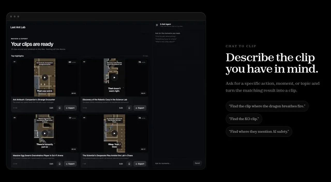 Feature story: natural-language control
S-Roll · Feature grid
Feature story: natural-language control
S-Roll · Feature grid
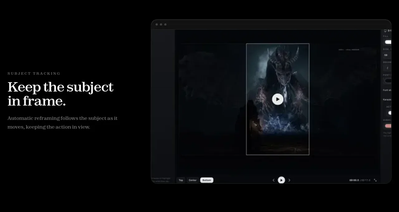 Feature story: subject tracking
S-Roll · Feature grid
Feature story: subject tracking
S-Roll · Feature grid
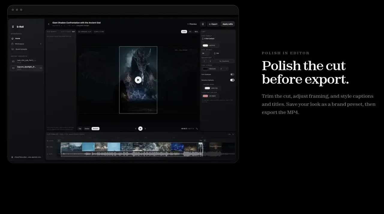 Feature story: final editing
S-Roll · Feature grid
Feature story: final editing
S-Roll · Feature grid
 Download questions FAQ
S-Roll · FAQ
Download questions FAQ
S-Roll · FAQ
 Utility and legal footer
S-Roll · Footer
Utility and legal footer
S-Roll · Footer