 kage
kage
saliency.dev
Design analysis
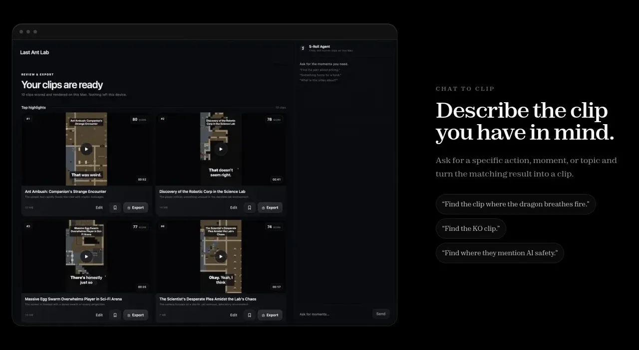
This alternating feature band reverses the layout, showing the product interface on the left and a text-led explanation with example prompt chips on the right.
Prompt preview
## Reference images

Study these alongside the description below: hierarchy, rhythm, spacing, colour. Build for the product you are asked about, using this design language.

- Component: https://kage-design-assets.t3.tigrisfiles.io/components/s-roll/31ce67c8-e756-4d99-81ee-7a5fcf910ca7-1789711386-4.webp
- Full page it was cut from: https://kage-design-assets.t3.tigrisfiles.io/screenshots/s-roll/31ce67c8-e756-4d99-81ee-7a5fcf910ca7-1789711333877-full.webp
- Component on Kage: https://kage.design/component/s-roll-feature-grid-2

## Before you start
Ask what natural-language or guided workflow your product offers and what examples would make it immediately understandable. Use those answers in the design.

Build an alternating two-column product feature section on a black background. Place a large rounded UI preview on the left and an editorial text block on the right with an eyebrow, strong serif title, supporting paragraph, and three compact example chips. Style chips as dark capsules with subtle borders, muted text, and enough padding to read as suggestions rather than buttons. Keep the visual and copy vertically centered, use generous section padding, and maintain a restrained palette of #000000, #f2eee9, #8f8b88, and #19191c. Add understated hover feedback to chips if they are interactive. Stack in a sensible order on mobile.

Never use logos, product names, copy, illustrations, or imagery from the reference.
More components

 AI-powered helpdesk feature section
intercom.com · Feature grid
AI-powered helpdesk feature section
intercom.com · Feature grid
 Integrations and ecosystem section
intercom.com · Feature grid
Integrations and ecosystem section
intercom.com · Feature grid
 AI agent capabilities section
intercom.com · Feature grid
AI agent capabilities section
intercom.com · Feature grid
 Unified support experience overview
intercom.com · Feature grid
Unified support experience overview
intercom.com · Feature grid

 Core invoicing capabilities
sendinvo.com · Feature grid
Core invoicing capabilities
sendinvo.com · Feature grid
 Audience and trade types
sendinvo.com · Feature grid
Audience and trade types
sendinvo.com · Feature grid