 kage
kage
saliency.dev
Design analysis
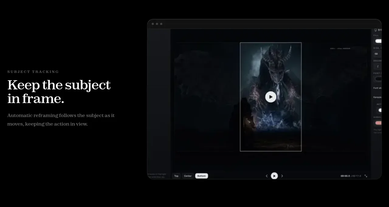
A third feature band returns to text on the left and a large visual on the right, emphasizing automatic framing and motion-aware behavior.
Prompt preview
## Reference images

Study these alongside the description below: hierarchy, rhythm, spacing, colour. Build for the product you are asked about, using this design language.

- Component: https://kage-design-assets.t3.tigrisfiles.io/components/s-roll/31ce67c8-e756-4d99-81ee-7a5fcf910ca7-1789711386-5.webp
- Full page it was cut from: https://kage-design-assets.t3.tigrisfiles.io/screenshots/s-roll/31ce67c8-e756-4d99-81ee-7a5fcf910ca7-1789711333877-full.webp
- Component on Kage: https://kage.design/component/s-roll-feature-grid-3

## Before you start
Ask what automated or intelligent capability in the user's product needs visual demonstration. Then adapt this showcase pattern to that capability.

Create a spacious two-column feature section with editorial copy on the left and a wide product demonstration frame on the right. Include a small uppercase eyebrow, a two-line serif heading, and one concise explanatory paragraph. The preview should be a dark browser-like frame with a clear focal area and enough contrast to communicate the behavior. Use 18px rounded corners, #24252a hairline borders, very subtle outer shadow, and a black page background. Keep text width constrained to about 300px, align both columns by their visual center, and stack them on mobile without clipping the preview.

Never use logos, product names, copy, illustrations, or imagery from the reference.
More components

 AI-powered helpdesk feature section
intercom.com · Feature grid
AI-powered helpdesk feature section
intercom.com · Feature grid
 Integrations and ecosystem section
intercom.com · Feature grid
Integrations and ecosystem section
intercom.com · Feature grid
 AI agent capabilities section
intercom.com · Feature grid
AI agent capabilities section
intercom.com · Feature grid
 Unified support experience overview
intercom.com · Feature grid
Unified support experience overview
intercom.com · Feature grid

 Core invoicing capabilities
sendinvo.com · Feature grid
Core invoicing capabilities
sendinvo.com · Feature grid
 Audience and trade types
sendinvo.com · Feature grid
Audience and trade types
sendinvo.com · Feature grid