 kage
kage
saidtrace.com
Design analysis
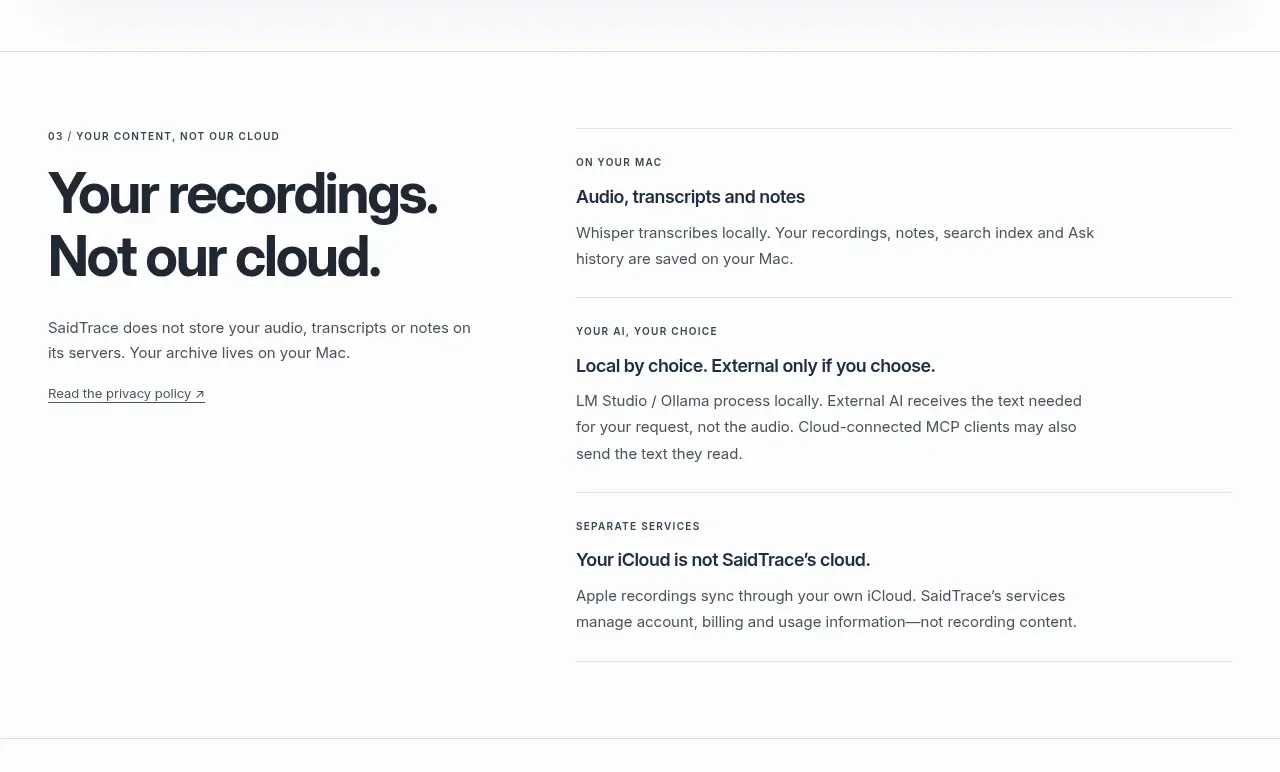
This split layout makes a strong privacy promise on the left and supports it with three compact explanatory principles on the right, separated by thin rules.
Prompt preview
## Reference images

Study these alongside the description below: hierarchy, rhythm, spacing, colour. Build for the product you are asked about, using this design language.

- Component: https://kage-design-assets.t3.tigrisfiles.io/components/saidtrace/da2a1190-1b0d-4dc6-9c61-691af1a5c9a8-1792130575-3.webp
- Full page it was cut from: https://kage-design-assets.t3.tigrisfiles.io/screenshots/saidtrace/da2a1190-1b0d-4dc6-9c61-691af1a5c9a8-1792130502177-full.webp
- Component on Kage: https://kage.design/component/saidtrace-feature-grid-2

## Before you start
Ask what the user's product and brand are, then apply the principles below to that product rather than copying the reference.

Create a two-column trust section. Place a large, assertive heading and a short privacy statement in the left column; place three vertically stacked principle rows in the right column, each with a tiny eyebrow, a concise bold subheading, and explanatory text. Let the rows be separated by 1px rules and keep the layout editorial rather than card-heavy. Use white or #fcfcfb, #20252b headings, #626b72 body copy, and a subtle brand accent for links. Use a max-width around 830px, 64–96px vertical padding, a 42–52px heading, 20–28px column gap, and 20–28px row padding. Links should underline on hover and all text should remain readable at mobile widths, where columns stack.

Never use the reference's logo, product name, copy, illustrations, or imagery.
More components

 Data-to-action engine
Salience · Feature grid
Data-to-action engine
Salience · Feature grid
 Actionable alert workflow
Salience · Feature grid
Actionable alert workflow
Salience · Feature grid
 Trust proof and core outcomes
Salience · Feature grid
Trust proof and core outcomes
Salience · Feature grid
 Three-step implementation flow
Salience · Feature grid
Three-step implementation flow
Salience · Feature grid
 What analytics misses
Salience · Feature grid
What analytics misses
Salience · Feature grid

 Workflow features and capabilities
CrewTower Mod for Claude Code · Feature grid
Workflow features and capabilities
CrewTower Mod for Claude Code · Feature grid