 kage
kage
saidtrace.com
Design analysis
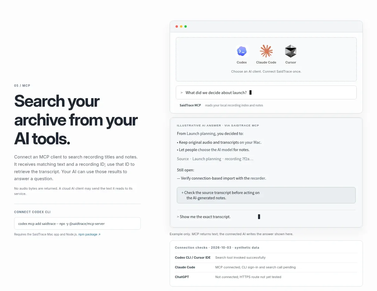
A technical feature section combines an integration-focused headline and setup snippet with a large simulated client conversation and connection-status panel.
Prompt preview
## Reference images

Study these alongside the description below: hierarchy, rhythm, spacing, colour. Build for the product you are asked about, using this design language.

- Component: https://kage-design-assets.t3.tigrisfiles.io/components/saidtrace/da2a1190-1b0d-4dc6-9c61-691af1a5c9a8-1792130576-6.webp
- Full page it was cut from: https://kage-design-assets.t3.tigrisfiles.io/screenshots/saidtrace/da2a1190-1b0d-4dc6-9c61-691af1a5c9a8-1792130502177-full.webp
- Component on Kage: https://kage.design/component/saidtrace-feature-grid-3

## Before you start
Ask what the user's product and brand are, then apply the principles below to that product rather than copying the reference.

Build a technical integration section in two columns. The left side needs an eyebrow, a large multi-line heading, explanatory copy, a compact install or setup command field, and a small note about data flow. The right side should be a polished browser-like demo: a top strip of selectable AI clients, a prompt field, an answer panel with bullets, a highlighted source excerpt, and a lower connection-check table. Use a white page with a pale #f4f6f7 demo surface, #dfe3e5 borders, 10–14px radii, charcoal #20252b, and muted #697178. Use tiny monospace text for commands/statuses, 13–15px UI text, and one vivid but controlled accent for active client state. Keep browser chrome subtle, preserve generous spacing, and make tabs, prompt input, and status rows keyboard accessible. Stack the demo beneath the copy on mobile.

Never use the reference's logo, product name, copy, illustrations, or imagery.
More components

 Data-to-action engine
Salience · Feature grid
Data-to-action engine
Salience · Feature grid
 Actionable alert workflow
Salience · Feature grid
Actionable alert workflow
Salience · Feature grid
 Trust proof and core outcomes
Salience · Feature grid
Trust proof and core outcomes
Salience · Feature grid
 Three-step implementation flow
Salience · Feature grid
Three-step implementation flow
Salience · Feature grid
 What analytics misses
Salience · Feature grid
What analytics misses
Salience · Feature grid

 Workflow features and capabilities
CrewTower Mod for Claude Code · Feature grid
Workflow features and capabilities
CrewTower Mod for Claude Code · Feature grid