 kage
kage
asksapien.ai
Design analysis
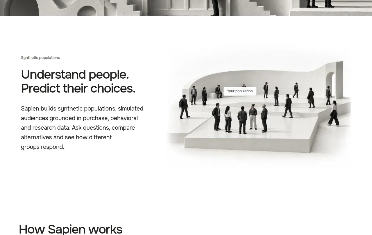
A left-aligned statement explains the value of simulated audiences while a large pale visual on the right makes the abstract idea tangible.
Prompt preview
## Reference images

Study these alongside the description below: hierarchy, rhythm, spacing, colour. Build for the product you are asked about, using this design language.

- Component: https://kage-design-assets.t3.tigrisfiles.io/components/sapien/bf276bc9-8a7f-4325-84fe-38ac6dd29868-1791093738-2.webp
- Full page it was cut from: https://kage-design-assets.t3.tigrisfiles.io/screenshots/sapien/bf276bc9-8a7f-4325-84fe-38ac6dd29868-1791093700749-full.webp
- Component on Kage: https://kage.design/component/sapien-feature-grid

## Before you start
Ask what concept the user's product needs to explain, what evidence supports it, and which audience needs the explanation. Apply the layout logic to that product.

Build a two-column explanatory section on white or #fbfbf8. Align a compact eyebrow, bold two-line heading, and readable body copy in the left column, with a large soft-edged conceptual visual in the right column. Use a 48/52 or 45/55 split, vertically center the text against the visual, and leave substantial whitespace around both. Typography should use a 30–36px heading, 16px body text, and muted gray #686864 for supporting copy. Keep imagery low-contrast, mostly neutral, and contained within the grid without a heavy card border. Stack columns on mobile, putting the explanation before the visual.

Never: use logos, product names, copy, illustrations, or imagery from the reference.
More components

 Three-step process cards
godaylight.com · Feature grid
Three-step process cards
godaylight.com · Feature grid

 Use-case selector with vertical video preview
Spira Maxima · Feature grid
Use-case selector with vertical video preview
Spira Maxima · Feature grid

 Insights and enterprise model access
FastRouter.ai · Feature grid
Insights and enterprise model access
FastRouter.ai · Feature grid
 Solutions by organizational role
FastRouter.ai · Feature grid
Solutions by organizational role
FastRouter.ai · Feature grid
 Routing reliability and model collaboration
FastRouter.ai · Feature grid
Routing reliability and model collaboration
FastRouter.ai · Feature grid
 Goal-oriented product capabilities
FastRouter.ai · Feature grid
Goal-oriented product capabilities
FastRouter.ai · Feature grid