 kage
kage
asksapien.ai
Design analysis
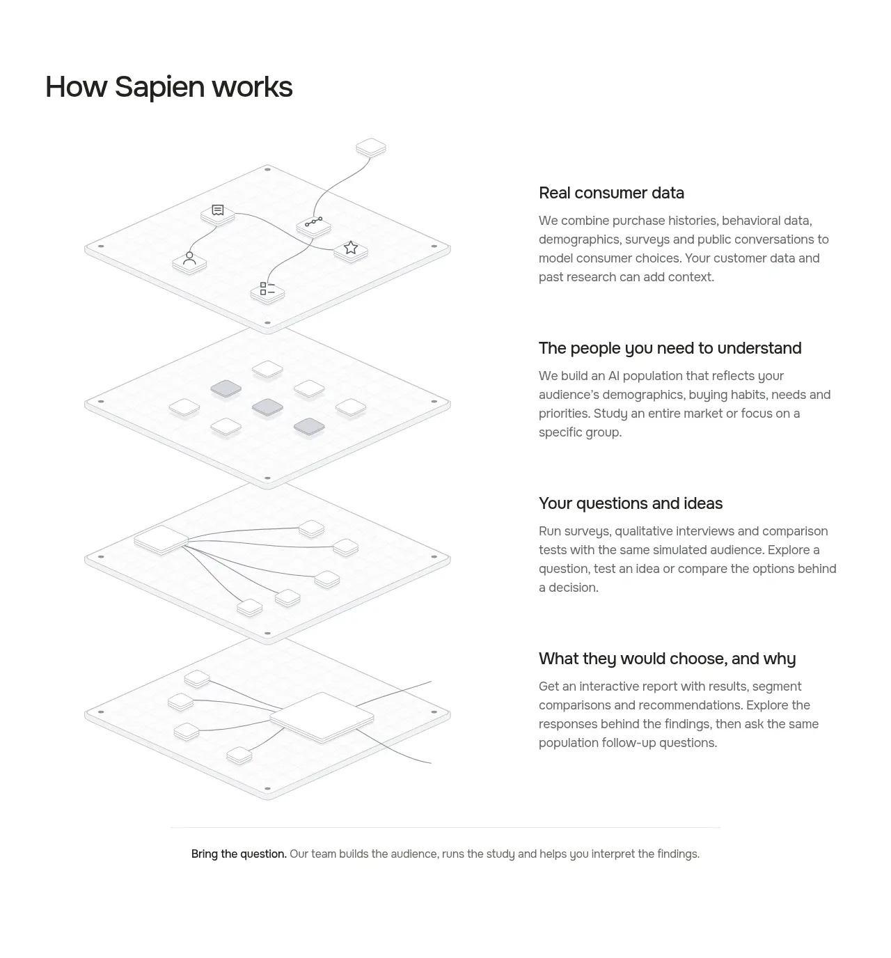
A process section pairs a strong heading with four vertically sequenced explanatory rows, each balancing a diagrammatic layer against concise text.
Prompt preview
## Reference images

Study these alongside the description below: hierarchy, rhythm, spacing, colour. Build for the product you are asked about, using this design language.

- Component: https://kage-design-assets.t3.tigrisfiles.io/components/sapien/bf276bc9-8a7f-4325-84fe-38ac6dd29868-1791093738-3.webp
- Full page it was cut from: https://kage-design-assets.t3.tigrisfiles.io/screenshots/sapien/bf276bc9-8a7f-4325-84fe-38ac6dd29868-1791093700749-full.webp
- Component on Kage: https://kage.design/component/sapien-feature-grid-2

## Before you start
Ask what the user's product workflow is, how many meaningful stages it has, and what each stage helps the user accomplish. Apply the same clarity-first structure to that workflow.

Create a spacious process section with a heading at the top and four vertically ordered rows. Use a two-column grid: a light technical diagram or abstract system illustration on the left and a text block on the right. Each row should have a concise 20–22px title and a 15–16px muted description. Let the rows breathe with 72–110px vertical spacing and subtle alignment guides or dividers where useful. Use white #ffffff, near-black #1d1d1b, gray #6d6d68, and very pale gray linework #e2e2dc. Preserve a sense of progression through repeated visual framing, not loud colors. On mobile, stack each visual above its text and reduce row spacing.

Never: use logos, product names, copy, illustrations, or imagery from the reference.
More components

 Three-step process cards
godaylight.com · Feature grid
Three-step process cards
godaylight.com · Feature grid

 Use-case selector with vertical video preview
Spira Maxima · Feature grid
Use-case selector with vertical video preview
Spira Maxima · Feature grid

 Insights and enterprise model access
FastRouter.ai · Feature grid
Insights and enterprise model access
FastRouter.ai · Feature grid
 Solutions by organizational role
FastRouter.ai · Feature grid
Solutions by organizational role
FastRouter.ai · Feature grid
 Routing reliability and model collaboration
FastRouter.ai · Feature grid
Routing reliability and model collaboration
FastRouter.ai · Feature grid
 Goal-oriented product capabilities
FastRouter.ai · Feature grid
Goal-oriented product capabilities
FastRouter.ai · Feature grid