 kage
kage
asksapien.ai
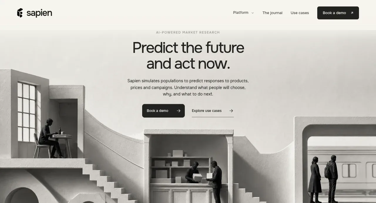
Design analysis
A centered promise-led headline and supporting copy sit above two actions, while a monochrome architectural scene creates a strong visual base.
Prompt preview
## Reference images

Study these alongside the description below: hierarchy, rhythm, spacing, colour. Build for the product you are asked about, using this design language.

- Component: https://kage-design-assets.t3.tigrisfiles.io/components/sapien/bf276bc9-8a7f-4325-84fe-38ac6dd29868-1791093737-1.webp
- Full page it was cut from: https://kage-design-assets.t3.tigrisfiles.io/screenshots/sapien/bf276bc9-8a7f-4325-84fe-38ac6dd29868-1791093700749-full.webp
- Component on Kage: https://kage.design/component/sapien-hero

## Before you start
Ask what the user's product is, what outcome it promises, who the audience is, and what brand tone it should use. Apply these principles to that product.

Create a tall hero directly beneath the navigation. Use a pale warm-gray background #f1f1ed and center a small uppercase eyebrow, a large two-line headline around 38–44px with tight line height, and a concise 16px supporting paragraph. Place a filled dark primary button beside a text-based secondary link with an arrow. Anchor a wide, high-impact monochrome or desaturated visual along the lower portion of the hero, allowing it to span nearly the full viewport width while preserving readable text above. Use restrained borders, 6–8px button radius, and generous vertical whitespace. The visual should feel architectural and editorial rather than decorative. On smaller screens, stack the actions and crop the visual below the copy.

Never: use logos, product names, copy, illustrations, or imagery from the reference.
More components
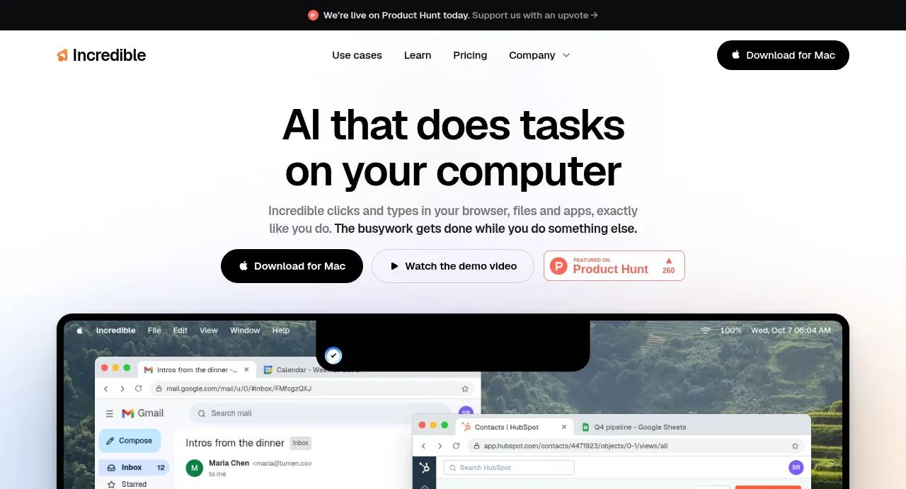
 AI workflow hero
Incredible · Hero
AI workflow hero
Incredible · Hero
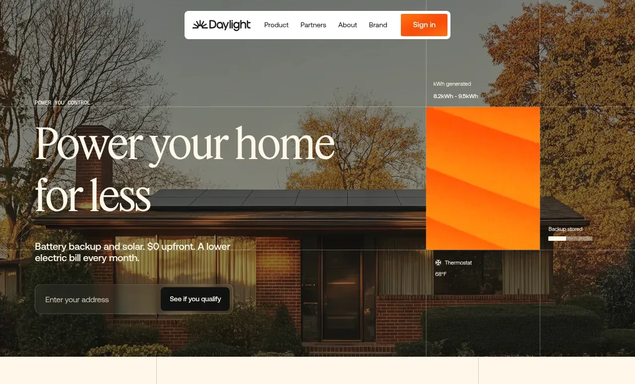
 Photographic power-home hero
godaylight.com · Hero
Photographic power-home hero
godaylight.com · Hero
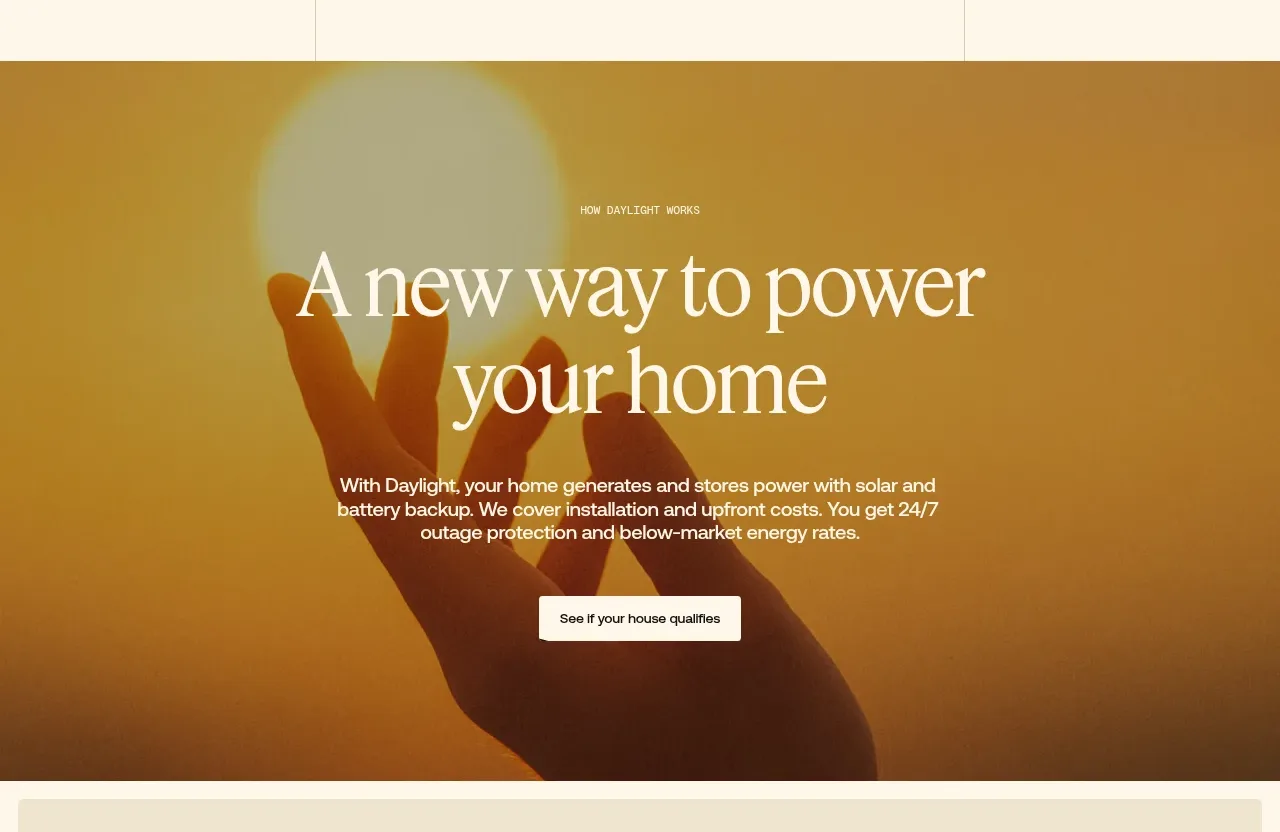 Warm mission statement panel
godaylight.com · Hero
Warm mission statement panel
godaylight.com · Hero
 Grid problem statement
godaylight.com · Hero
Grid problem statement
godaylight.com · Hero
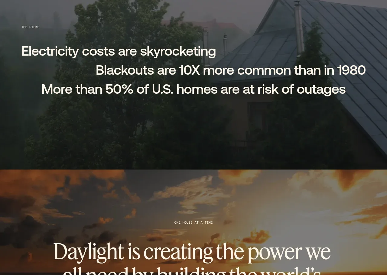 Decentralized energy statement
godaylight.com · Hero
Decentralized energy statement
godaylight.com · Hero
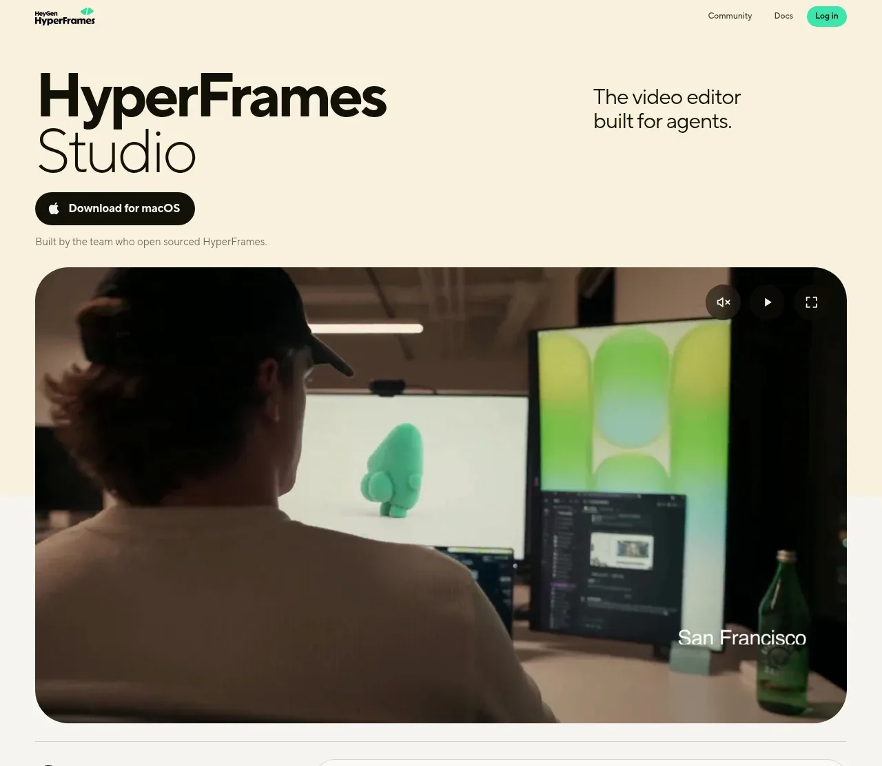
 Product hero with download action and video
HyperFrames Studio (Desktop) · Hero
Product hero with download action and video
HyperFrames Studio (Desktop) · Hero