 kage
kage
scalebrowser.net
Design analysis
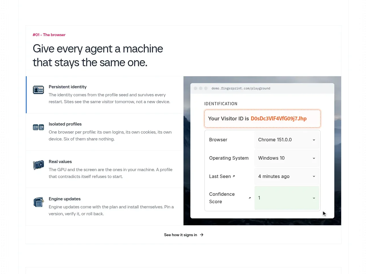
The first product capability band pairs a numbered eyebrow and strong heading with a vertical list of benefits and a large UI illustration, making the feature concrete.
Prompt preview
## Reference images

Study these alongside the description below: hierarchy, rhythm, spacing, colour. Build for the product you are asked about, using this design language.

- Component: https://kage-design-assets.t3.tigrisfiles.io/components/scalebrowser/2a4622f4-ebe3-4b20-ac5d-aef2ae1302c9-1792216897-4.webp
- Full page it was cut from: https://kage-design-assets.t3.tigrisfiles.io/screenshots/scalebrowser/2a4622f4-ebe3-4b20-ac5d-aef2ae1302c9-1792216866183-full.webp
- Component on Kage: https://kage.design/component/scalebrowser-feature-grid

## Before you start
Ask what foundational capability of the user's product should be explained first, what proof it needs, and what product UI can demonstrate it. Build around that answer.

Create a bordered feature panel with a small coloured eyebrow, a two-line heading, and a two-column lower area. Put four concise benefit rows on the left; each row has a small custom icon, bold label, and one or two lines of explanation. Highlight the active row with a thin blue left rule. Put a large product screenshot/mock UI on the right in a dark or tinted frame. Finish with a centered text link beneath the columns. Use #1769d2 for emphasis, #17202a for headings, #66717b for copy, #eef1f3 dividers, 12–16px corners, and 64px internal padding. On mobile, place the visual after the benefit list.

Never use logos, product names, copy, illustrations, or imagery from the reference.
More components

 Data-to-action engine
Salience · Feature grid
Data-to-action engine
Salience · Feature grid
 Actionable alert workflow
Salience · Feature grid
Actionable alert workflow
Salience · Feature grid
 Trust proof and core outcomes
Salience · Feature grid
Trust proof and core outcomes
Salience · Feature grid
 Three-step implementation flow
Salience · Feature grid
Three-step implementation flow
Salience · Feature grid
 What analytics misses
Salience · Feature grid
What analytics misses
Salience · Feature grid

 Workflow features and capabilities
CrewTower Mod for Claude Code · Feature grid
Workflow features and capabilities
CrewTower Mod for Claude Code · Feature grid