 kage
kage
scalebrowser.net
Design analysis
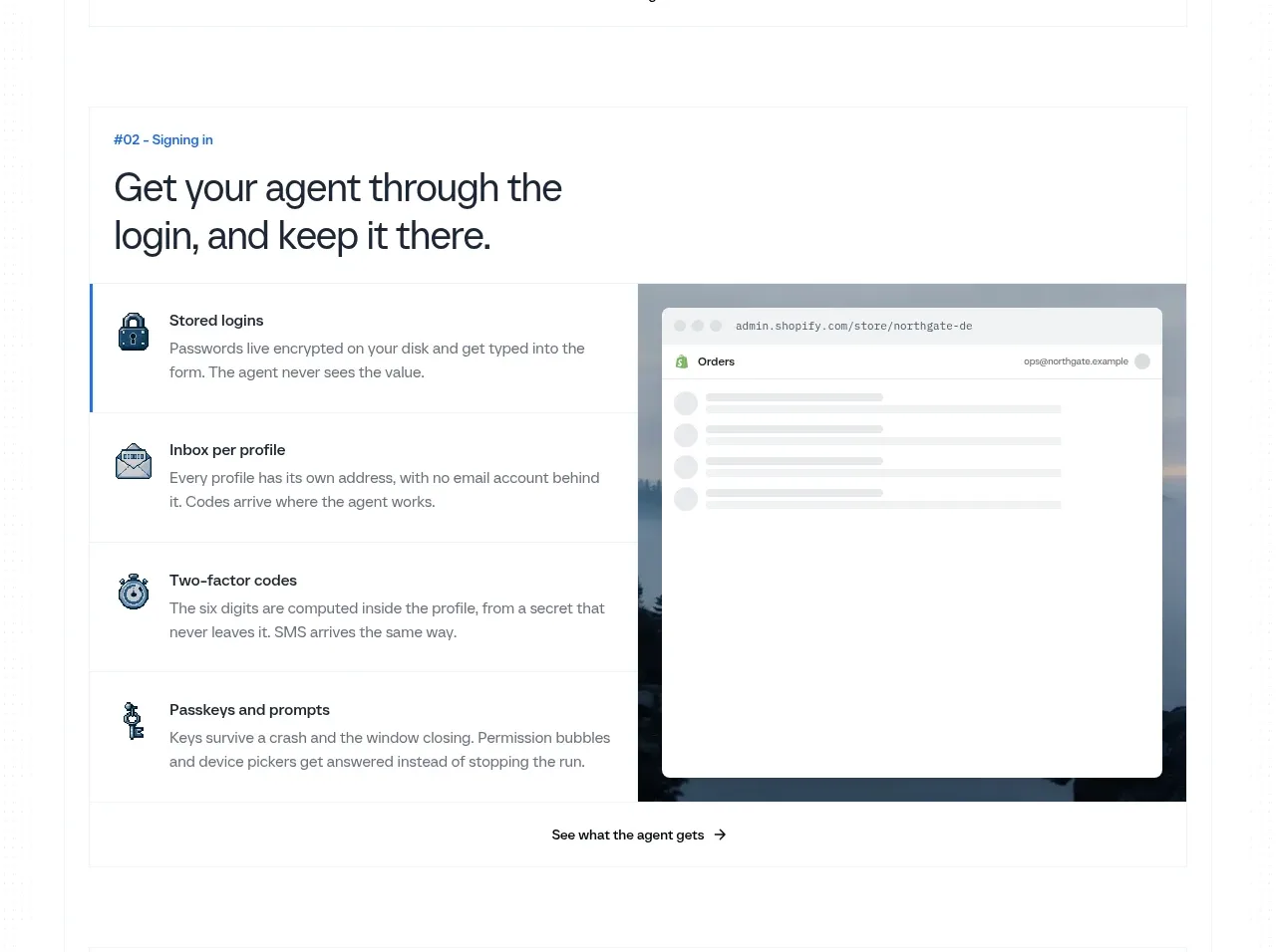
A second feature band repeats the proven split layout for a different workflow, using rows of operational benefits beside a simulated application screen.
Prompt preview
## Reference images

Study these alongside the description below: hierarchy, rhythm, spacing, colour. Build for the product you are asked about, using this design language.

- Component: https://kage-design-assets.t3.tigrisfiles.io/components/scalebrowser/2a4622f4-ebe3-4b20-ac5d-aef2ae1302c9-1792216897-5.webp
- Full page it was cut from: https://kage-design-assets.t3.tigrisfiles.io/screenshots/scalebrowser/2a4622f4-ebe3-4b20-ac5d-aef2ae1302c9-1792216866183-full.webp
- Component on Kage: https://kage.design/component/scalebrowser-feature-grid-2

## Before you start
Ask which recurring workflow your product makes safer or easier, and what screen would best prove that claim. Use that workflow as the content source.

Build a second feature panel using a consistent numbered eyebrow, bold two-line heading, four stacked benefit rows, and a right-side application mockup. Keep the structure familiar but vary the UI state so the section communicates a new capability. Use a clean white surface, #f1f3f4 rules, dark #17202a headings, #626d77 body text, and a restrained #1a70d5 active indicator. Give rows at least 52px vertical room and make the screenshot feel like a real interface with browser chrome, not a generic rectangle. Add one centered follow-up link at the bottom and stack responsively.

Never use logos, product names, copy, illustrations, or imagery from the reference.
More components

 Data-to-action engine
Salience · Feature grid
Data-to-action engine
Salience · Feature grid
 Actionable alert workflow
Salience · Feature grid
Actionable alert workflow
Salience · Feature grid
 Trust proof and core outcomes
Salience · Feature grid
Trust proof and core outcomes
Salience · Feature grid
 Three-step implementation flow
Salience · Feature grid
Three-step implementation flow
Salience · Feature grid
 What analytics misses
Salience · Feature grid
What analytics misses
Salience · Feature grid

 Workflow features and capabilities
CrewTower Mod for Claude Code · Feature grid
Workflow features and capabilities
CrewTower Mod for Claude Code · Feature grid