 kage
kage
sendinvo.com

Design analysis
A dark, high-contrast band communicates broad relevance through a simple list of customer categories. The large stacked type creates rhythm without requiring illustrations or cards.
Prompt preview
## Reference images

Study these alongside the description below: hierarchy, rhythm, spacing, colour. Build for the product you are asked about, using this design language.

- Component: https://kage-design-assets.t3.tigrisfiles.io/components/sendinvo-com/4a31d5e4-cfef-4553-9e1a-9dbc27d89a1a-1789890399-2.webp
- Full page it was cut from: https://kage-design-assets.t3.tigrisfiles.io/screenshots/sendinvo-com/4a31d5e4-cfef-4553-9e1a-9dbc27d89a1a-1789890376670-full.webp
- Component on Kage: https://kage.design/component/sendinvo-feature-grid

## Before you start
Ask what kinds of customers or use cases the user's product supports and which brand colours should anchor the section. Translate the principle into original categories and copy.

Build a dark audience-led section that answers “who is this for?” with a small introductory label and a large vertical list of customer types, industries, or workflows. Use a deep warm near-black background around `#160A03` or a product-appropriate equivalent, white text around `#F5F3EF`, and one blue accent around `#6B91E8` for the final broad category or link. Place the content in a two-column desktop composition: a narrow label column and a wide list column, inside a centered max-width container. Set the list in large 40–52px sans-serif type with tight line-height and modest row spacing; keep the label smaller and muted. Provide generous top and bottom padding, preserve strong contrast, and make the accent item look interactive with hover/focus treatment if it is a link. Collapse to one column on mobile while retaining the typographic scale hierarchy.

### Never
- Never reuse the reference's trade names, exact wording, product name, logo, or imagery.
- Never turn every item into a separate glossy card.
- Never sacrifice readability for oversized type.
More components

 AI-powered helpdesk feature section
intercom.com · Feature grid
AI-powered helpdesk feature section
intercom.com · Feature grid
 Integrations and ecosystem section
intercom.com · Feature grid
Integrations and ecosystem section
intercom.com · Feature grid
 AI agent capabilities section
intercom.com · Feature grid
AI agent capabilities section
intercom.com · Feature grid
 Unified support experience overview
intercom.com · Feature grid
Unified support experience overview
intercom.com · Feature grid

 Core invoicing capabilities
sendinvo.com · Feature grid
Core invoicing capabilities
sendinvo.com · Feature grid
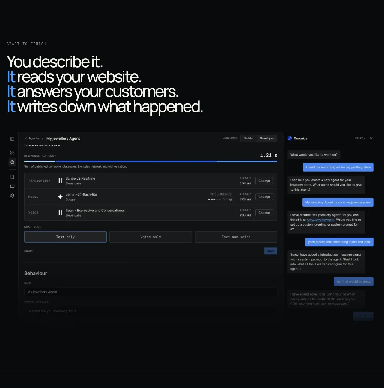
 End-to-end product workflow
Duvi · Feature grid
End-to-end product workflow
Duvi · Feature grid