kage
kage
sendinvo.com
Design analysis
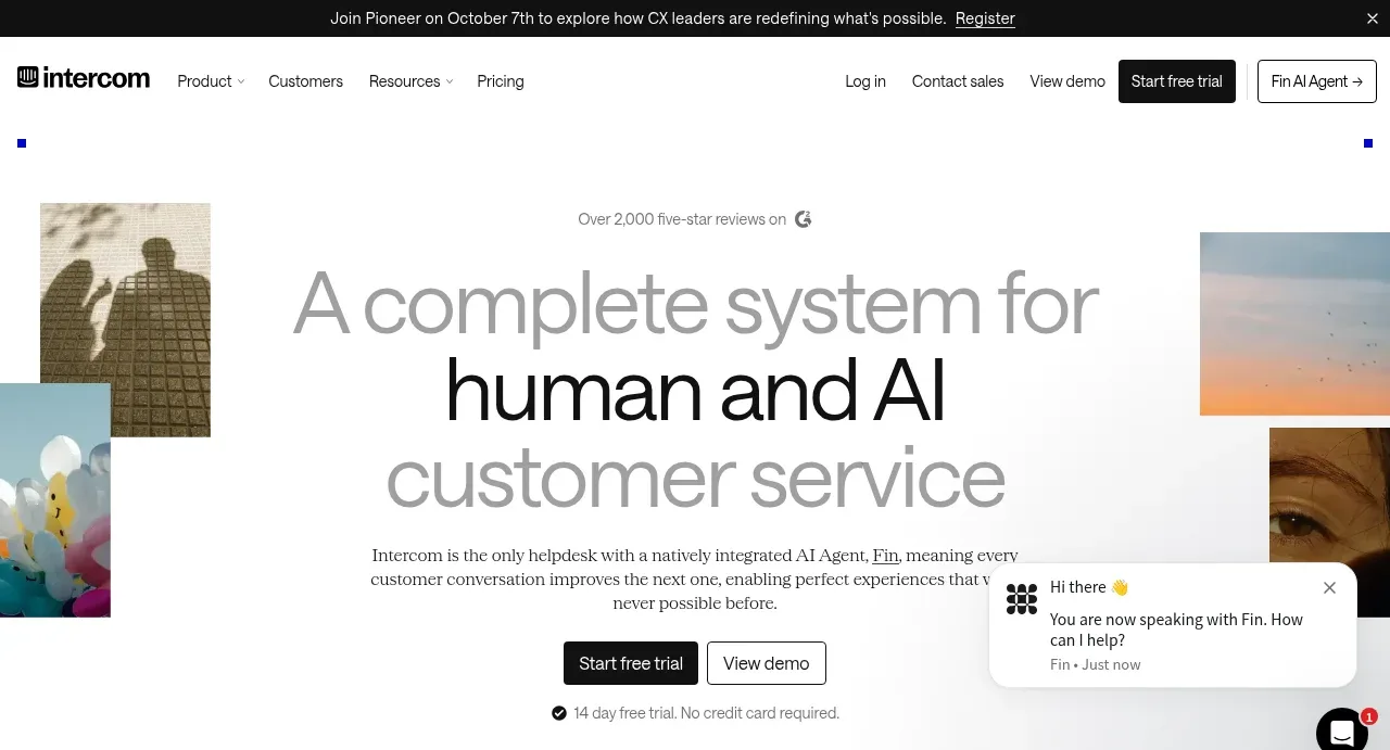
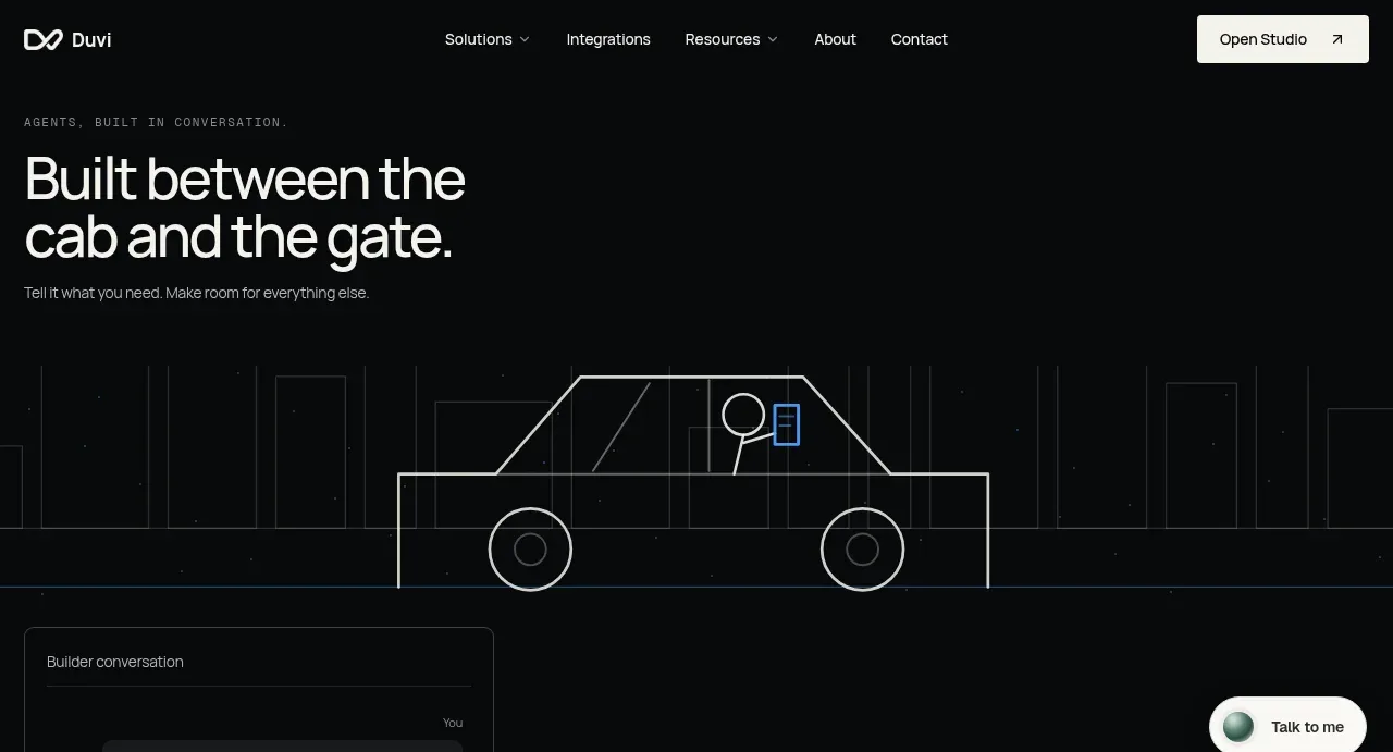
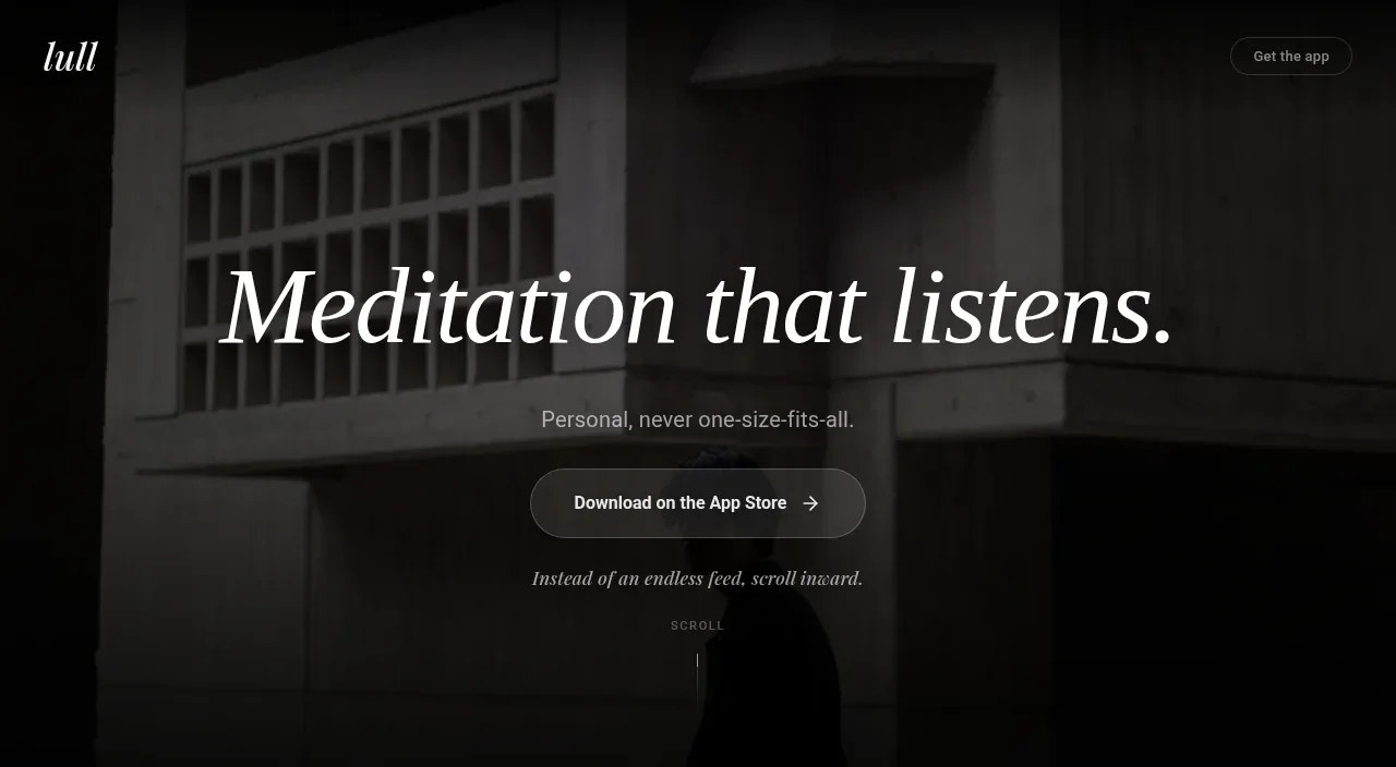
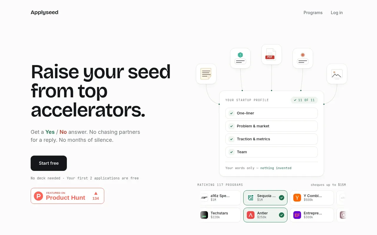
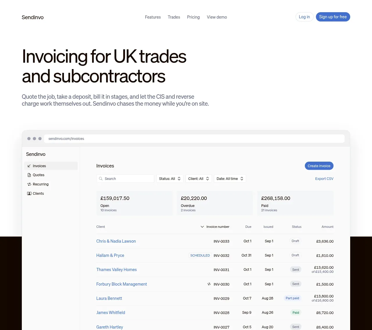
The hero uses a large, direct headline followed by a concise explanation and a substantial product interface preview. The oversized visual gives the abstract invoicing promise a concrete, credible outcome.
Prompt preview
## Reference images

Study these alongside the description below: hierarchy, rhythm, spacing, colour. Build for the product you are asked about, using this design language.

- Component: https://kage-design-assets.t3.tigrisfiles.io/components/sendinvo-com/4a31d5e4-cfef-4553-9e1a-9dbc27d89a1a-1789890398-1.webp
- Full page it was cut from: https://kage-design-assets.t3.tigrisfiles.io/screenshots/sendinvo-com/4a31d5e4-cfef-4553-9e1a-9dbc27d89a1a-1789890376670-full.webp
- Component on Kage: https://kage.design/component/sendinvo-hero

## Before you start
Ask what the user's product does, who the ideal customer is, and what brand, tone, and conversion goal should shape the hero. Apply these rules to that product and invent original content.

Create a product hero that begins directly below the navigation and combines a strong value proposition with a realistic interface preview. Align everything to a centered max-width container, with the headline in a readable left-aligned column and supporting copy beneath it; let the product screenshot or browser-like mockup extend generously below the copy as the main proof point. Use a very large sans-serif headline, roughly 44–58px on desktop with tight line height, near-black `#111111` text, and supporting text in `#626262` at 16–18px. Keep the background white or warm off-white (`#FFFFFF` / `#FAFAF8`) and use one restrained blue accent around `#4F79D9` for actions or meaningful interface states. Give the mockup a pale chrome bar, subtle `#E7E7E7` border, 12–16px radius, and a soft shadow; its internal UI should use clear hierarchy, compact rows, neutral surfaces, and restrained status colours. Leave generous vertical spacing around the heading and visual, and ensure the preview remains legible and crops gracefully on small screens.

### Never
- Never copy the reference headline, product name, interface labels, logo, illustrations, or imagery.
- Never use a generic abstract hero image when a product-specific workflow is more persuasive.
- Never add multiple competing calls to action or excessive decoration.