 kage
kage
sendinvo.com
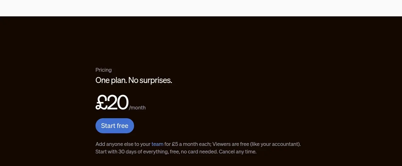
Design analysis
The pricing block is deliberately simple: one transparent plan, a prominent monthly price, a free-start action, and concise reassurance about trial and team costs. The dark background gives the conversion moment emphasis.
Prompt preview
## Reference images

Study these alongside the description below: hierarchy, rhythm, spacing, colour. Build for the product you are asked about, using this design language.

- Component: https://kage-design-assets.t3.tigrisfiles.io/components/sendinvo-com/4a31d5e4-cfef-4553-9e1a-9dbc27d89a1a-1789890400-5.webp
- Full page it was cut from: https://kage-design-assets.t3.tigrisfiles.io/screenshots/sendinvo-com/4a31d5e4-cfef-4553-9e1a-9dbc27d89a1a-1789890376670-full.webp
- Component on Kage: https://kage.design/component/sendinvo-pricing-table

## Before you start
Ask what the user's product costs, billing model, free trial or demo policy, and conversion goal are. Ask for the brand accent and write original pricing copy.

Create a focused single-plan pricing section on a deep dark background around `#160A03` with a centered max-width content area. Use a small muted eyebrow, a clear plan statement, a very large price, a compact billing suffix, and one rounded primary CTA. Set the heading in 20–24px white text, the price in 44–56px white text, supporting details in 13–15px warm grey `#B9B0AA`, and the CTA in a saturated blue around `#5B83DE` with white text and a 999px radius. Keep the plan honest and uncluttered: show only the details needed to remove purchase anxiety, such as trial length, included usage, team pricing, or cancellation. Use 56–80px vertical padding and a strong left-aligned or centered hierarchy. Include visible hover, focus, and disabled states, and make the pricing language responsive without wrapping awkwardly.

### Never
- Never use the reference's price, plan name, copy, product name, logo, or imagery.
- Never invent hidden fees or misleading “from” pricing.
- Never add multiple tiers when the product strategy calls for one clear offer.
More components
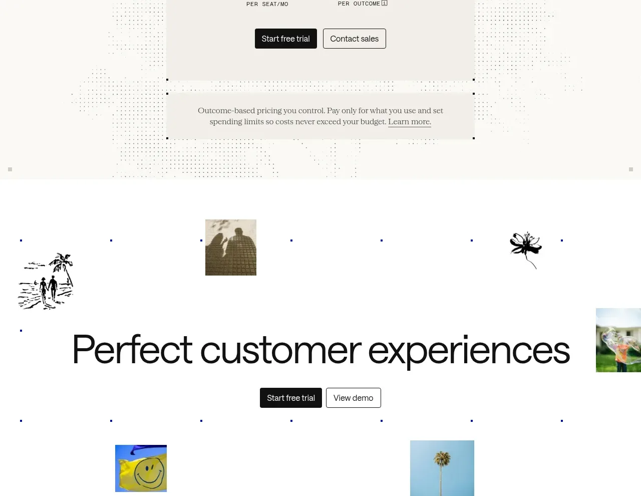
 Transparent pricing card
intercom.com · Pricing table
Transparent pricing card
intercom.com · Pricing table
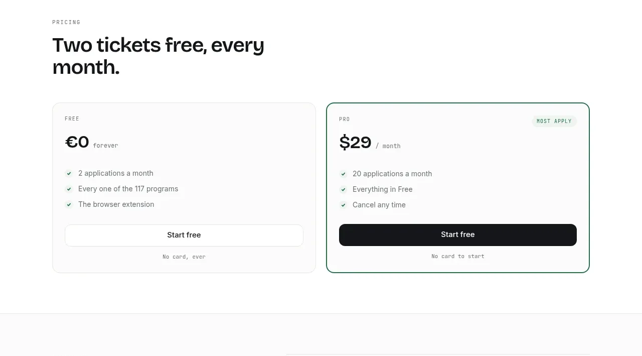
 Two-tier pricing table
ApplySeed · Pricing table
Two-tier pricing table
ApplySeed · Pricing table
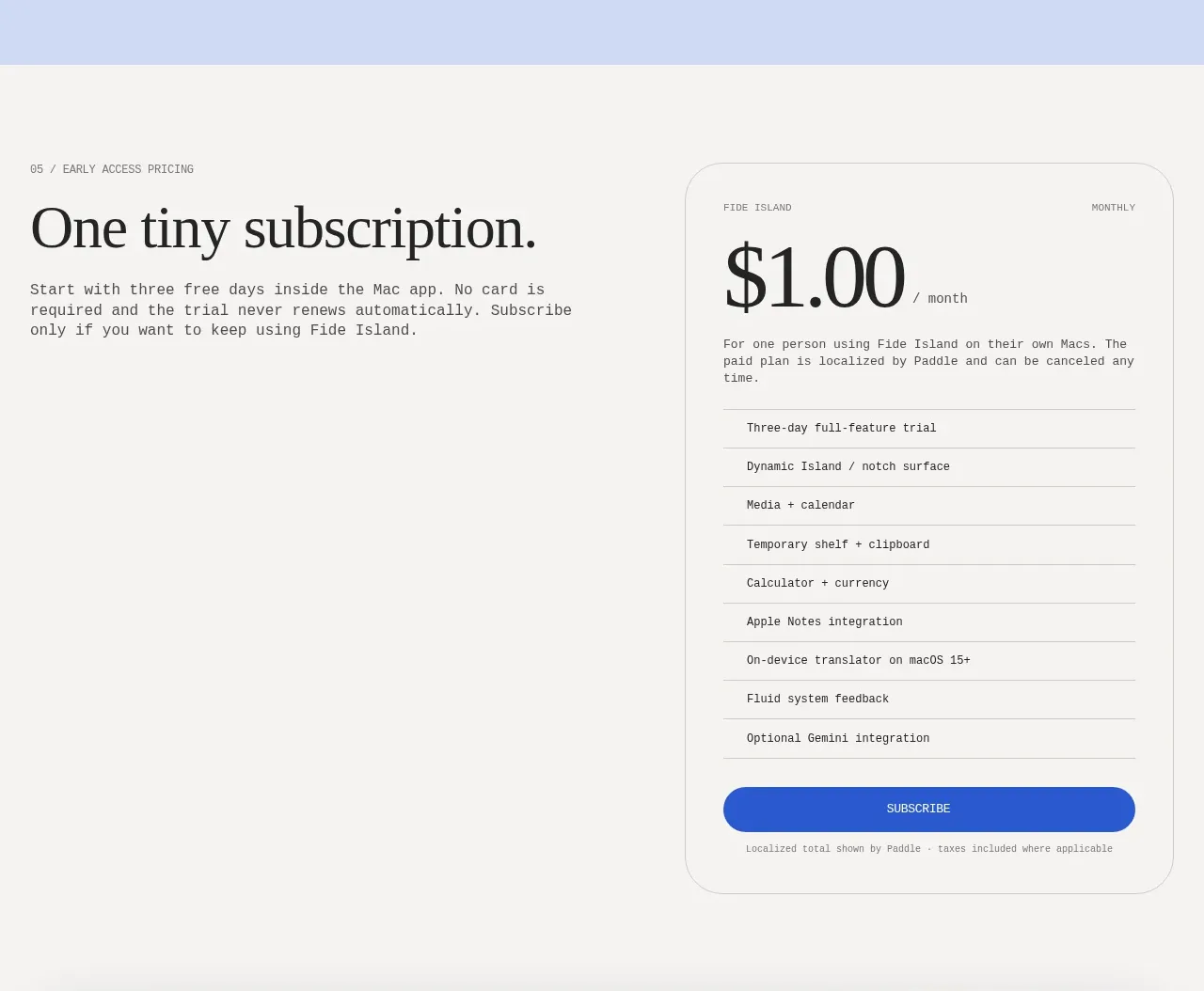
F
Single-plan early access pricing
Fide Island · Pricing table
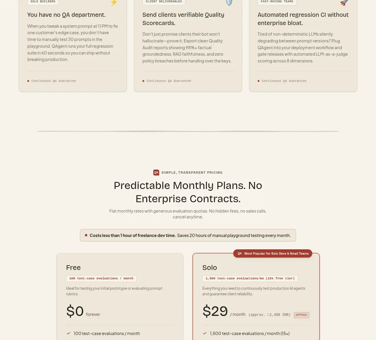
 Two-tier pricing table
QAgent · Pricing table
Two-tier pricing table
QAgent · Pricing table
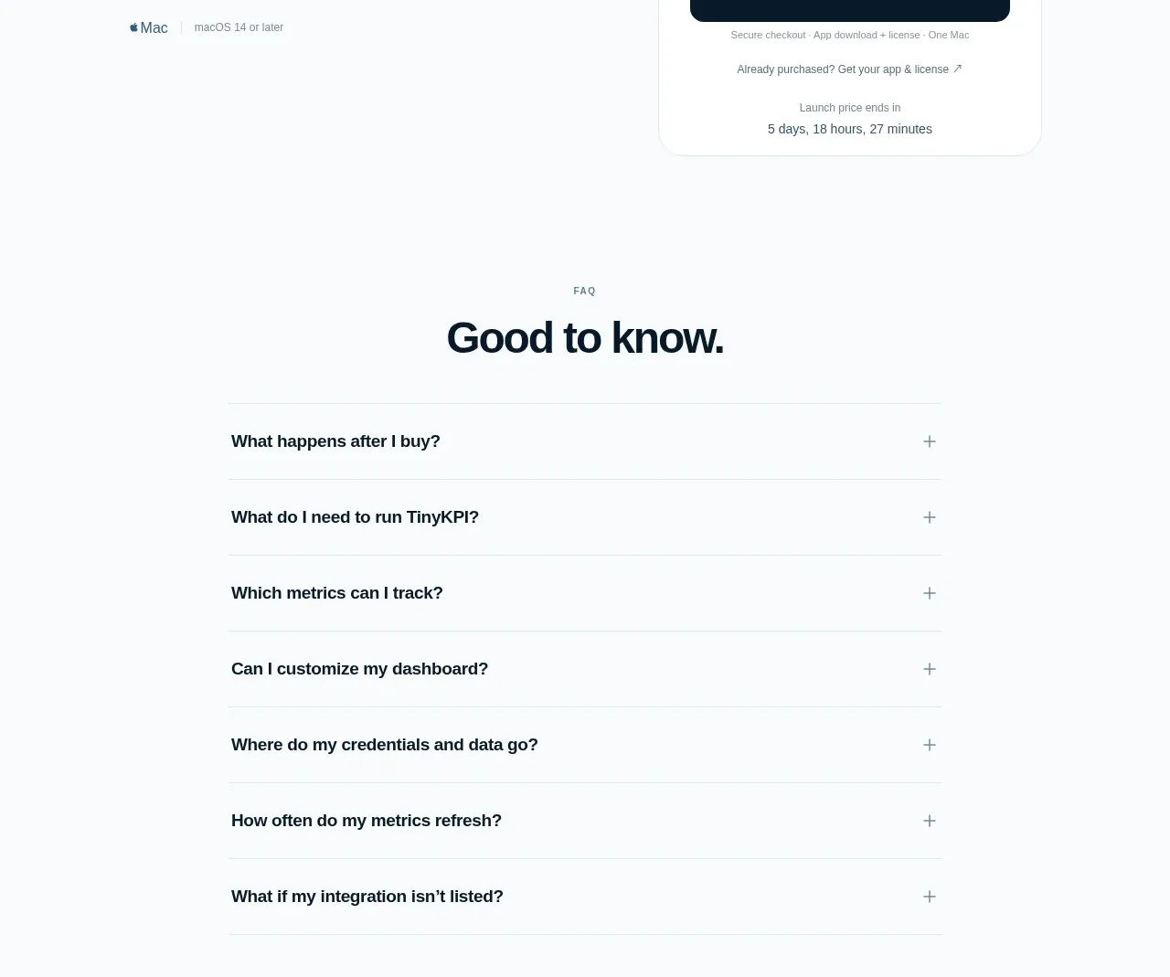
 Single launch price offer
TinyKPI · Pricing table
Single launch price offer
TinyKPI · Pricing table
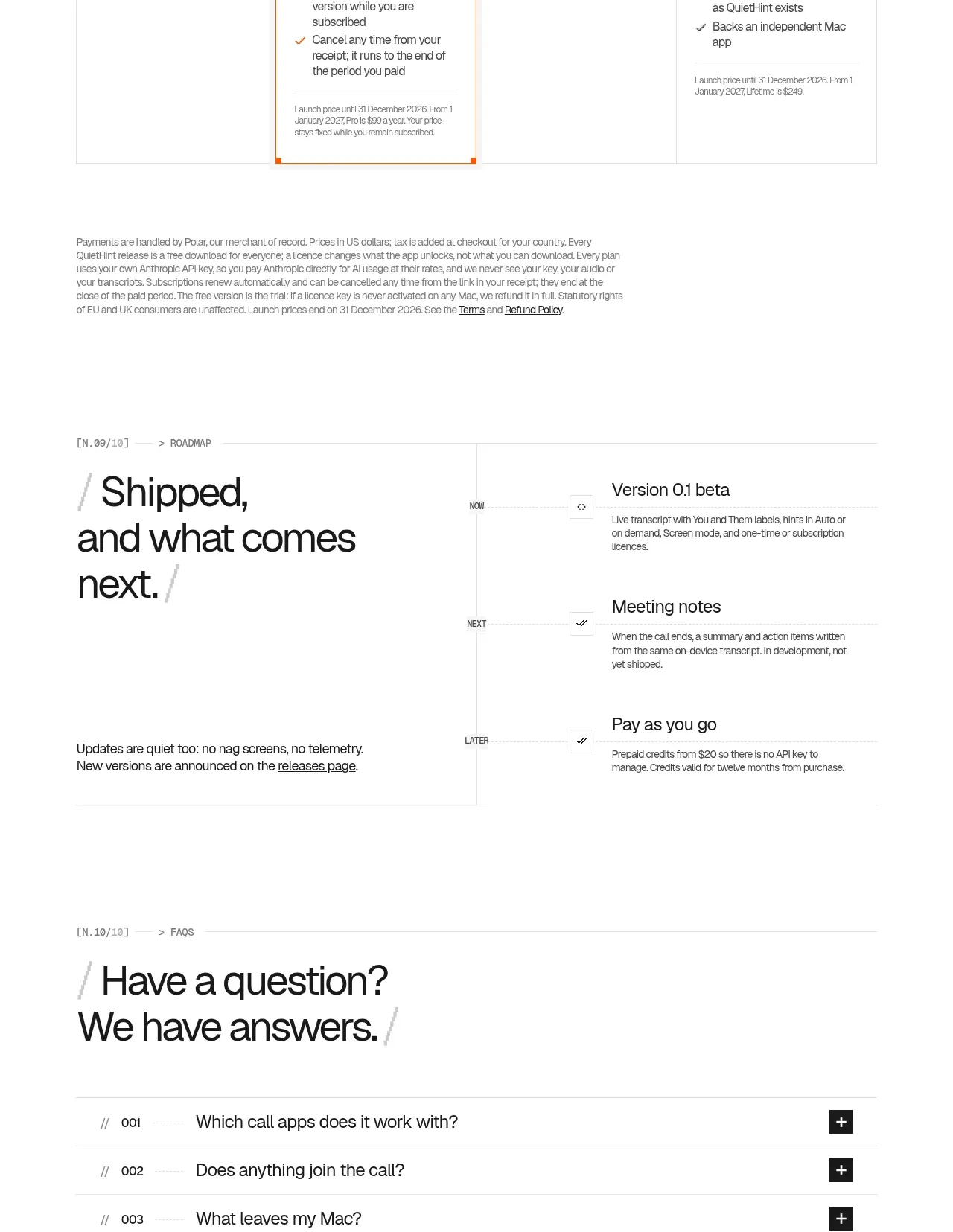
 Flexible four-plan pricing
QuietHint® · Pricing table
Flexible four-plan pricing
QuietHint® · Pricing table