 kage
kage
shi-ui.vercel.app
Design analysis
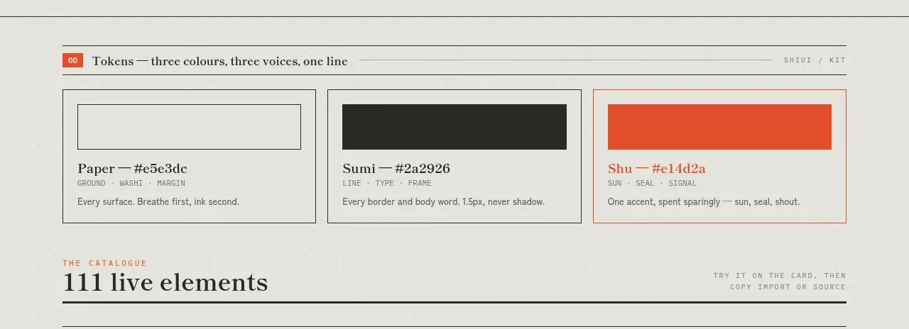
A short catalogue preface introduces the system and presents three named color/token cards, creating a bridge from the hero into the component inventory.
Prompt preview
## Reference images

Study these alongside the description below: hierarchy, rhythm, spacing, colour. Build for the product you are asked about, using this design language.

- Component: https://kage-design-assets.t3.tigrisfiles.io/components/shiui/3111a107-5e9b-4487-9176-525a4b4c448a-1789365764-2.webp
- Full page it was cut from: https://kage-design-assets.t3.tigrisfiles.io/screenshots/shiui/3111a107-5e9b-4487-9176-525a4b4c448a-1789365716423-full.webp
- Component on Kage: https://kage.design/component/shiui-feature-grid

## Before you start
Ask what the user's product and brand are, then apply the principles below to their context rather than reproducing this reference.

Build a compact token-introduction section with a numbered section heading and a three-column grid of color cards. Each card should have a large color swatch, token name, hex/value metadata, and one short usage note. Use a strict baseline grid, thin gray borders, a paper-colored background, monochrome labels, and one or two brand accents chosen for the user's product. Keep cards flat, square or 2px radius, with 14–20px padding and 10–12px labels. Make the swatches prominent and ensure the grid collapses cleanly on small screens.

Never: use logos, product names, copy, illustrations or imagery from the reference.
More components
 Surface and motion pattern library
kinetics.colorion.co · Feature grid
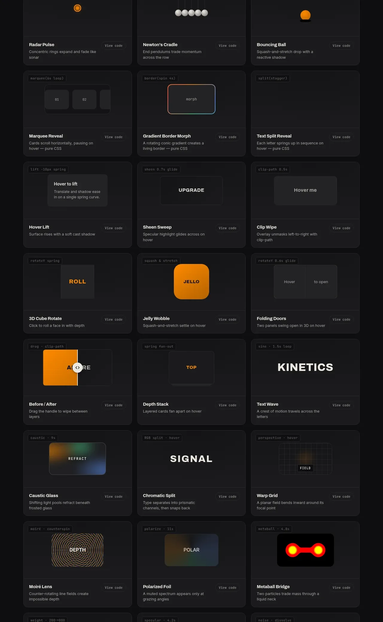
Surface and motion pattern library
kinetics.colorion.co · Feature grid
 Feedback and state pattern library
kinetics.colorion.co · Feature grid
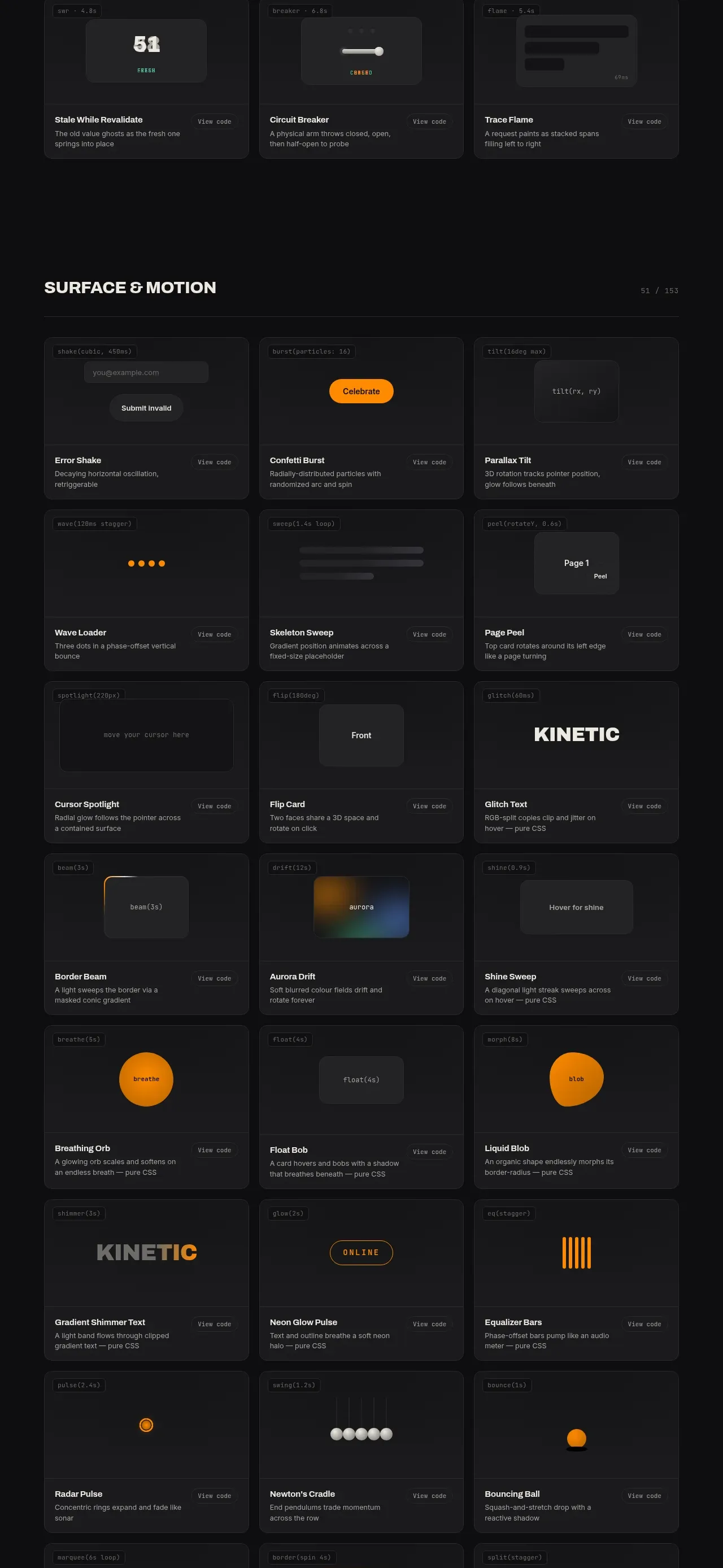
Feedback and state pattern library
kinetics.colorion.co · Feature grid
 Interaction and input pattern library
kinetics.colorion.co · Feature grid
Interaction and input pattern library
kinetics.colorion.co · Feature grid
 Feedback and state inventory
SHIUI · Feature grid
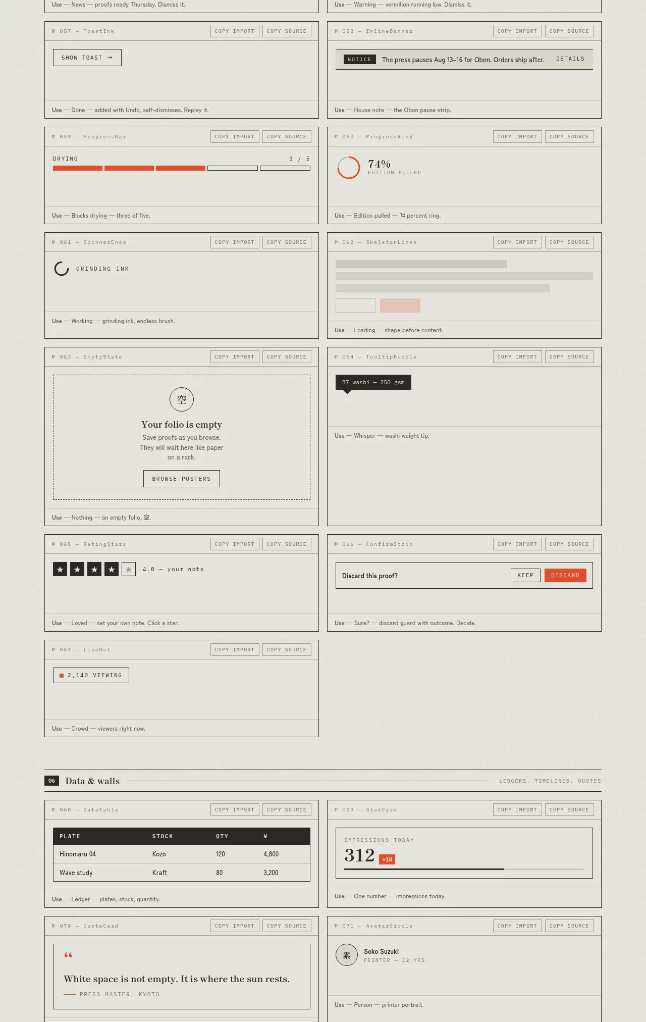
Feedback and state inventory
SHIUI · Feature grid
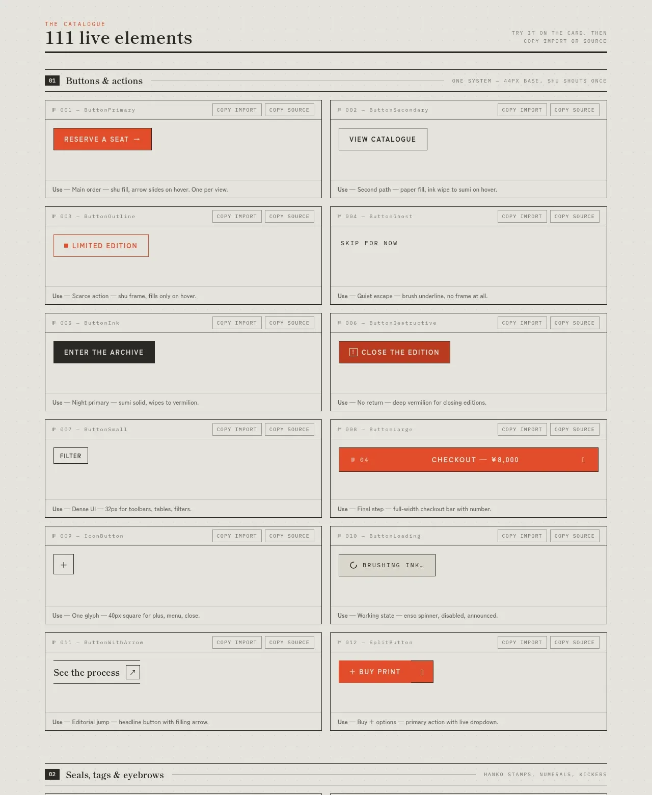 Buttons and actions inventory
SHIUI · Feature grid
Buttons and actions inventory
SHIUI · Feature grid
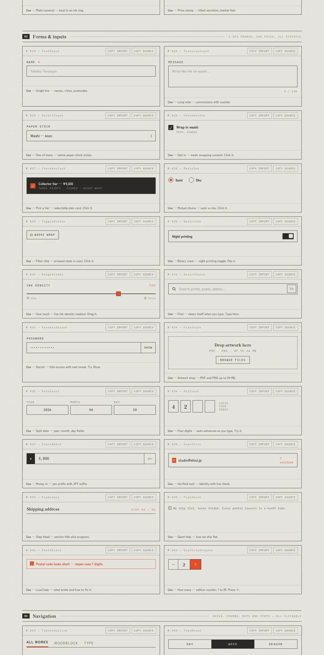 Forms and inputs inventory
SHIUI · Feature grid
Forms and inputs inventory
SHIUI · Feature grid