 kage
kage
shi-ui.vercel.app
Design analysis
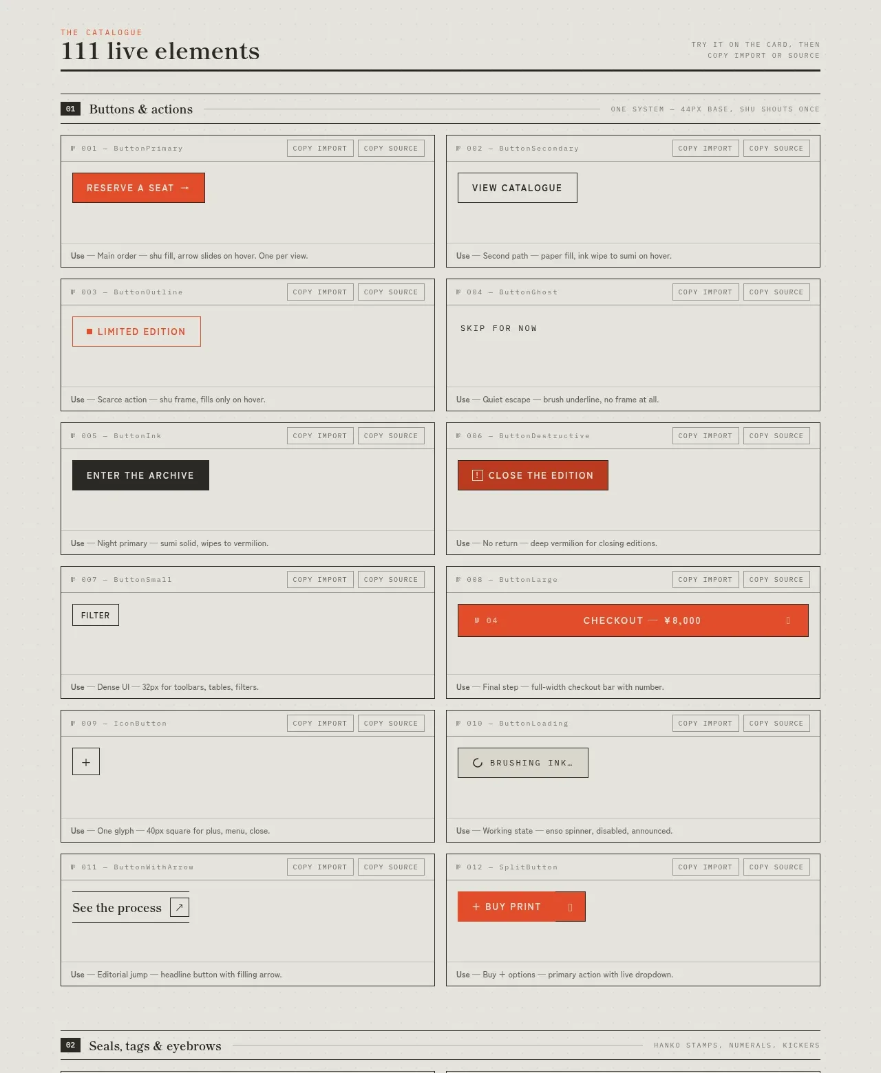
A dense two-column component inventory demonstrates many action treatments in context, with each specimen contained in a bordered card and accompanied by implementation-oriented metadata.
Prompt preview
## Reference images

Study these alongside the description below: hierarchy, rhythm, spacing, colour. Build for the product you are asked about, using this design language.

- Component: https://kage-design-assets.t3.tigrisfiles.io/components/shiui/3111a107-5e9b-4487-9176-525a4b4c448a-1789365765-3.webp
- Full page it was cut from: https://kage-design-assets.t3.tigrisfiles.io/screenshots/shiui/3111a107-5e9b-4487-9176-525a4b4c448a-1789365716423-full.webp
- Component on Kage: https://kage.design/component/shiui-feature-grid-2

## Before you start
Ask what the user's product and brand are, then apply the principles below to their context rather than reproducing this reference.

Create a catalogue section for buttons and actions. Begin with a numbered divider heading and a two-column responsive grid of specimen cards. Every card needs a small component ID/header, optional copy/export controls, a generous live-preview area, and a tiny usage note at the bottom. Demonstrate varied button hierarchy—solid primary, outlined secondary, text, dark inverse, warning, icon-only, and dropdown actions—while keeping the visual language coherent. Use off-white #e8e7e1, charcoal #292926, gray rules #aaa9a1, and a single accent near #e94d2f; use uppercase 9–10px labels, 12–14px controls, 1px borders, 0–2px radii, and consistent 12–16px card padding. Add hover, focus, disabled, and pressed states where relevant.

Never: use logos, product names, copy, illustrations or imagery from the reference.
More components
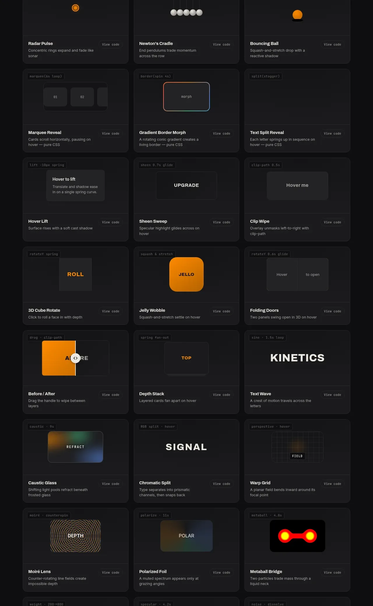
 Surface and motion pattern library
kinetics.colorion.co · Feature grid
Surface and motion pattern library
kinetics.colorion.co · Feature grid
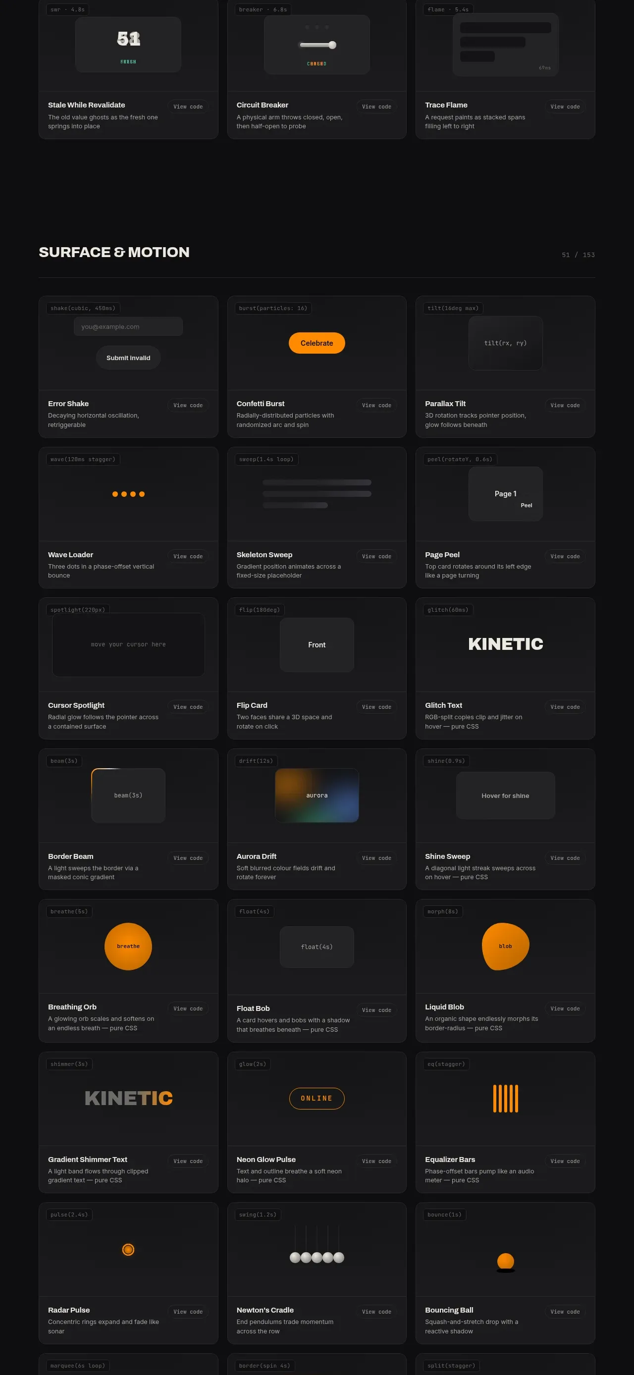 Feedback and state pattern library
kinetics.colorion.co · Feature grid
Feedback and state pattern library
kinetics.colorion.co · Feature grid
 Interaction and input pattern library
kinetics.colorion.co · Feature grid
Interaction and input pattern library
kinetics.colorion.co · Feature grid
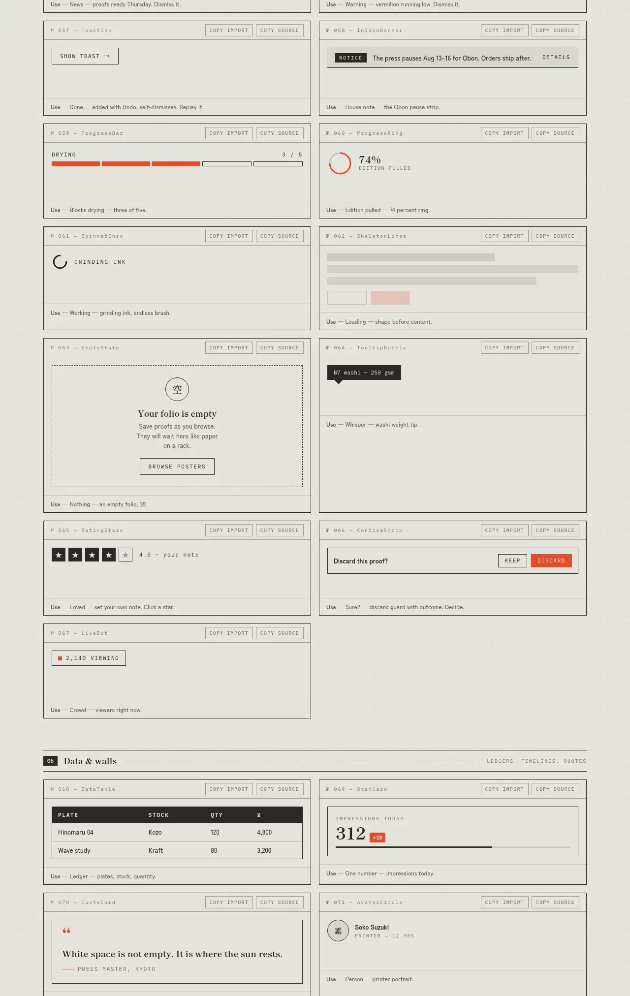
 Feedback and state inventory
SHIUI · Feature grid
Feedback and state inventory
SHIUI · Feature grid
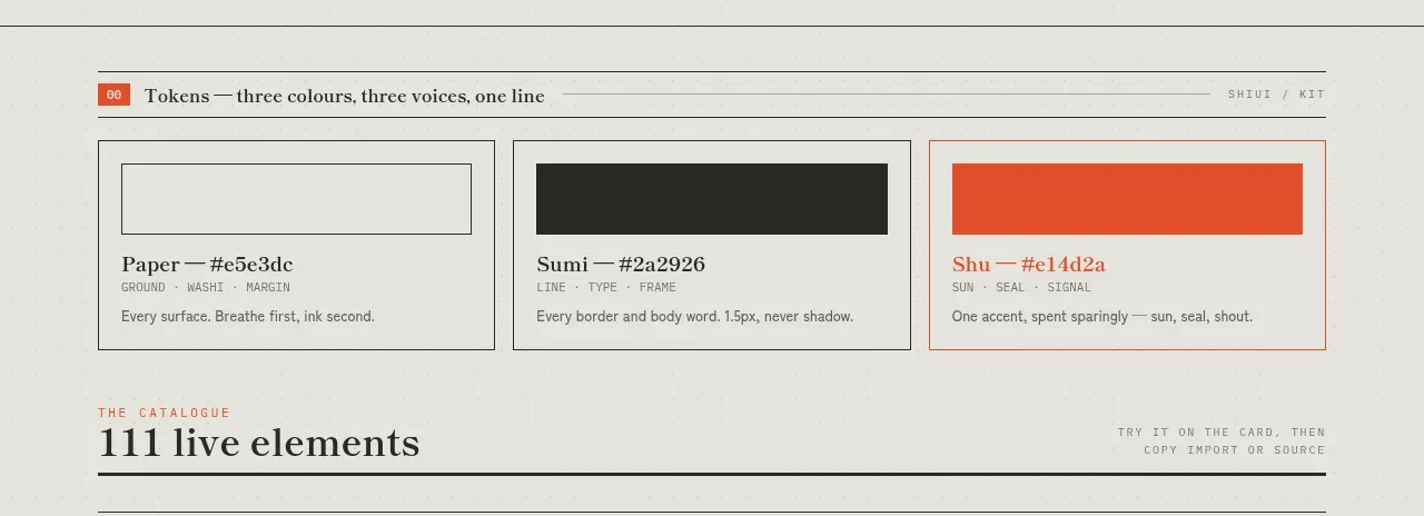 Colour and element catalogue
SHIUI · Feature grid
Colour and element catalogue
SHIUI · Feature grid
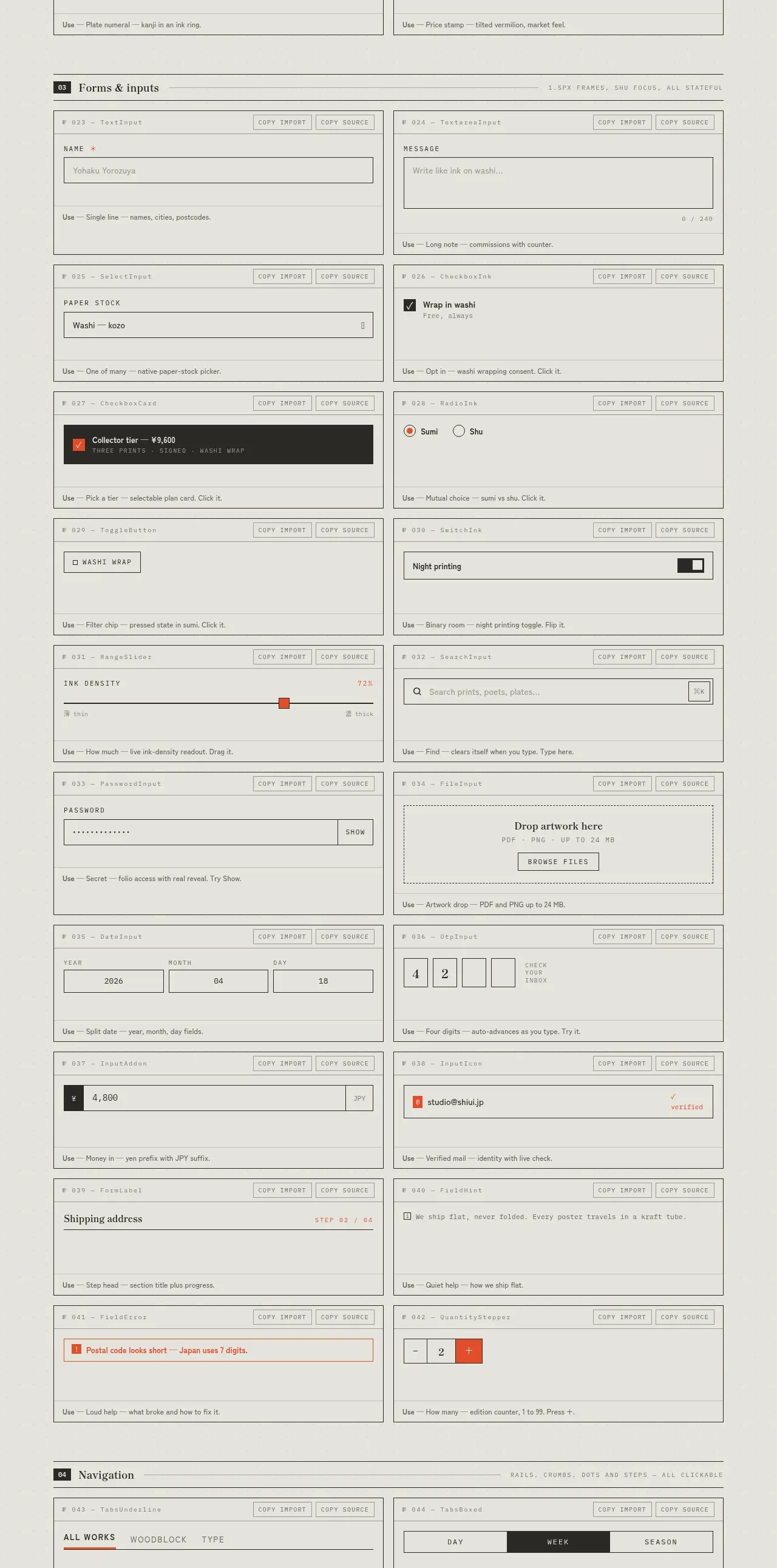 Forms and inputs inventory
SHIUI · Feature grid
Forms and inputs inventory
SHIUI · Feature grid