 kage
kage
shi-ui.vercel.app
Design analysis
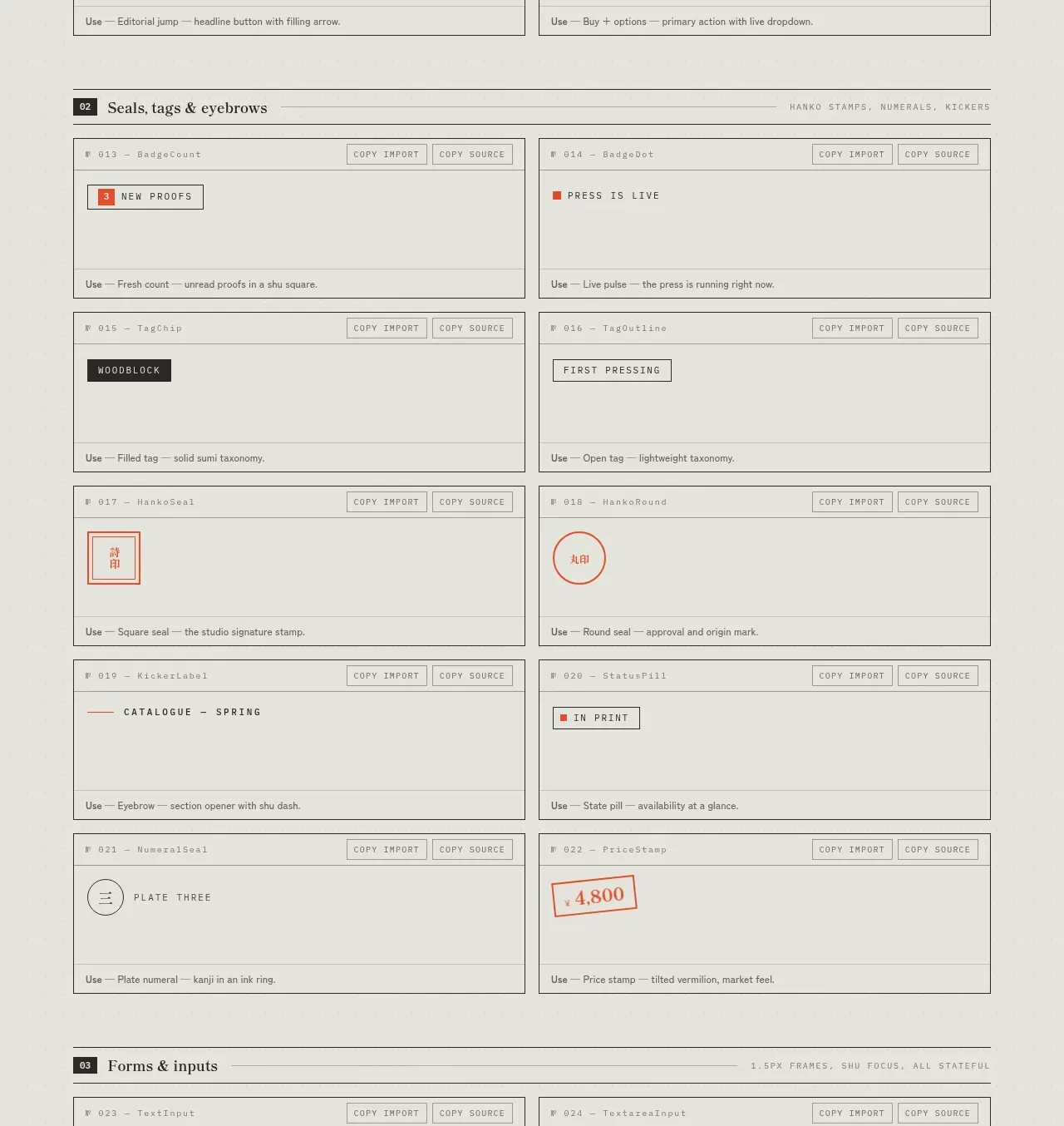
This section isolates small editorial markers and status elements, showing how stamps, tags, labels, and eyebrow treatments work as a coherent family.
Prompt preview
## Reference images

Study these alongside the description below: hierarchy, rhythm, spacing, colour. Build for the product you are asked about, using this design language.

- Component: https://kage-design-assets.t3.tigrisfiles.io/components/shiui/3111a107-5e9b-4487-9176-525a4b4c448a-1789365765-4.webp
- Full page it was cut from: https://kage-design-assets.t3.tigrisfiles.io/screenshots/shiui/3111a107-5e9b-4487-9176-525a4b4c448a-1789365716423-full.webp
- Component on Kage: https://kage.design/component/shiui-feature-grid-3

## Before you start
Ask what the user's product and brand are, then apply the principles below to their context rather than reproducing this reference.

Build a two-column catalogue grid for compact labels and metadata treatments. Use bordered specimen cards with a tiny identifier row, preview area, and usage guidance. Include tags, status pills, stamps, uppercase eyebrows, circular markers, price labels, and small typographic seals, but design them for the user's domain. Favor condensed or mono utility typography at 9–11px, high letter spacing, muted charcoal and gray, and a restrained accent color. Use 1px borders, mostly square corners, 12–16px spacing, and subtle hover/focus states. Keep the section dense but readable and make cards stack on mobile.

Never: use logos, product names, copy, illustrations or imagery from the reference.
More components
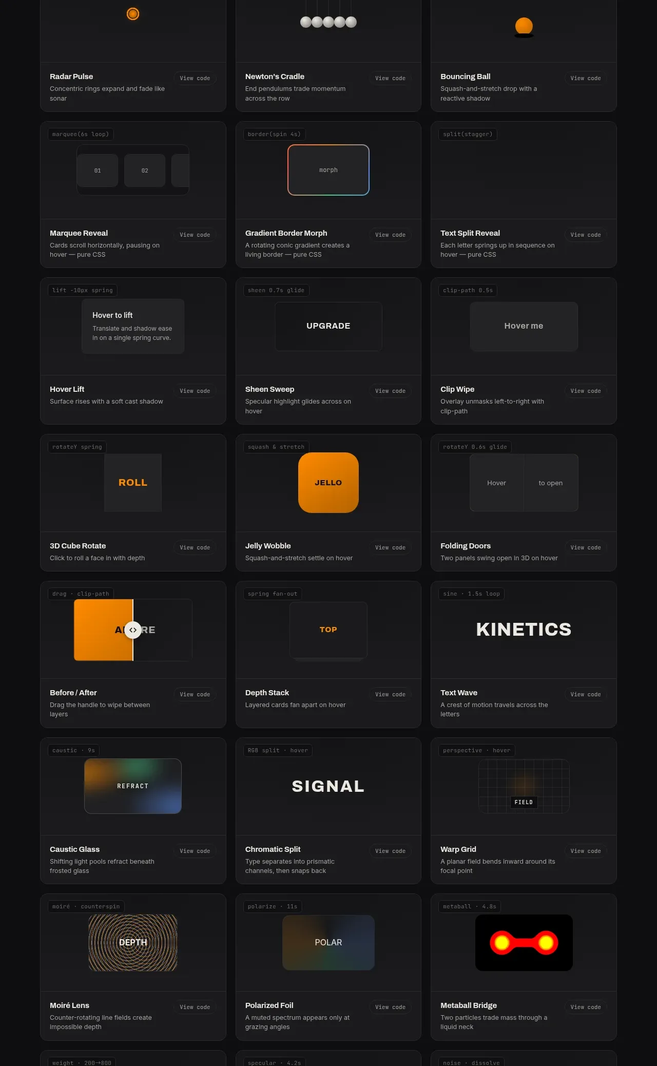
 Surface and motion pattern library
kinetics.colorion.co · Feature grid
Surface and motion pattern library
kinetics.colorion.co · Feature grid
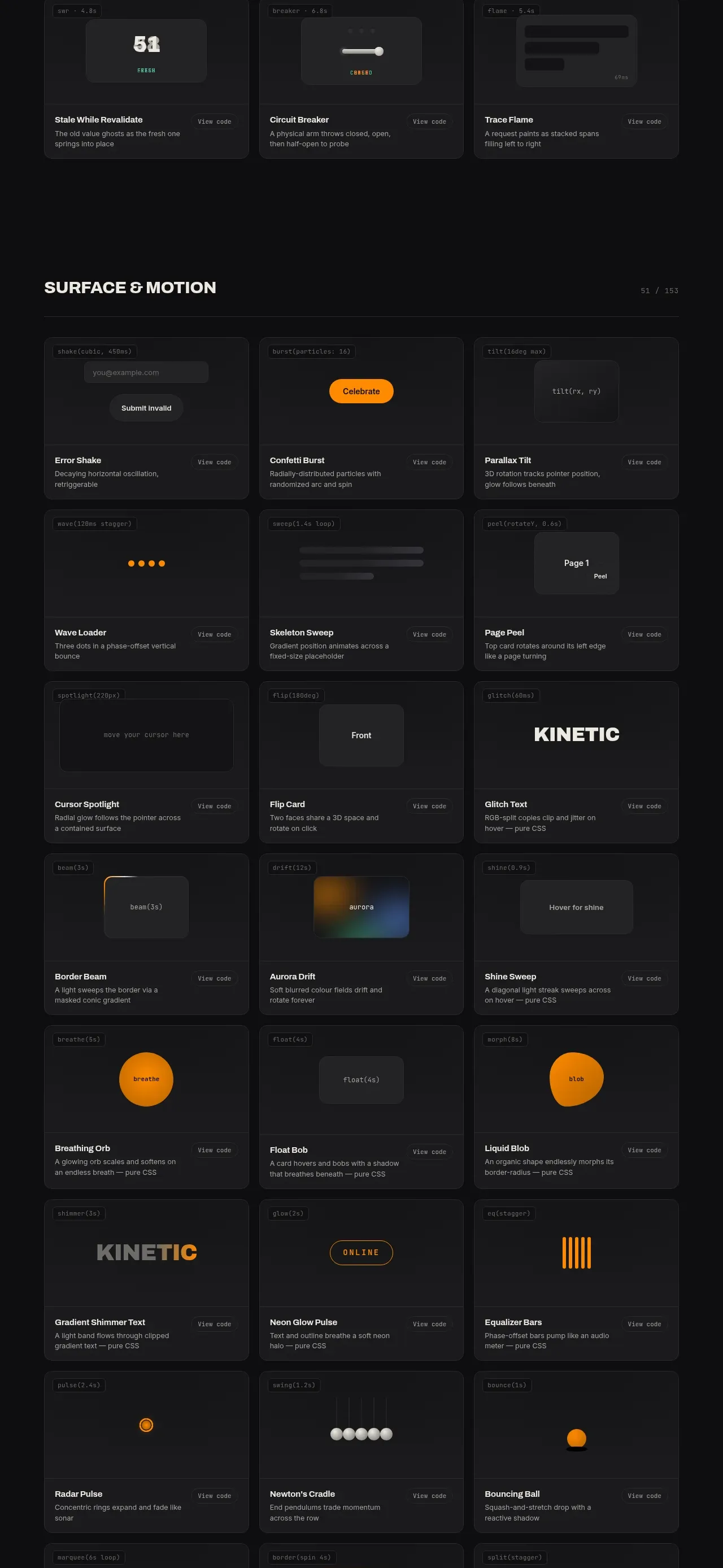 Feedback and state pattern library
kinetics.colorion.co · Feature grid
Feedback and state pattern library
kinetics.colorion.co · Feature grid
 Interaction and input pattern library
kinetics.colorion.co · Feature grid
Interaction and input pattern library
kinetics.colorion.co · Feature grid
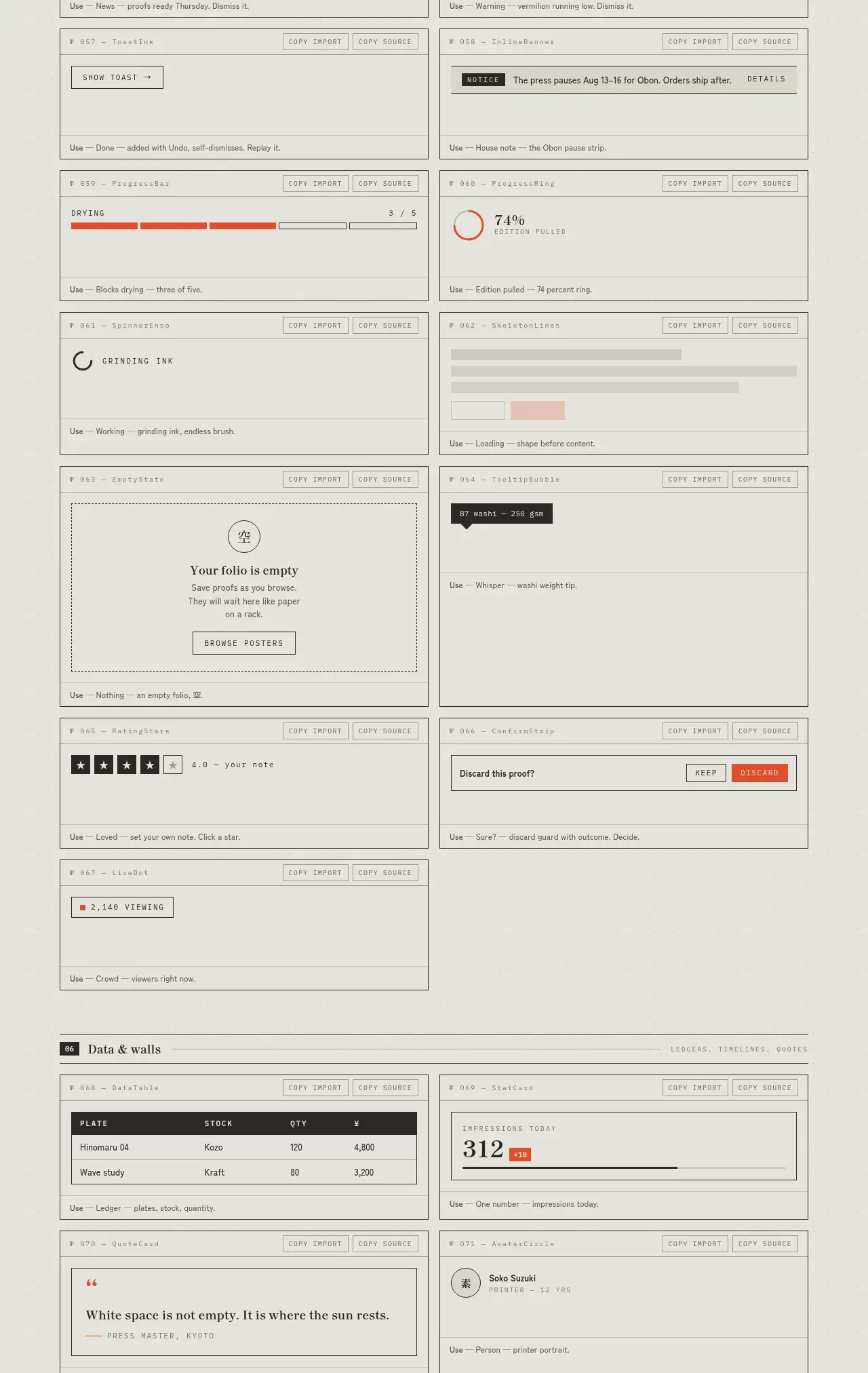
 Feedback and state inventory
SHIUI · Feature grid
Feedback and state inventory
SHIUI · Feature grid
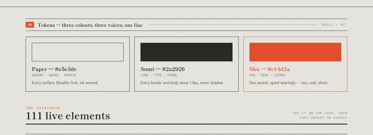 Colour and element catalogue
SHIUI · Feature grid
Colour and element catalogue
SHIUI · Feature grid
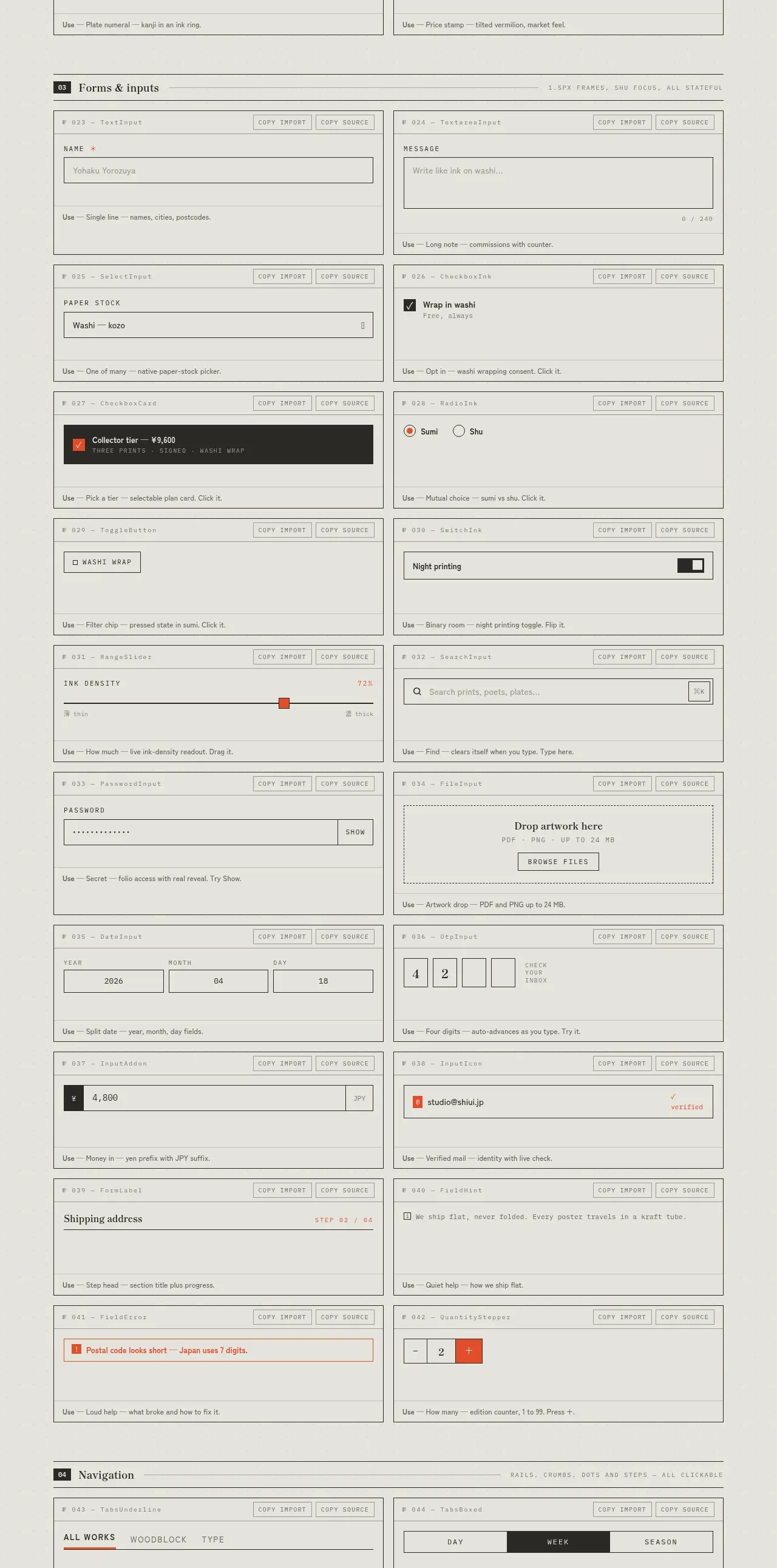 Forms and inputs inventory
SHIUI · Feature grid
Forms and inputs inventory
SHIUI · Feature grid