 kage
kage
shi-ui.vercel.app
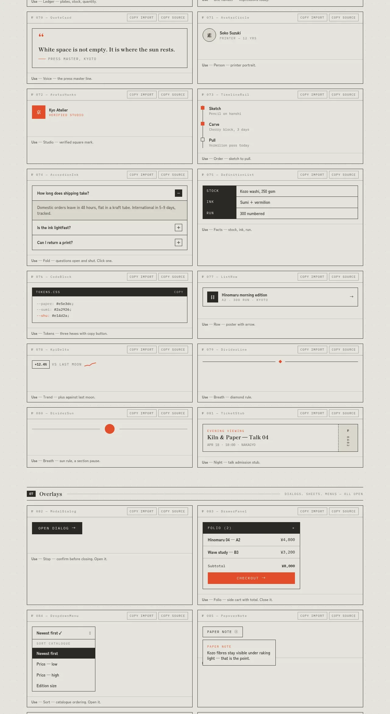
Design analysis
Data-focused specimens show tables, counters, quotes, profiles, accordions, stock-like rows, code tokens, and compact content modules in a reusable card system.
Prompt preview
## Reference images

Study these alongside the description below: hierarchy, rhythm, spacing, colour. Build for the product you are asked about, using this design language.

- Component: https://kage-design-assets.t3.tigrisfiles.io/components/shiui/3111a107-5e9b-4487-9176-525a4b4c448a-1789365767-8.webp
- Full page it was cut from: https://kage-design-assets.t3.tigrisfiles.io/screenshots/shiui/3111a107-5e9b-4487-9176-525a4b4c448a-1789365716423-full.webp
- Component on Kage: https://kage.design/component/shiui-feature-grid-7

## Before you start
Ask what the user's product and brand are, then apply the principles below to their context rather than reproducing this reference.

Build a data-and-content catalogue using two bordered columns of specimen cards. Include a compact table, headline metric, quote, profile row, checklist/steps, accordion FAQ, stock or key-value list, code/token panel, trend indicator, and editorial card. Every specimen gets a small label row, the component preview, and a usage annotation. Use a paper-toned background, charcoal type, 1px gray rules, subtle accent highlights, 10–12px metadata, and a clear 14–20px content hierarchy. Keep tables scannable, rows aligned, and dense content breathable. Add responsive table overflow, expandable accordions, and semantic markup.

Never: use logos, product names, copy, illustrations or imagery from the reference.
More components
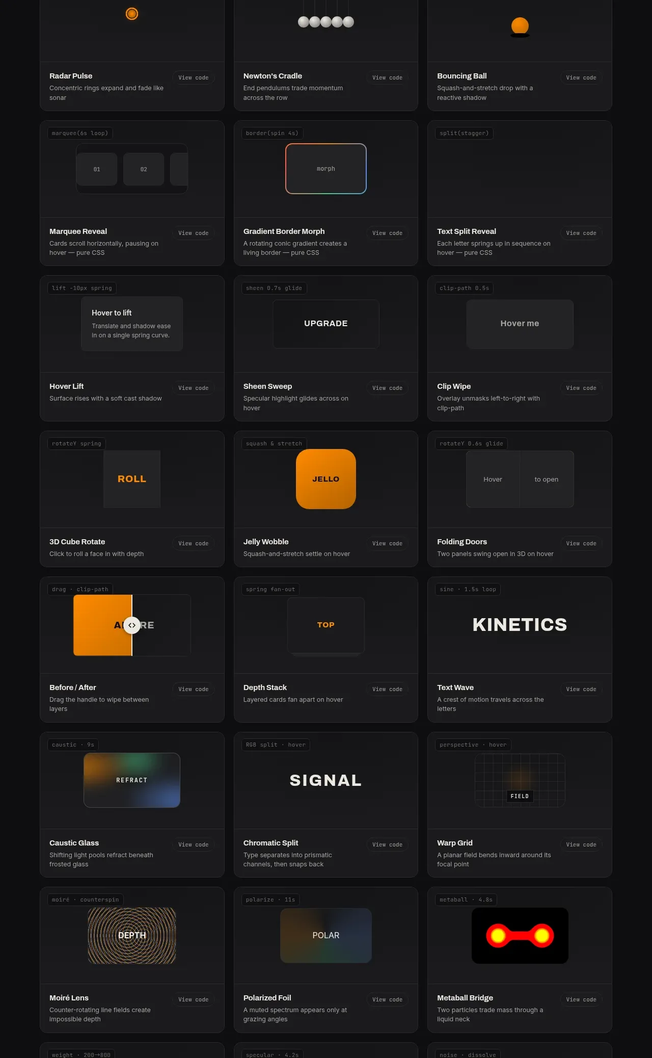
 Surface and motion pattern library
kinetics.colorion.co · Feature grid
Surface and motion pattern library
kinetics.colorion.co · Feature grid
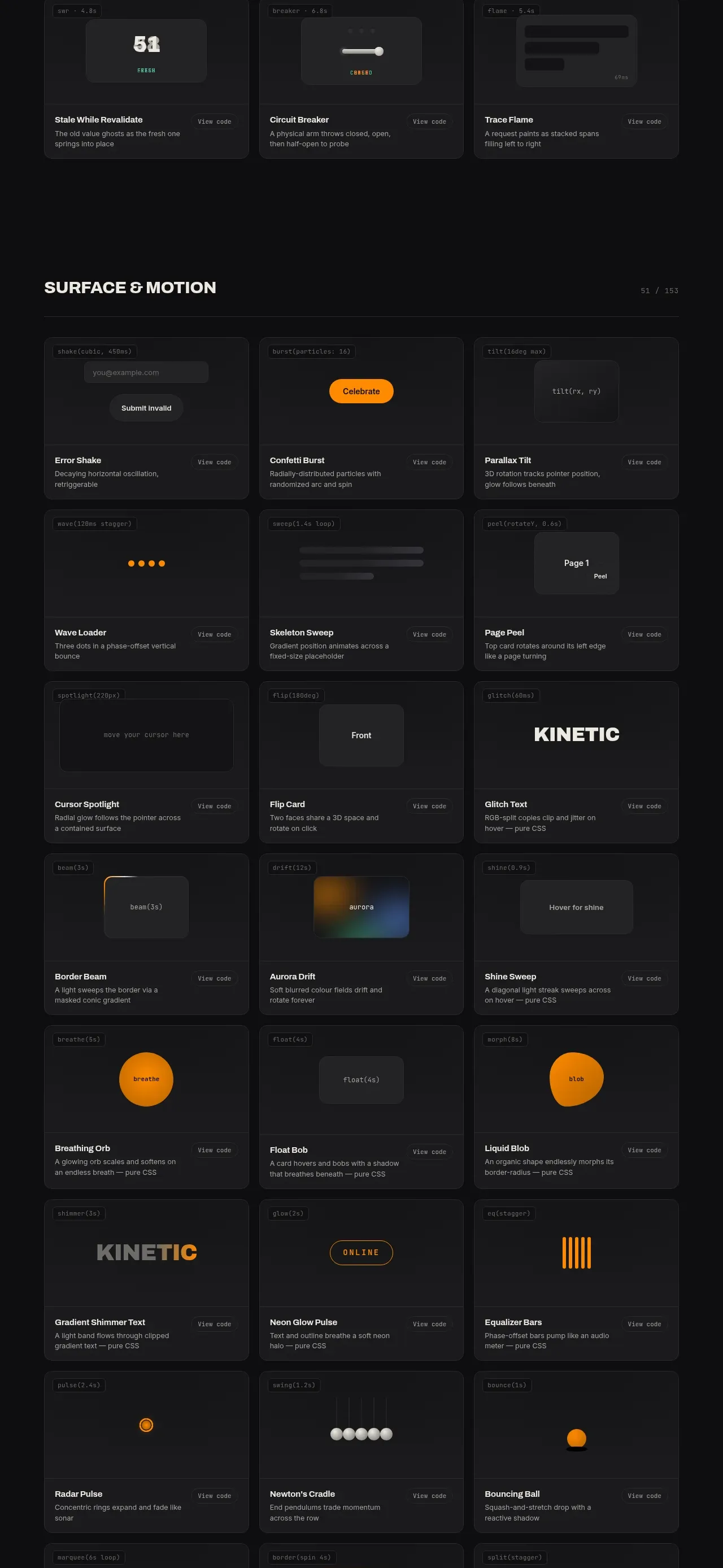 Feedback and state pattern library
kinetics.colorion.co · Feature grid
Feedback and state pattern library
kinetics.colorion.co · Feature grid
 Interaction and input pattern library
kinetics.colorion.co · Feature grid
Interaction and input pattern library
kinetics.colorion.co · Feature grid
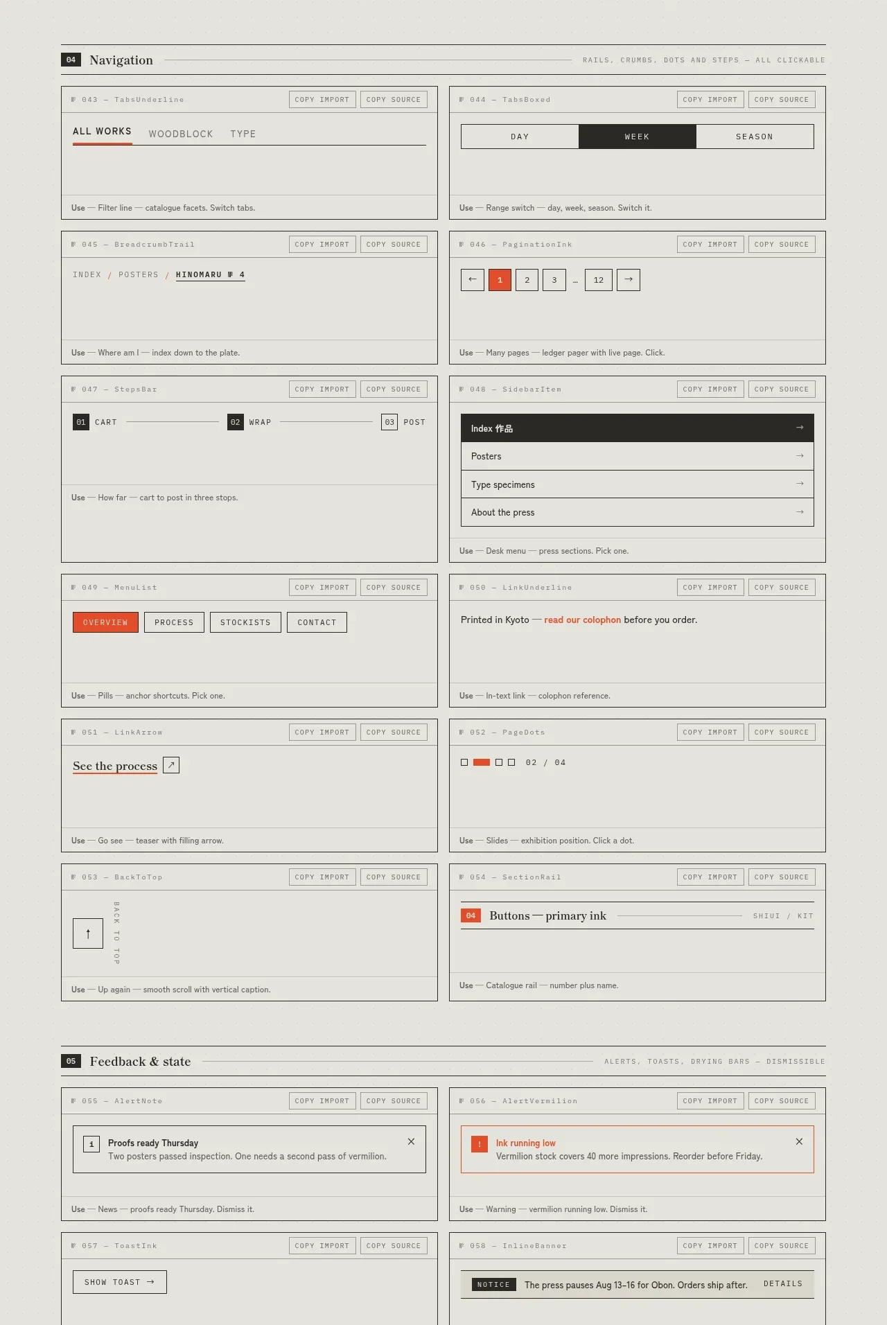
 Navigation patterns inventory
SHIUI · Feature grid
Navigation patterns inventory
SHIUI · Feature grid
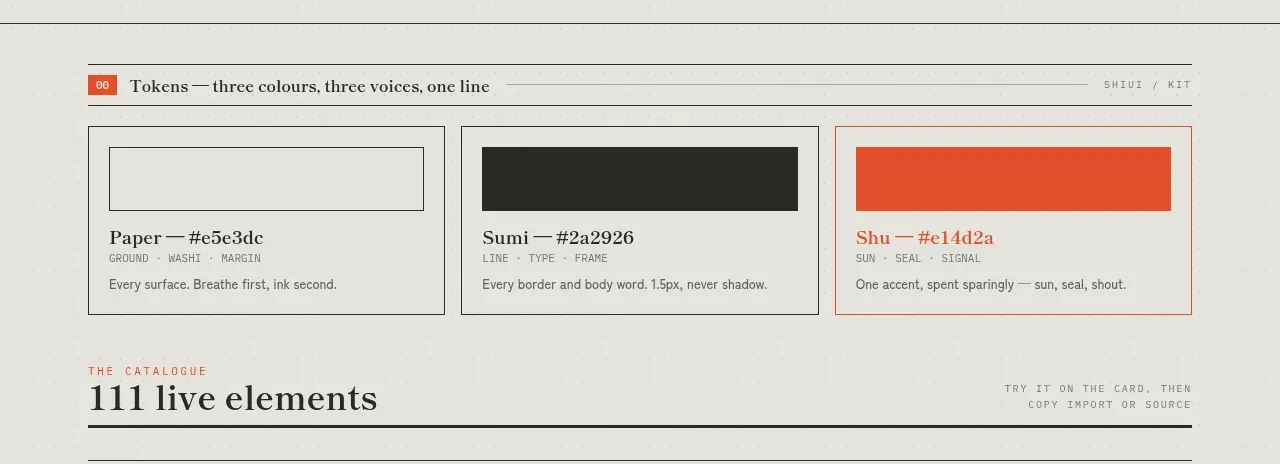 Colour and element catalogue
SHIUI · Feature grid
Colour and element catalogue
SHIUI · Feature grid
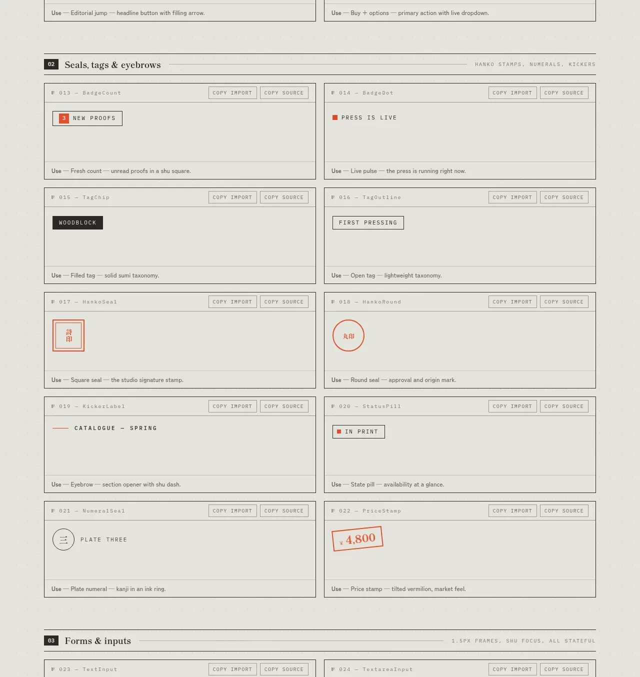 Seals, tags and eyebrows inventory
SHIUI · Feature grid
Seals, tags and eyebrows inventory
SHIUI · Feature grid