 kage
kage
shi-ui.vercel.app
Design analysis
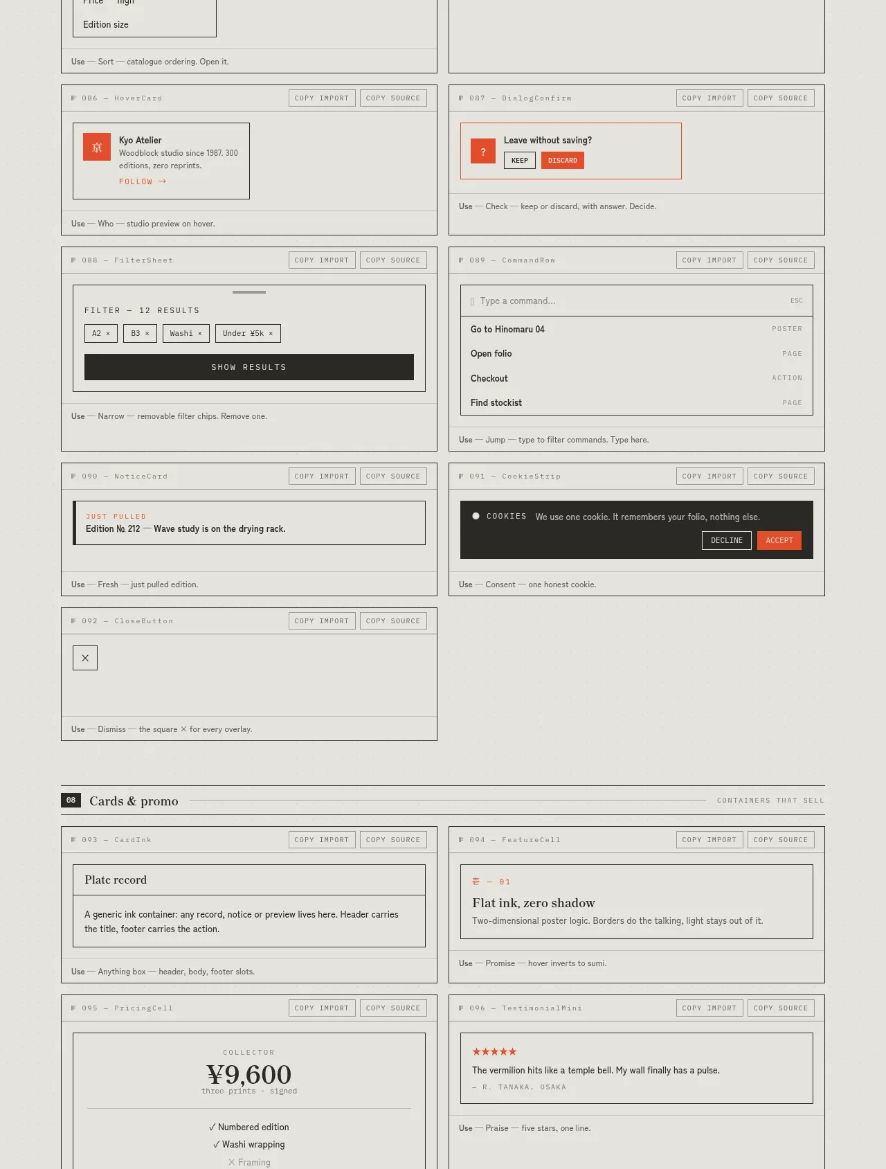
The overlay section demonstrates dialogs, cart summaries, sort menus, notes, popovers, command menus, cookie notices, and small promotional cards without leaving the catalogue framework.
Prompt preview
## Reference images

Study these alongside the description below: hierarchy, rhythm, spacing, colour. Build for the product you are asked about, using this design language.

- Component: https://kage-design-assets.t3.tigrisfiles.io/components/shiui/3111a107-5e9b-4487-9176-525a4b4c448a-1789365768-9.webp
- Full page it was cut from: https://kage-design-assets.t3.tigrisfiles.io/screenshots/shiui/3111a107-5e9b-4487-9176-525a4b4c448a-1789365716423-full.webp
- Component on Kage: https://kage.design/component/shiui-feature-grid-8

## Before you start
Ask what the user's product and brand are, then apply the principles below to their context rather than reproducing this reference.

Create an overlays-and-promotion catalogue with bordered specimen cards in two columns. Demonstrate modal/dialog anatomy, a cart or summary panel, dropdown sorting, sticky note/popover, profile hover card, command palette, toast-like prompt, cookie consent, and a small promo card. Use strong layering cues: paper surfaces #e8e7e1, dark charcoal panels #292926, a vermilion accent #e94d2f, hairline borders, 2–4px radii, and 14–20px internal spacing. Show close controls, action hierarchy, backdrop treatment, and compact responsive behavior. Implement correct focus trapping, Escape handling, portal layering, and accessible labeling.

Never: use logos, product names, copy, illustrations or imagery from the reference.
More components
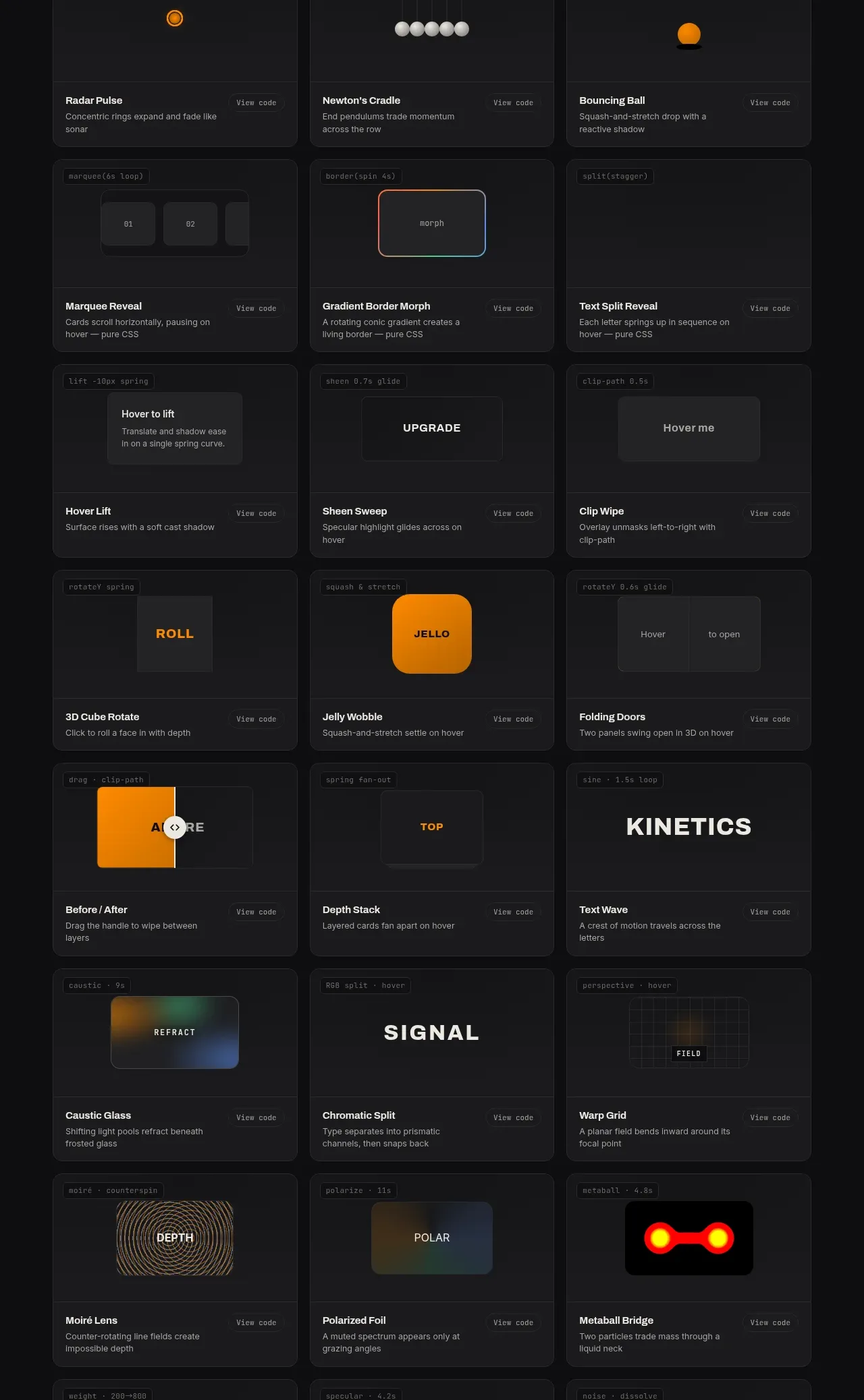
 Surface and motion pattern library
kinetics.colorion.co · Feature grid
Surface and motion pattern library
kinetics.colorion.co · Feature grid
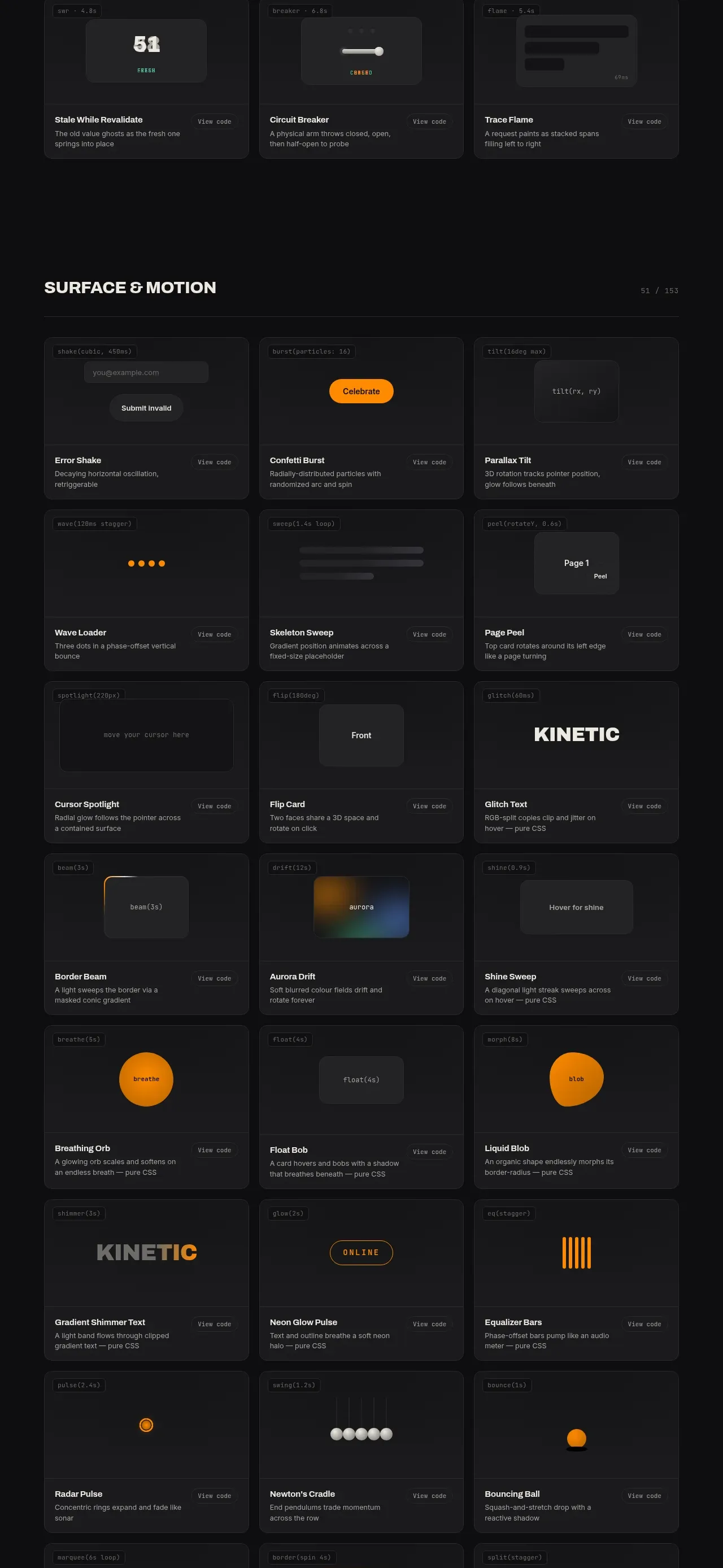 Feedback and state pattern library
kinetics.colorion.co · Feature grid
Feedback and state pattern library
kinetics.colorion.co · Feature grid
 Interaction and input pattern library
kinetics.colorion.co · Feature grid
Interaction and input pattern library
kinetics.colorion.co · Feature grid
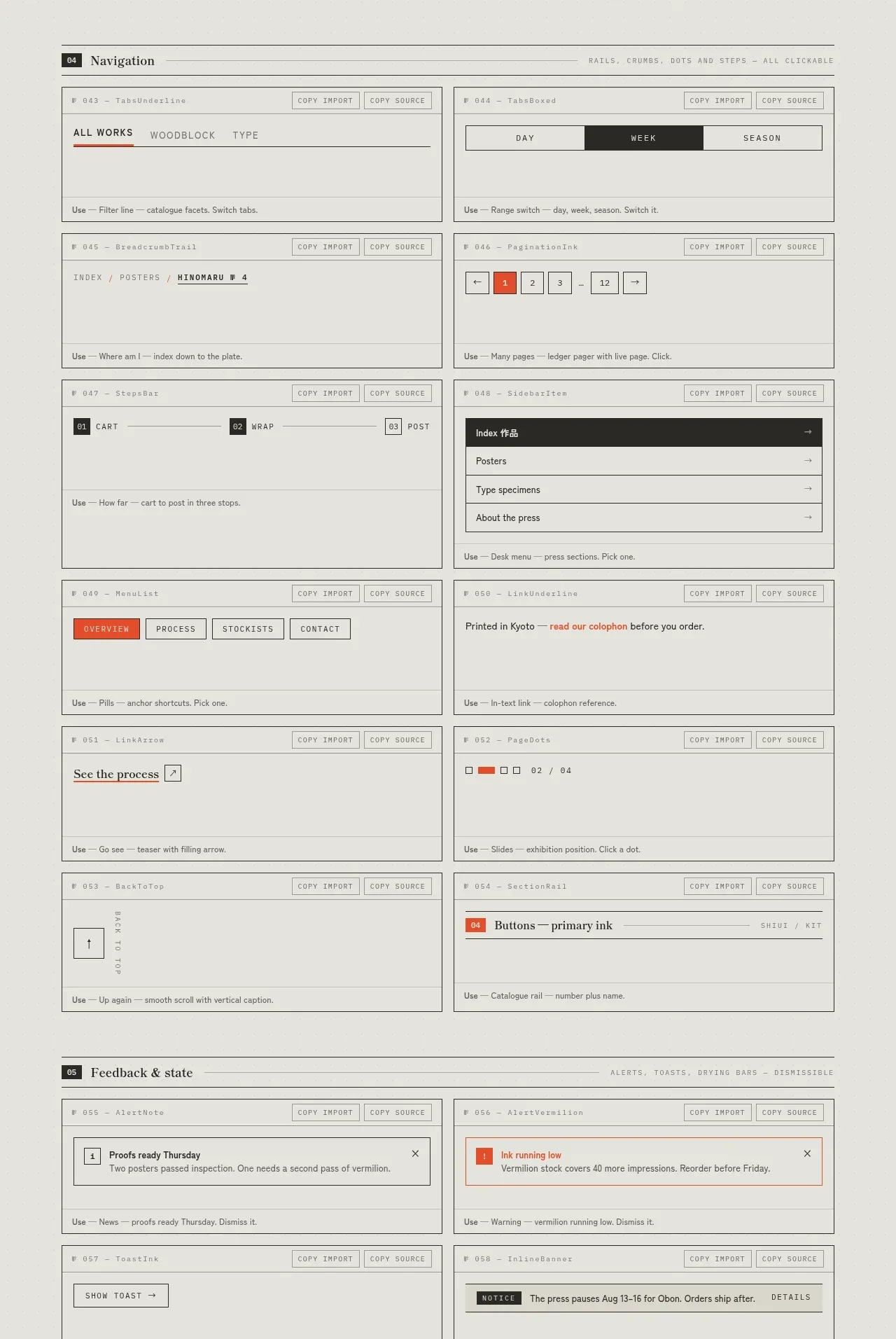
 Navigation patterns inventory
SHIUI · Feature grid
Navigation patterns inventory
SHIUI · Feature grid
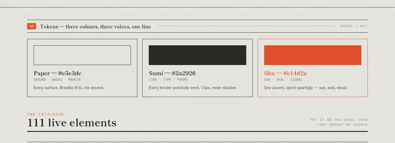 Colour and element catalogue
SHIUI · Feature grid
Colour and element catalogue
SHIUI · Feature grid
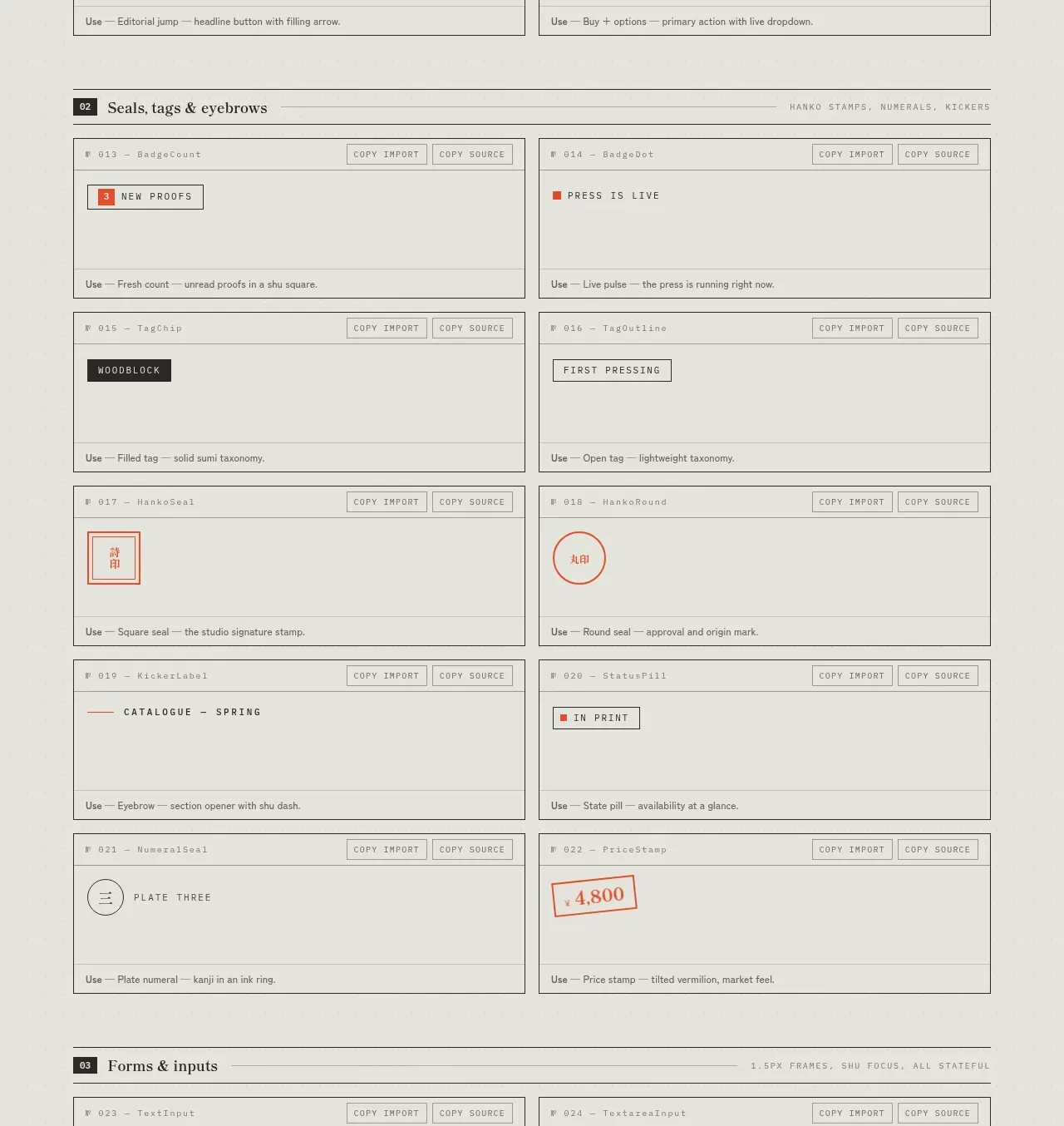 Seals, tags and eyebrows inventory
SHIUI · Feature grid
Seals, tags and eyebrows inventory
SHIUI · Feature grid