 kage
kage
shi-ui.vercel.app
Design analysis
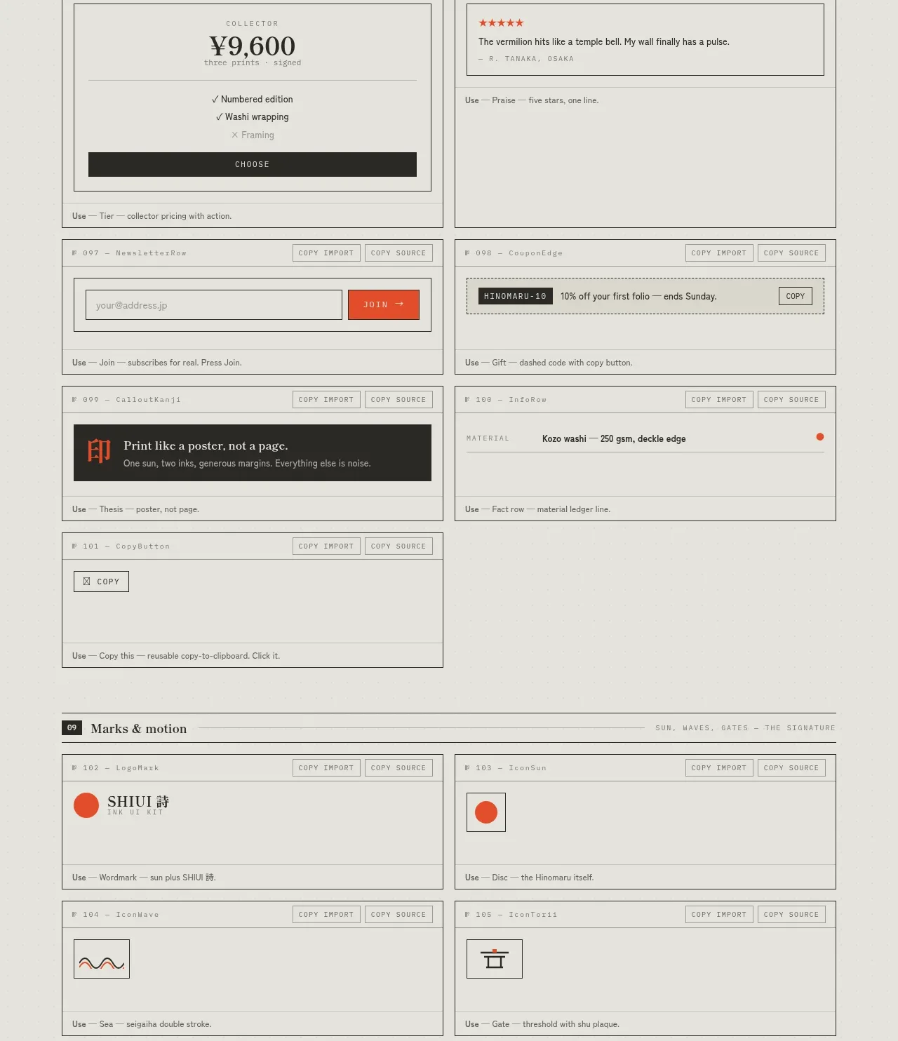
These specimens explore reusable content-card structures such as notices, pricing cards, reviews, newsletter signup, coupons, material rows, and print/editorial promos.
Prompt preview
## Reference images

Study these alongside the description below: hierarchy, rhythm, spacing, colour. Build for the product you are asked about, using this design language.

- Component: https://kage-design-assets.t3.tigrisfiles.io/components/shiui/3111a107-5e9b-4487-9176-525a4b4c448a-1789365768-10.webp
- Full page it was cut from: https://kage-design-assets.t3.tigrisfiles.io/screenshots/shiui/3111a107-5e9b-4487-9176-525a4b4c448a-1789365716423-full.webp
- Component on Kage: https://kage.design/component/shiui-feature-grid-9

## Before you start
Ask what the user's product and brand are, then apply the principles below to their context rather than reproducing this reference.

Build a cards-and-promotion section with a numbered divider and a two-column grid. Include a notice card, link card, pricing card, testimonial/review card, email signup, coupon strip, material/specification row, and a dark editorial promo block. Use a flat paper aesthetic with 1px gray borders, square or 2px corners, charcoal typography, muted metadata, and one strong accent for calls to action. Establish consistent card anatomy: eyebrow, title/value, supporting detail, action, and optional footer. Use 12–20px padding, 10–11px labels, 24–36px display values, and responsive stacking. Add hover states only where the card is actionable.

Never: use logos, product names, copy, illustrations or imagery from the reference.
More components
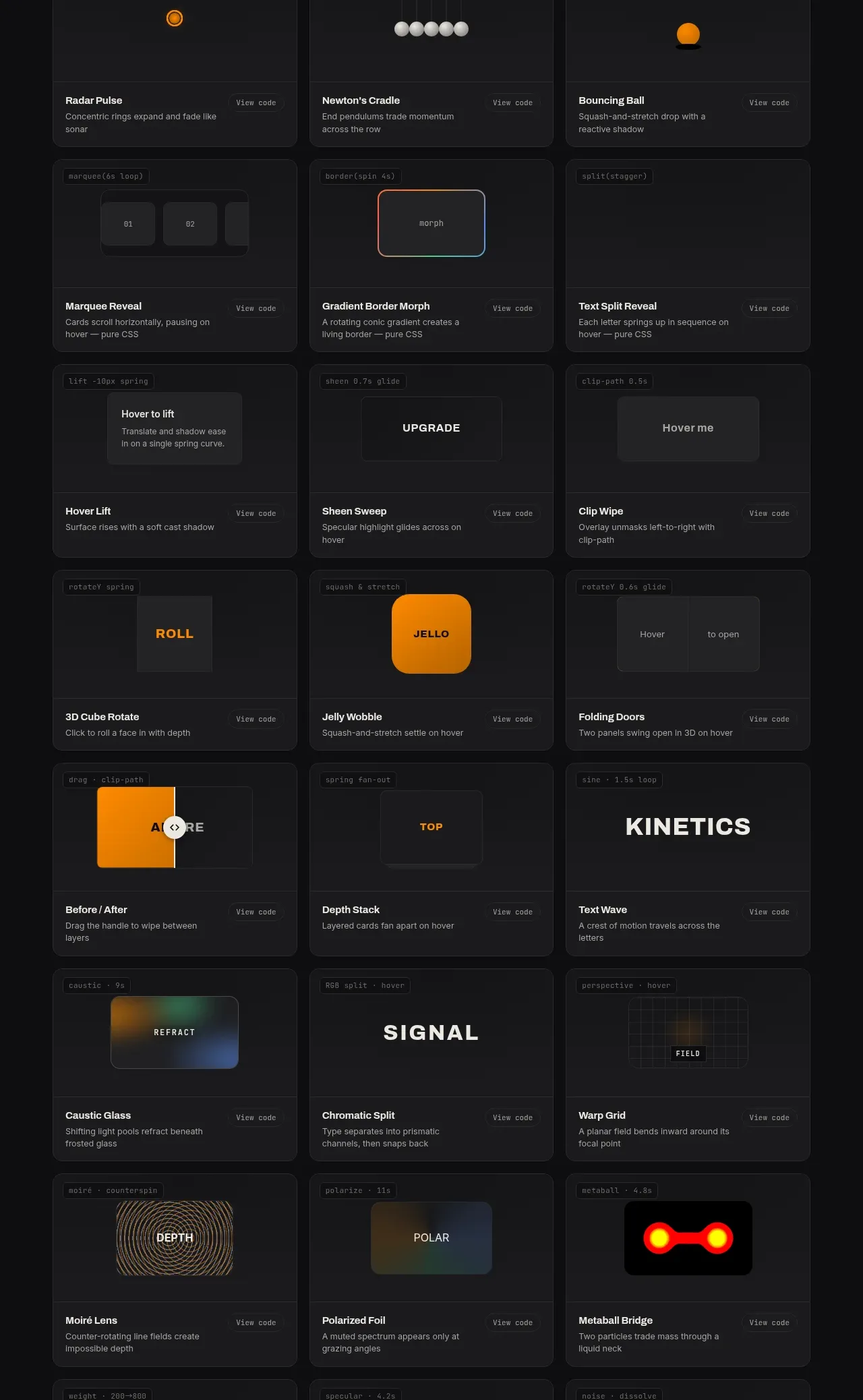
 Surface and motion pattern library
kinetics.colorion.co · Feature grid
Surface and motion pattern library
kinetics.colorion.co · Feature grid
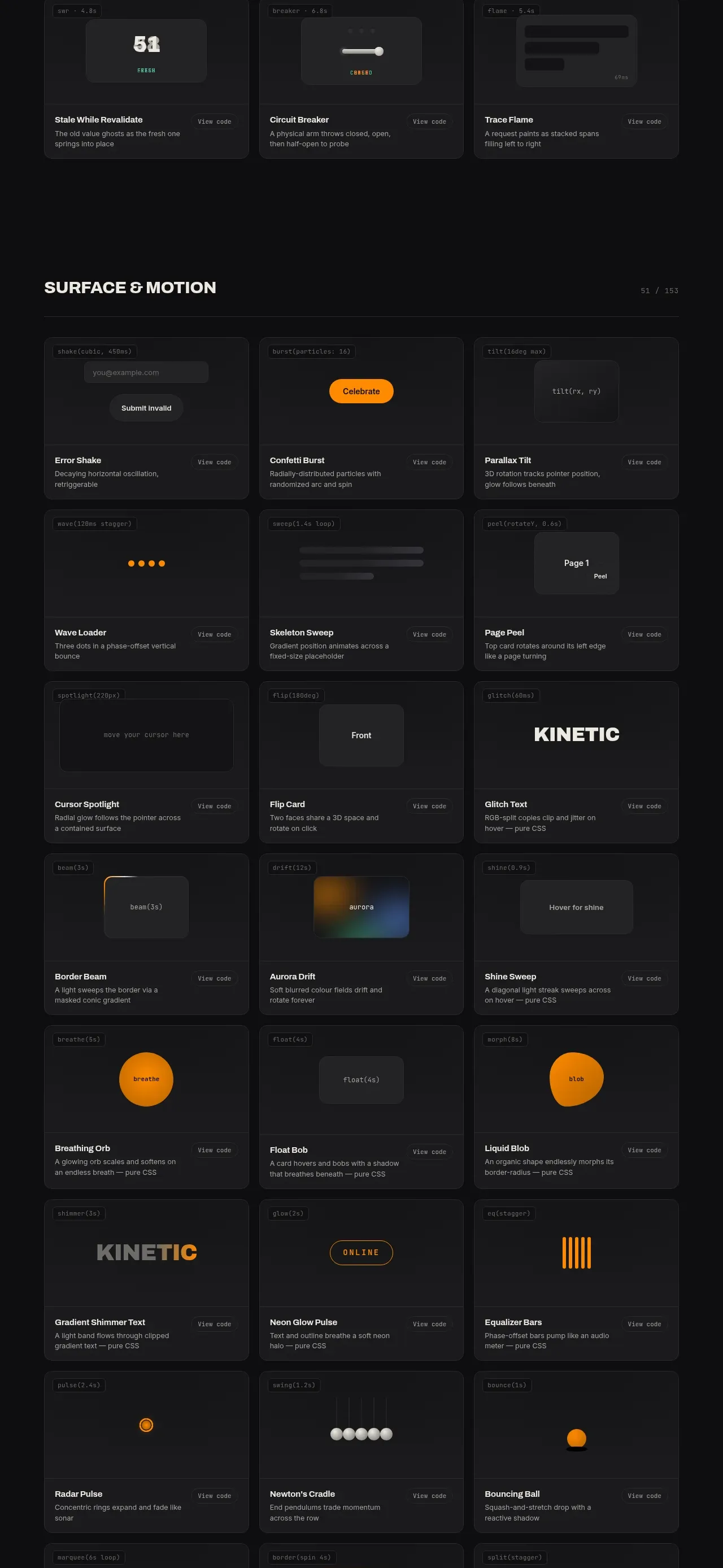 Feedback and state pattern library
kinetics.colorion.co · Feature grid
Feedback and state pattern library
kinetics.colorion.co · Feature grid
 Interaction and input pattern library
kinetics.colorion.co · Feature grid
Interaction and input pattern library
kinetics.colorion.co · Feature grid
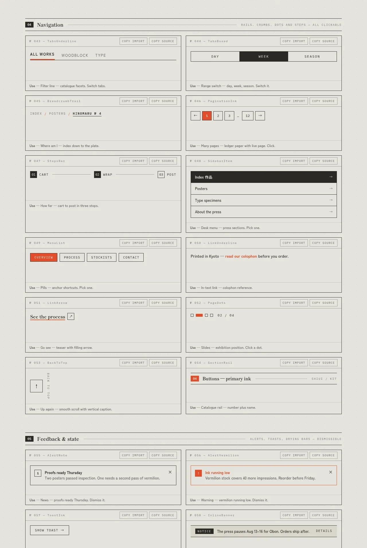
 Navigation patterns inventory
SHIUI · Feature grid
Navigation patterns inventory
SHIUI · Feature grid
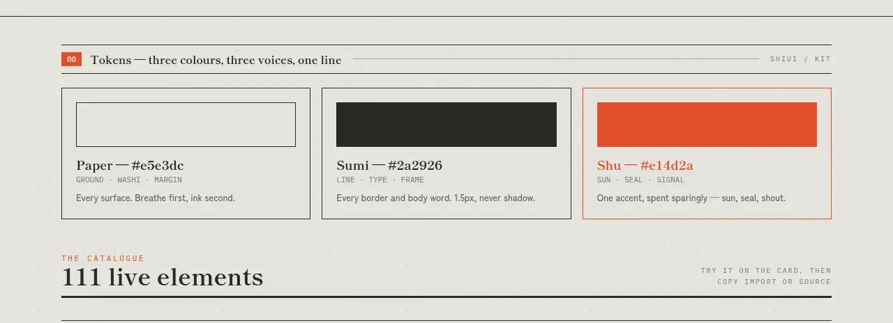 Colour and element catalogue
SHIUI · Feature grid
Colour and element catalogue
SHIUI · Feature grid
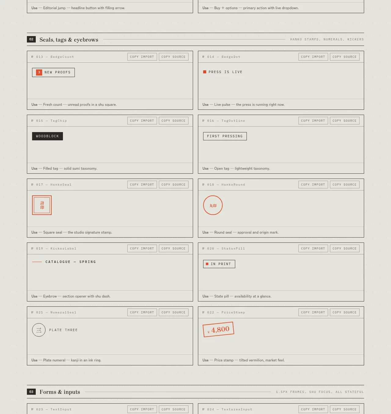 Seals, tags and eyebrows inventory
SHIUI · Feature grid
Seals, tags and eyebrows inventory
SHIUI · Feature grid